[16x] Isabella II: FTB Edition
- Thread starter MrAndrew420
- Start date
-
The FTB Forum is now read-only, and is here as an archive. To participate in our community discussions, please join our Discord! https://ftb.team/discord
You are using an out of date browser. It may not display this or other websites correctly.
You should upgrade or use an alternative browser.
You should upgrade or use an alternative browser.
Think that the update pack looks simply amazing, I just have one suggestion on the Gui's. I haven't had the time to observe all of the machines yet but I noticed that the "Rolling machine" Mj bar is grey like the rest of the gui which is vaguely not appealing as they were a blueish tint before. Then I looked at the "Pulverizer" Gui interface and its Mj bar has a nice orange color to it which makes it stand out. I like that you can tell a lot easier with the pulverizer on how much energy is still left in the tank. Perhaps make the mall like the pulverizer to have that orange color for the energy meter. This is only positive feedback, you don't have to but I really think the orange brighter color stands out more better than the same gray as the background color. I really don't know how to add that spoiler thing so I just post the images and sorry , maybe someone can tell me how to add that and I'll use it for rest of my postings.
The two GUIs you are referencing are done by two different people, Gnomeo is responsible for the lovely Thermal Expansion GUIs, and myself for the Railcraft stuff. I can only speak for myself here, so I'll just let you know that I am using the GUI template supplied by bonemouse (The creator of this lovely texture pack) on his MCF thread. Once I get going on doing a bunch of GUIs it's just a bunch of overlays, filters, effects and the like. I'm willing to admit that they aren't as inspired as Gnomeo's work, but they are faithful to the vanilla Isabella GUIs. I have no problem with going back and touching them up at a later date, but I have been so swamped with RL stuff and wanting to keep my promise for the date of the updates release, that I just flew through them by the seat of my pants.
I will get together with Gnomeo to discuss a set look for the GUIs to give more consistency in the future. We can come up with a set look for MJ bars, EU bars, progress bars and so on.
I hope you guys continue to enjoy the pack, and keep it coming with the feedback so we can continue to make this a better texture pack overall.
Oh I understand completely what your saying,I love the pack and all the work each person has put into so I'm not arguing that this is a big issue if one at all.If you feel that they are as what you wanted them to be then leave it as is. It was just positive feedback i like the style and feel of this pack ever more so than I ever did with sphax.
Keep up the great work and I look forward to future updates on the pack.
Thanks for the feedback. The Thermal Expansion GUIs I put together were based on the ones used in IndustrialCraft 2 and Forestry's Generator (the IC2 energy converter). In those GUIs the energy bars (MJ & EU) are red/orange and progress bars are the standard Isabella GUI color (grey/blue).
Thermal Expansion is a little different in the sense that the inputs/outputs can be selected by colors. Because of this, the mod developer made an option to choose a color blind version of the GUIs in the config file of the mod. I toyed with the idea of making the "standard" GUI the colored version and the color blind version the grey version more consistent with default Isabella; but since IC2 and Forestry already had established the red/orange energy bar I went with that instead.
I look forward to hearing everyone's thoughts on the look, and will be fixing a few derps I found with the version of the GUIs I submitted. Specifically, I had started work on TE's Magma Crucible but pushed out the WIP version, and for some reason my Carpenter GUI is cut off on the bottom. Anyone else see issues with Forestry GUIs? I thought I had them nailed down...
FYI: To make a spoiler type the following without spaces in the brackets: [ spoiler ] *content within spoiler* [ /spoiler ]
Thanks gnomeo, I'll have a look at some of the other GUI in a few. If I find anything I will drop a post.
Personally I think progress bars, charge meters et cetera should offer contrast and color, it's one of my minor gripes about Isabella, no little fire icon in furnaces and the progress bar is a slightly bevelled background. ") I certainly appreciate simplicity and consistency when it comes to GUI design, but this particular thing I don't like. Gnomeo's charge meter is very nice and offers a much more easily parsed way of telling how full (or empty) a machine is. My only suggestions would be to maybe desaturate the red a little bit and fix the highlight/shadow border being backwards ;P
I certainly appreciate simplicity and consistency when it comes to GUI design, but this particular thing I don't like. Gnomeo's charge meter is very nice and offers a much more easily parsed way of telling how full (or empty) a machine is. My only suggestions would be to maybe desaturate the red a little bit and fix the highlight/shadow border being backwards ;P
In other news, I got bored (again) and set about making Thaumcraft look like I want it to
Changed the Arcane Ear and the Alembic's gold color to match Isabella's gold. Not sure I like the way the tools turned out and the wand handles look a bit off colorwise. Thaumometer needs more contrasting shadows/highlights.
Edit: Added nuggets and messed with amber ore (also added shading to Cinnabar):
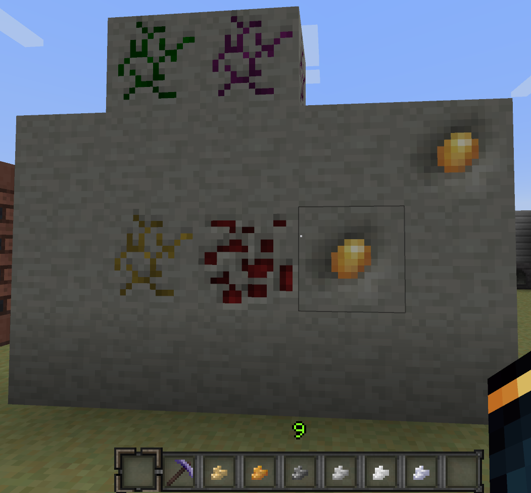
I swear the amber looked smaller in Paint.net
I certainly appreciate simplicity and consistency when it comes to GUI design, but this particular thing I don't like. Gnomeo's charge meter is very nice and offers a much more easily parsed way of telling how full (or empty) a machine is. My only suggestions would be to maybe desaturate the red a little bit and fix the highlight/shadow border being backwards ;PIn other news, I got bored (again) and set about making Thaumcraft look like I want it to
Changed the Arcane Ear and the Alembic's gold color to match Isabella's gold. Not sure I like the way the tools turned out and the wand handles look a bit off colorwise. Thaumometer needs more contrasting shadows/highlights.
Edit: Added nuggets and messed with amber ore (also added shading to Cinnabar):
I swear the amber looked smaller in Paint.net
UPDATE:
Small Thamcraft related tweaks. New Golem icons, new thaumium ingots, some Thaumcraft GUIs, and listoflights' Mystcraft GUIs
Grab it from the download link on the first post.
Small Thamcraft related tweaks. New Golem icons, new thaumium ingots, some Thaumcraft GUIs, and listoflights' Mystcraft GUIs
Grab it from the download link on the first post.
Zippety Doo Da
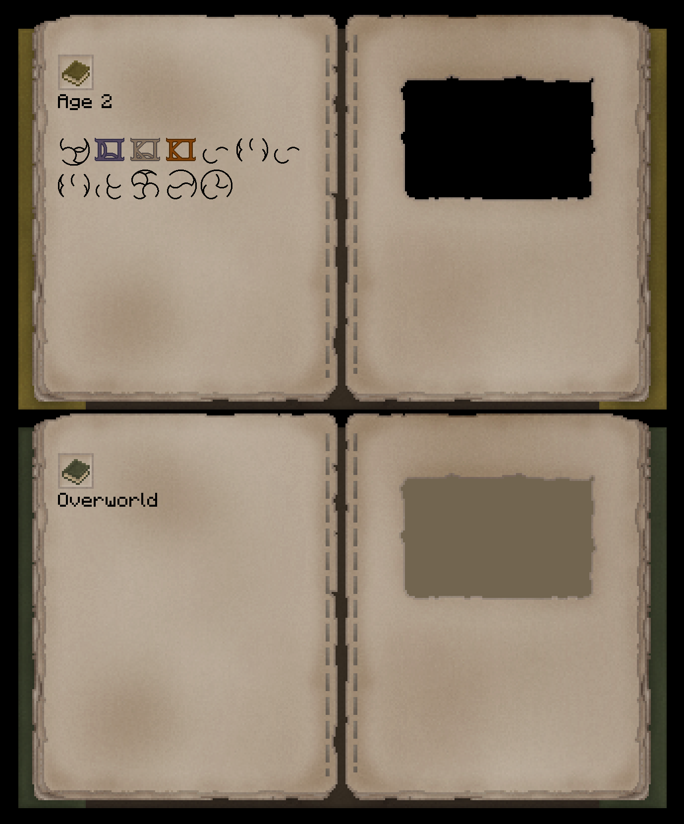
Fiddled with the paper some, finished the biome symbols. The other symbols... I think we need a combined caligrapher/pixel artist to figure those out...
Also, added covers to the Myst books:
Edit: while I remember, Railcraft's folder structure has changed, causing the GUIs to not work at the moment. Refer to the Railcraft jar/zip (Can't remember) to see the changes. Also, the Thermal Expansion item sprite sheet needs to be updated. Rich slag currently has no texture at all.

Yay for version wars. The changes to Railcraft affect only the Magic Pack, since it uses a more updated version. This version also included steel armor. The item list has no texture (pink squares), and the armor when worn defaults to the vanilla texture.
The same is true for the Thermal Expansion change. Rich slag didn't exist in 1.4.2.
The same is true for the Thermal Expansion change. Rich slag didn't exist in 1.4.2.
I'll take a crack at it. I have a few updates to Forestry and Thermal Expansion to add to the next update as well.No round minimap?
I found out the cause behind the Carpenter error I mentioned a few posts ago. The in-game GUI for the Carpenter cuts off the bottom of the texture. Since I patterned my GUI over the vanilla texture, it gets cut off as well. I've updated my version to move the border up to compensate.
I'll take a crack at it. I have a few updates to Forestry and Thermal Expansion to add to the next update as well.
Great, cool, I love it!
I like those a lot. Much better than my amateur attempt.
I was able to get the square border to show on the minimap using the instructions provided.
I was able to get the square border to show on the minimap using the instructions provided.
I did take a crack at it, and I can't get the darn thing to show up in-game. Does the square border show, cause neither of them show up for me...
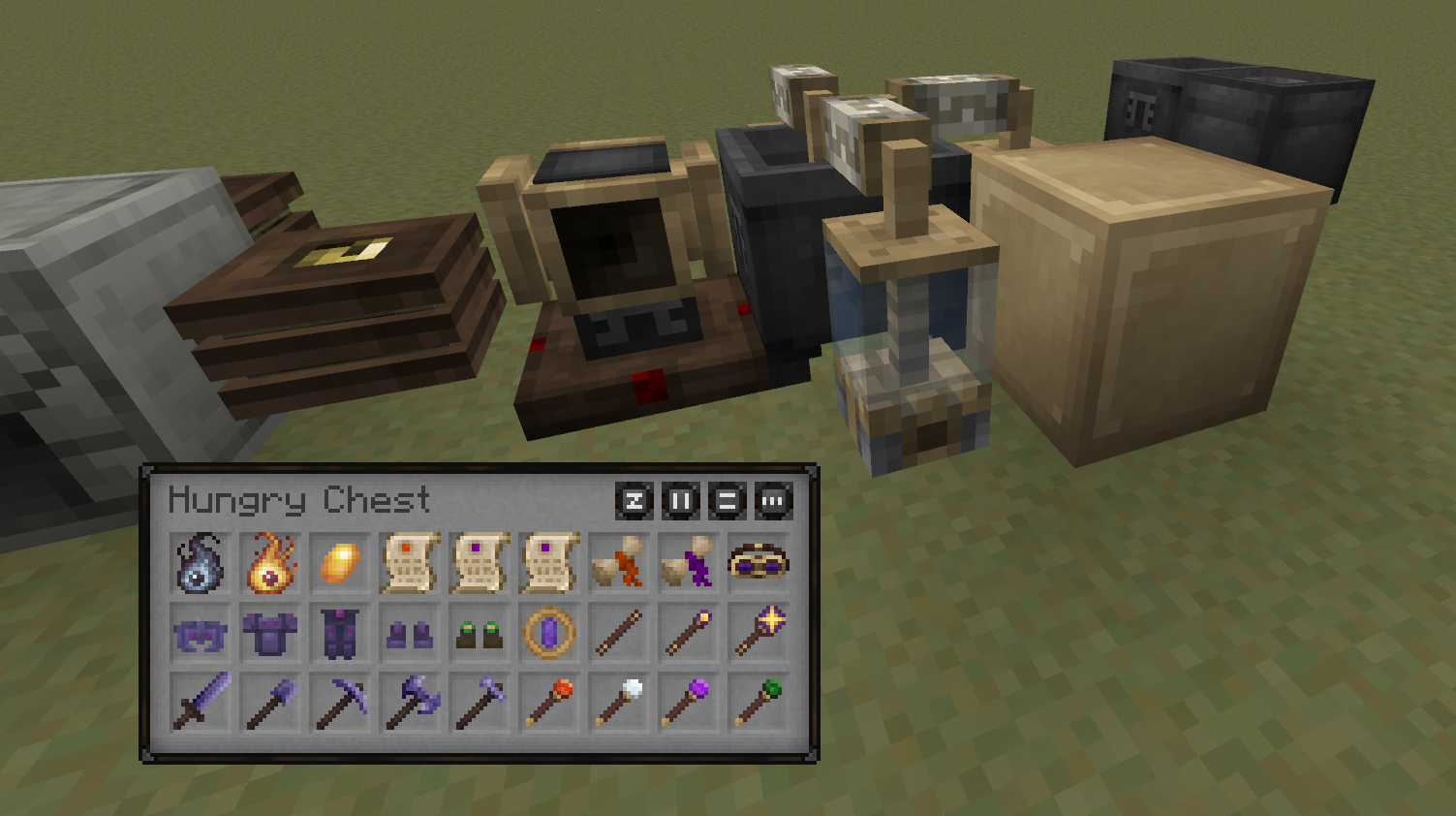
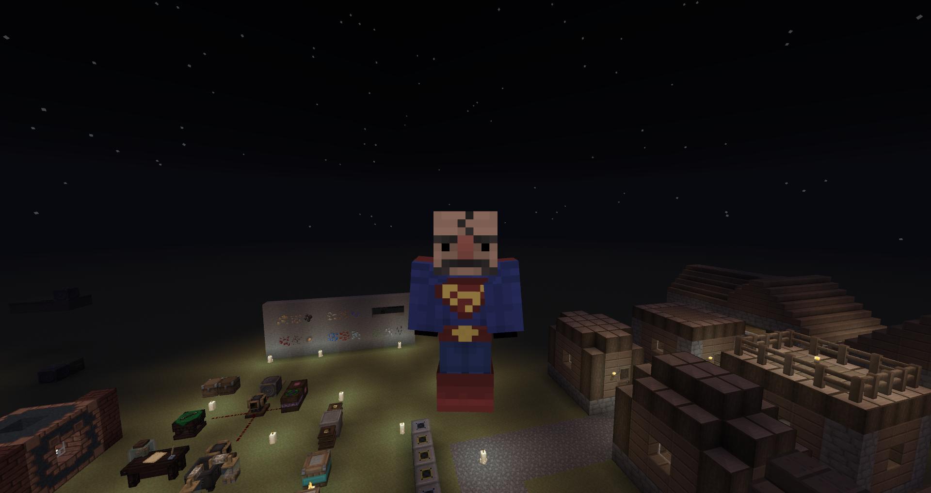
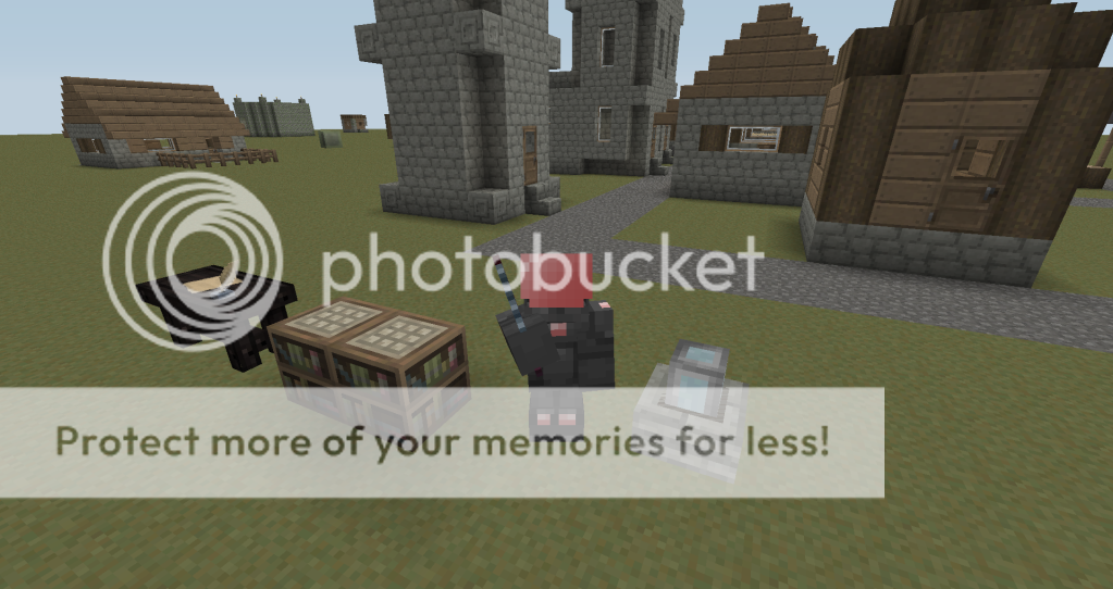
Also, been messing with backpacks and the apiarist's armor. Thoughts?
Loving the apiarist gear. Might need some sleeves to protect from the swarms of bees though ;]. And as for the Backpacks, they are looking good, but I would scale back the shading a bit.
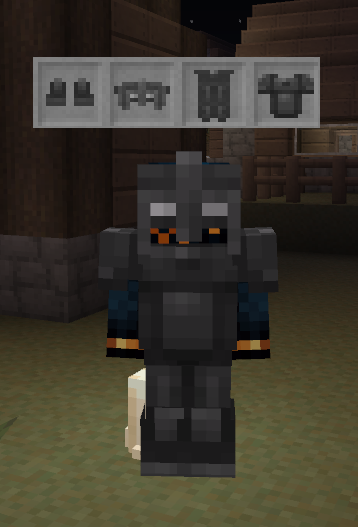
On another note, I heard you guys like armor!
Nano:
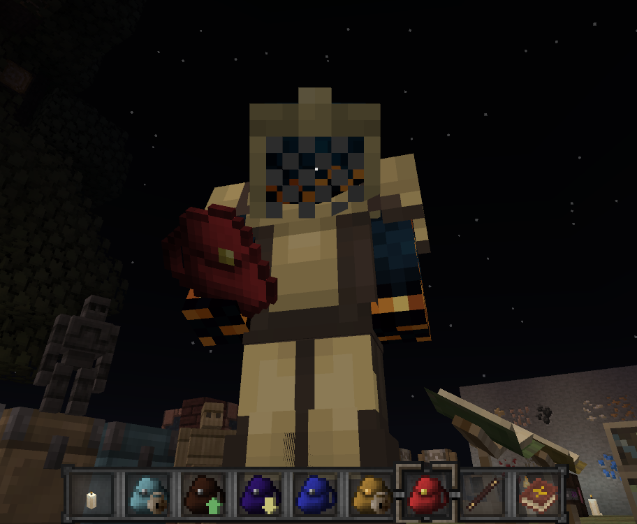
and Iron Wood (plus a sneak-peek at Fiery Armor/tools and some upcoming BuildCraft 3 stuff in my hotbar)
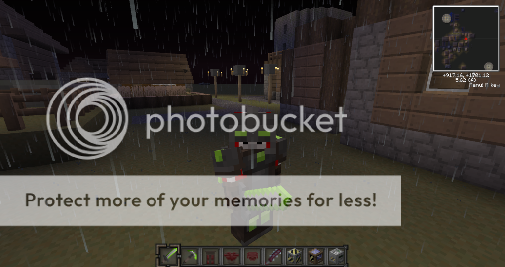
and some Splinter Cell-errific Night Vision goggles
and Iron Wood (plus a sneak-peek at Fiery Armor/tools and some upcoming BuildCraft 3 stuff in my hotbar)
and some Splinter Cell-errific Night Vision goggles
I'm not quite sure what you meant by scaling back the shading, but I tried. Would be easier if I had any idea what I'm doing. 
In regards to the apiarist's armor, yeah, I kinda struggled with deciding whether to stick to Isabella armor etiquette or logic The hat isn't even a hat, just a mask! I'll fiddle around with it.
Nice lookin' armors you got there, shame if... no -- no, not doing that!
If you're working on Buildcraft, are you planning on fixing the z-fighting on the engines? I've also been looking at Buildcraft, primarily the pipes. Haven't done much yet, but I really feel like they need some texture.
In regards to the apiarist's armor, yeah, I kinda struggled with deciding whether to stick to Isabella armor etiquette or logic
The hat isn't even a hat, just a mask! I'll fiddle around with it.Nice lookin' armors you got there, shame if... no -- no, not doing that!
If you're working on Buildcraft, are you planning on fixing the z-fighting on the engines? I've also been looking at Buildcraft, primarily the pipes. Haven't done much yet, but I really feel like they need some texture.
I just meant they looked /too/ shaded before. Looking excellent nowI'm not quite sure what you meant by scaling back the shading, but I tried. Would be easier if I had any idea what I'm doing.
Yeah I had the same dilemma when I started working on the IC2 armors, but I decided If we didn't start to change it up we would have alot of too similar armor sets.In regards to the apiarist's armor, yeah, I kinda struggled with deciding whether to stick to Isabella armor etiquette or logic
>_>Nice lookin' armors you got there, shame if... no -- no, not doing that!
I'm not sure what you mean. I'm not seeing anything on my side.If you're working on Buildcraft, are you planning on fixing the z-fighting on the engines? I've also been looking at Buildcraft, primarily the pipes. Haven't done much yet, but I really feel like they need some texture.
I agree about something needing to be done about the pipes.