[16x] Isabella II: FTB Edition

  • The FTB Forum is now read-only, and is here as an archive. To participate in our community discussions, please join our Discord! https://ftb.team/discord

stormkitster

New Member
Jul 29, 2019
61
0
0
Yeah they did but they will be chnging again soon. Try to find a design that fits considering the recipe, the look of the pack in general and the original look of the engine.


Sorry, I updated the link yesterday, just forgot to post saying that I did. It's only a slight shift because there's a fine line between it looking too much like aluminum, and looking too much like tin.


Thanks andrew. I noticed they look to much like aluminum also which threw me off because I keep all my ingots in one safe :). I'm glad to hear there has been another update. Personally I like the current electric engine look but if you got something even more awesome in mind by all means go for it mate. Keep up the great work and the rest that help you also. Fantastic 16x texture pack.
 

Gnomeo

New Member
Jul 29, 2019
134
0
1
Sadly some of the things are hard coded. The candles, markers, and liquids can't be changed from what I can tell so far. The only things I've done so far was a few golems, the furnace, and a few other small things.

I noticed the same thing with the newest version of Forestry. The backpacks in particular.

The updates look great, thanks for the hard work.
 

MrAndrew420

New Member
Jul 29, 2019
119
0
0
Just a heads up, I'm currently working on finishing up RailCraft. Most machines and rails are done, just need to finish up the items and such and will release a big update today or tomorrow :D
 

stormkitster

New Member
Jul 29, 2019
61
0
0
Just a heads up, I'm currently working on finishing up RailCraft. Most machines and rails are done, just need to finish up the items and such and will release a big update today or tomorrow :D

WOOHOOO!!!!! Rock on mate. Can't wait for it,keep it coming.:D
 

Gnomeo

New Member
Jul 29, 2019
134
0
1
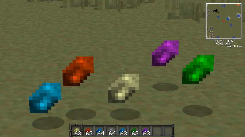
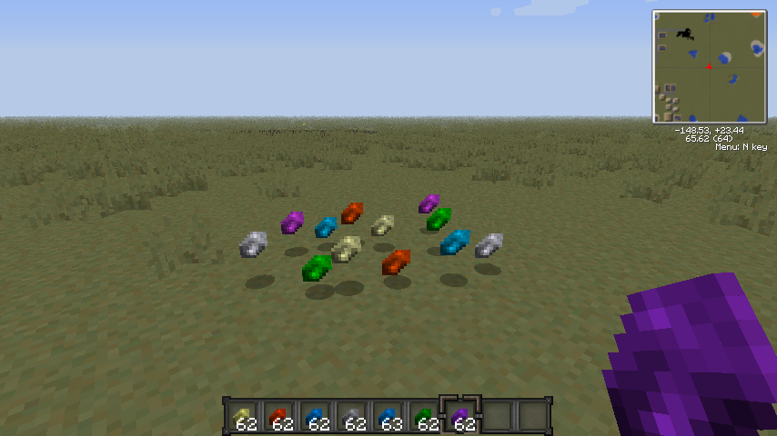
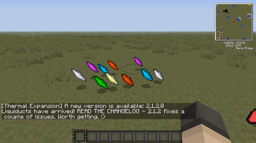
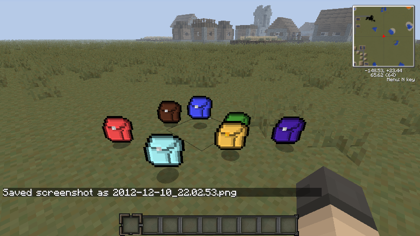
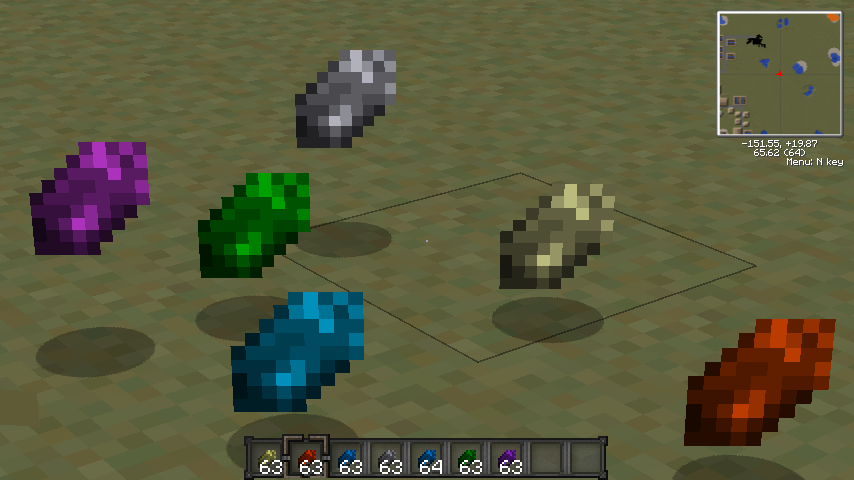
So, the default TC3 shard colors & shapes bug me, so I messed around a bit with the texture. I figured since there was only one texture in the file the they all use the same one and just overlay a different color on top for each shard color. The different shades of grey in the texture file serve as highlights. That being the case, instead of changing the color itself, why not just add more grey to wash out the brightness? Here's the result:

Crystals/Shards
These were a little dark...
VS64K.png


...so I fixed them a bit
epXZj.png


Here's the non-zoom pic
fKHX3.png


And a comparison
N5ZOs.png

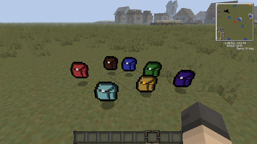
It also works for Forestry's backpacks
glaH3.png


Another comparison
JJwKy.png

Ah crystals, how I've missed you.

What do you guys think of the darker look?
 

MrAndrew420

New Member
Jul 29, 2019
119
0
0
So, the default TC3 shard colors & shapes bug me, so I messed around a bit with the texture. I figured since there was only one texture in the file the they all use the same one and just overlay a different color on top for each shard color. The different shades of grey in the texture file serve as highlights. That being the case, instead of changing the color itself, why not just add more grey to wash out the brightness? Here's the result:

Crystals/Shards
These were a little dark...
VS64K.png


...so I fixed them a bit
epXZj.png


Here's the non-zoom pic
fKHX3.png


And a comparison
N5ZOs.png

It also works for Forestry's backpacks
glaH3.png


Another comparison
JJwKy.png

Ah crystals, how I've missed you.

What do you guys think of the darker look?

First off... since when did we get spoilers here?

Second, the crystals look great! Backpacks too. Once I get back into Forestry stuff I plan on completely changing the back packs to look better when they are on your back (for whatever that client side mod is that does that :p)
 

Gnomeo

New Member
Jul 29, 2019
134
0
1
Yeah, they bleed into the background. Perhaps a shadow, or two-toned approach?

I really like the look of the notebook and the color of the tabs.
 

MrAndrew420

New Member
Jul 29, 2019
119
0
0
UPDATE:

RAILCRAFT!
New GUI's for Forestry and IC2
Thermal Expansion blocks
ThaumCraft Goodies
New Iron Chests
And more...

Grab the newest build from the link in the first post, and as always, enjoy!
 

listoflights

New Member
Jul 29, 2019
12
0
0
@listoflights Did you make those notebook/link book GUI textures? They look amazing!

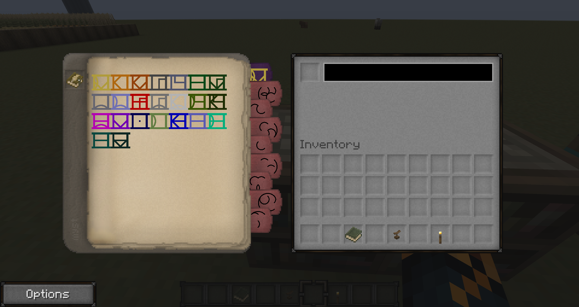
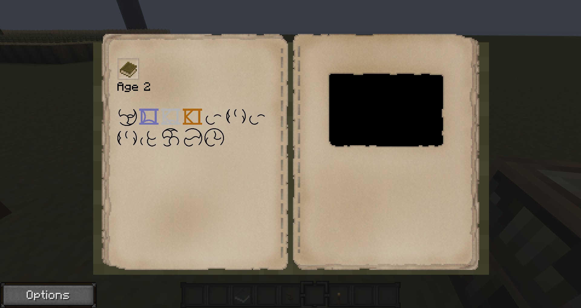
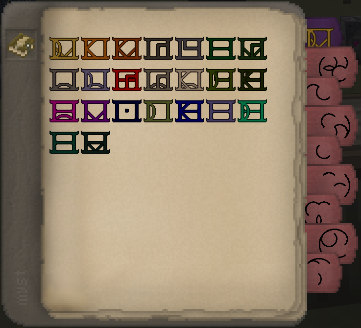
Aside from the paper edge, which is from bonemouse's book texture, yes it's all me. I initially only intended to do something simple to get rid of the terrible default GUI textures but it kinda snowballed :) If you wanna use them I'd be glad to zip them up -- I also added the Isabella inventory GUI to the Thaumcraft golems and altar/research table if you want those.

On that note, this is my current draft for Mystcraft symbols:

iDegO.png

Also, the Thaumium ingot seems to be the darker one from the TC2 textures. I'd suggest using the lighter colored one not only because it's closer to "vanilla" Thaumcraft but also because it would make it easier to distinguish between Thaumium and Dark Iron ingots.

...and I hate the look of Silverwood and Greatwood trees... :(
 
  • Like
Reactions: Gnomeo

MrAndrew420

New Member
Jul 29, 2019
119
0
0
Aside from the paper edge, which is from bonemouse's book texture, yes it's all me. I initially only intended to do something simple to get rid of the terrible default GUI textures but it kinda snowballed :) If you wanna use them I'd be glad to zip them up -- I also added the Isabella inventory GUI to the Thaumcraft golems and altar/research table if you want those.
Yes please :D

Also, the Thaumium ingot seems to be the darker one from the TC2 textures. I'd suggest using the lighter colored one not only because it's closer to "vanilla" Thaumcraft but also because it would make it easier to distinguish between Thaumium and Dark Iron ingots.

...and I hate the look of Silverwood and Greatwood trees... :(

Yeah I may switch Thaumium and Dark Iron. I knew that would end up being a problem back when I started on Factorization textures.

What exactly don't you like about Silverwood and Greatwood? I've already changed Greatwood trees, It Just didn't make it into this update.
 

listoflights

New Member
Jul 29, 2019
12
0
0
Zip ahoy!

As far as ingots, the brighter thaumium one is in the old TC2 items.png right next to enchanted fabric. I like it!

The trees... they look too plain, too dark. I like that the original logs have more of a glow to them than the rest of the trees, makes them seem ever so slightly more magical -- capable of bringing a touch of color to a bleak and desaturated world o_O . As far as leaves are concerned I far prefer the vanilla ones in terms of luminosity and hue.

Edit: I might mention that Thaumcraft is my favorite mod and unlike most it has a very strong and informed art style to it, which is probably why I kinda don't like too much meddling with it (blanket desaturate on ss_core... grrr) :p It's a mod I feel very protective of, I guess.
 
  • Like
Reactions: Gnomeo

Gnomeo

New Member
Jul 29, 2019
134
0
1
Zip ahoy!

As far as ingots, the brighter thaumium one is in the old TC2 items.png right next to enchanted fabric. I like it!

The trees... they look too plain, too dark. I like that the original logs have more of a glow to them than the rest of the trees, makes them seem ever so slightly more magical -- capable of bringing a touch of color to a bleak and desaturated world o_O . As far as leaves are concerned I far prefer the vanilla ones in terms of luminosity and hue.

Edit: I might mention that Thaumcraft is my favorite mod and unlike most it has a very strong and informed art style to it, which is probably why I kinda don't like too much meddling with it (blanket desaturate on ss_core... grrr) :p It's a mod I feel very protective of, I guess.

Those are going straight into my texture files. I like everything about them.

Unless I'm mistaken, MrAndrew420 used the ss_core which I modified from the prior release of the pack. I took many of the TC2 Isabella textures, including the ingots and the crystals, and copied them in. I wasn't thinking of Factorization, though. Having switched to the Magic Pack, I didn't have a conflict of textures. If you look at the dark iron ingots in the latest pack you will see that they are indeed lighter than the thaumium ingots. Perhaps a swap is in order.

Thaumcraft is also my favorite mod, and I've grown far too accustomed to the Isabella support I received. In fact, looking for texture packs with Thaumcraft support is what led me to discover Isabella. It was one of the reasons I was excited to see Isabella support for FTB and what prompted me to assist.
 

stormkitster

New Member
Jul 29, 2019
61
0
0
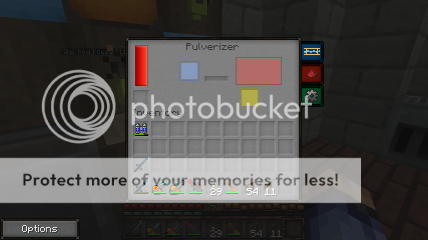
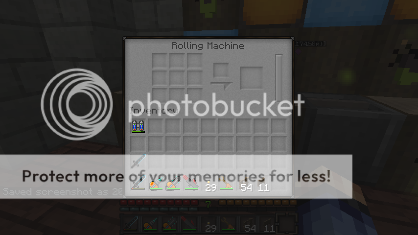
Think that the update pack looks simply amazing, I just have one suggestion on the Gui's. I haven't had the time to observe all of the machines yet but I noticed that the "Rolling machine" Mj bar is grey like the rest of the gui which is vaguely not appealing as they were a blueish tint before. Then I looked at the "Pulverizer" Gui interface and its Mj bar has a nice orange color to it which makes it stand out. I like that you can tell a lot easier with the pulverizer on how much energy is still left in the tank. Perhaps make the mall like the pulverizer to have that orange color for the energy meter. This is only positive feedback, you don't have to but I really think the orange brighter color stands out more better than the same gray as the background color. I really don't know how to add that spoiler thing so I just post the images and sorry , maybe someone can tell me how to add that and I'll use it for rest of my postings.

Pulverizer:
2012-12-12_215830.png

Rolling Machine:
2012-12-12_215834.png