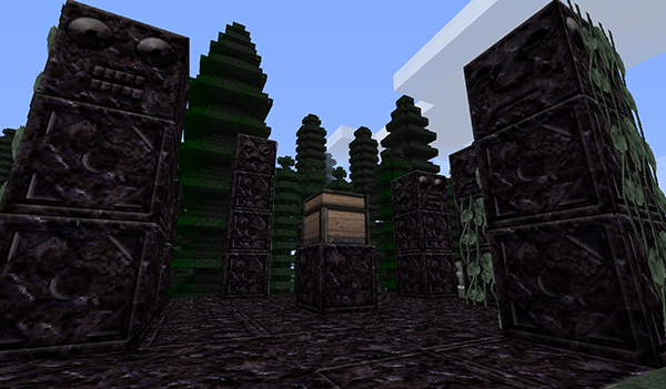
Those are going to give me nightmares.Updated the pack again with more textures. Finished up the ExtraBiomes Mod and started in on more Thaumcraft textures. Here is a look at the Thaumcraft Obsidian Totems:
T42 [x64] Texture Pack
- Thread starter tpelham42
- Start date
-
The FTB Forum is now read-only, and is here as an archive. To participate in our community discussions, please join our Discord! https://ftb.team/discord
You are using an out of date browser. It may not display this or other websites correctly.
You should upgrade or use an alternative browser.
You should upgrade or use an alternative browser.
Yes. I'm still actively working on adding textures to the pack as I go through the various mods.Are you going to retexture apiaries? Other than that everything is solid.
Apiaries, bees and the beealyzer, and the treealyzer?
when will the insatll section on the website be updated?
Install page has been updated to include FTB install instructions.
coolInstall page has been updated to include FTB install instructions.
Been playing with the pack for about a day now and loving it but i think the redstone looks abit plain any plans on changing it? If not thats fine but thought i would put my 2 cent forward
Thanks for the feedback.Been playing with the pack for about a day now and loving it but i think the redstone looks abit plain any plans on changing it? If not thats fine but thought i would put my 2 cent forward
Thanks for the feedback.Are you referring to the Redstone Ore, the Redstone item or the Redstone graphic when placing it on the ground?
The item when in chest etc
More textures have been added in to my T42 FTB pack...
Updates:
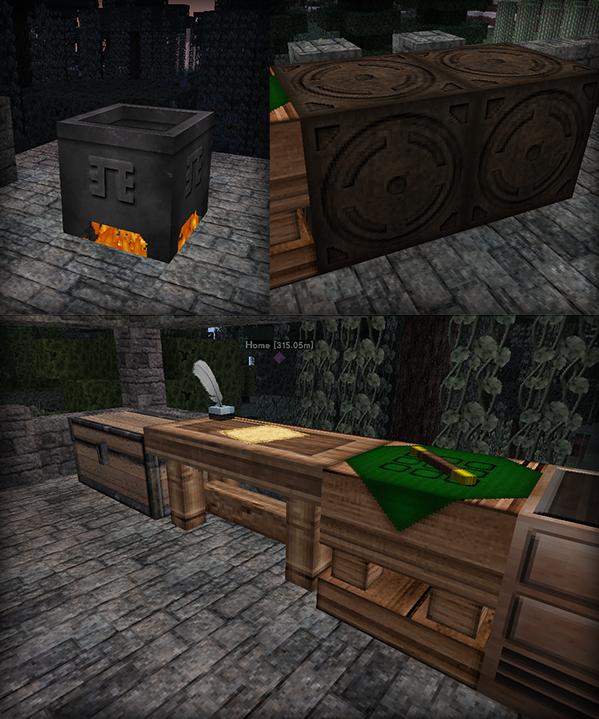
ThaumCraft
- Infernal Furnace
- Magical Building Block
- Writing Feather
- Scribing Tool
- Cauldron
- Marker
- Wand
- Thaumometer
- Amber Item
- Tallow Item
- Magical Cloth Item
- Knowledge Fragment
Forestry
- Planks
- Wood logs
XyCraft
- Corn Stalk
- Henequen plant
- Henequen Seeds
- Henequen Leaf
- Corn Cob
- Twine
And here is a picture of some Thaumcraft 3 stuff...

Few things with latest update:
SS_Core file is 4 meg. If I resave it, it shrinks down to the more expected size of 350kb.
The arcane stone block texture is 1 pixel shifted to the left
Thanks for the heads up. Uploaded a new version with those things fixed as well as some new textures...
Updates:
IC2
- added in additional reactor components
- Color change to bronze ingot
Forestry
- Peat
- Apatite Item
- Apatite Ore
- Fertilizer
- Ingots
- Gears
- Propolis
- Cherry
- Sturdy Casing
ThaumCraft
- Fixed Magical Block being off by one pixel
- Fixed issue with large file size of ss_core.png file
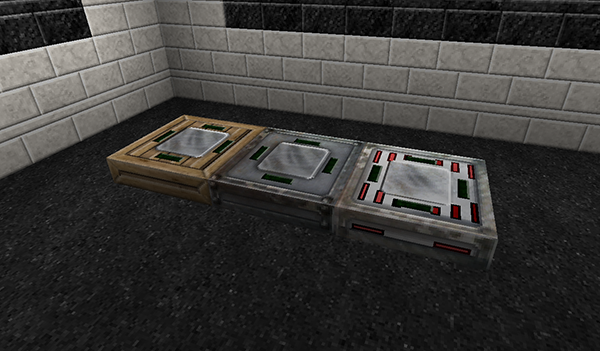
Another round of updates to the pack and this time I've finished up the IC2 Charge Pads Mod. See below for full list of updates.
Updates:
XyCraft
- Block/Plate/Platform/Shield Blocks
Forestry
- Bags
MystCraft
- Lectern
- Placed Book object
Charge Pads
- Charge pads
- Upgrades/Modules
- GUI
Thermal Expansion
- Various Item Textures

Updates:
XyCraft
- Block/Plate/Platform/Shield Blocks
Forestry
- Bags
MystCraft
- Lectern
- Placed Book object
Charge Pads
- Charge pads
- Upgrades/Modules
- GUI
Thermal Expansion
- Various Item Textures
Not bad, not bad at all.. I'll try this out for a while... I absolutely don't like the look of diamonds but hey...
keep up the good work!
Not sure how hard it would be but some higher resolution packs would be awesome although I like the fact that this pack looks good and has good performance ingame (contrary to say sphax which causes a lot of stuttering).
keep up the good work!
Not sure how hard it would be but some higher resolution packs would be awesome although I like the fact that this pack looks good and has good performance ingame (contrary to say sphax which causes a lot of stuttering).
I really like the work you've done here. But I will be honest - the only reason I'm not currently using it is the inventory GUI. The brick-thing texture background is .. eye-crossing. It only seems to show up in main inventory and wooden chests, but it stands out even more as other interfaces don't suffer the same cross-hatched fate.
JS+TR fell victim to this symptom too; epic world textures, abysmal GUIs (in their case, stubbornly insisting that transparency isn't total crap). Since we spend a considerable amount of time in our inventories, crafting grids, and recipe pages ... I beg texture makers to just keep them clean, simple, and easy on the eyes. Your font and stacked-item textures follow this rule well - don't muddy them up with a background pattern. Awesome work otherwise, truly.
JS+TR fell victim to this symptom too; epic world textures, abysmal GUIs (in their case, stubbornly insisting that transparency isn't total crap). Since we spend a considerable amount of time in our inventories, crafting grids, and recipe pages ... I beg texture makers to just keep them clean, simple, and easy on the eyes. Your font and stacked-item textures follow this rule well - don't muddy them up with a background pattern. Awesome work otherwise, truly.
I really like the work you've done here. But I will be honest - the only reason I'm not currently using it is the inventory GUI. The brick-thing texture background is .. eye-crossing. It only seems to show up in main inventory and wooden chests, but it stands out even more as other interfaces don't suffer the same cross-hatched fate.
JS+TR fell victim to this symptom too; epic world textures, abysmal GUIs (in their case, stubbornly insisting that transparency isn't total crap). Since we spend a considerable amount of time in our inventories, crafting grids, and recipe pages ... I beg texture makers to just keep them clean, simple, and easy on the eyes. Your font and stacked-item textures follow this rule well - don't muddy them up with a background pattern. Awesome work otherwise, truly.
I really appreciate this feedback as I've been a bit concerned with the UI's I've started working on. My latest plan was to back track from those UI's and simply keep the standard UI color schemes but just make them a bit smoother and higher definition. Thanks for the feedback and the confirmation of my current plans.