New Launcher design | We need you!

Are you scared of change? (Trollol)

  • Yes

    Votes: 72 11.7%
  • No

    Votes: 546 88.3%

  • Total voters
    618
Status
Not open for further replies.

Someone Else 37

Forum Addict
Feb 10, 2013
1,876
1,440
168
FTBLauncherIdeaPNG.png


Yes, I know the colors will need to be changed, but that's not what I'm going after here.

The News and Options buttons in the green portion of the image will pull up a page similar to what they do in the current launcher, filling the entire screen (including the other tabs and the magenta Login area), except for a "Back" button at the top left.
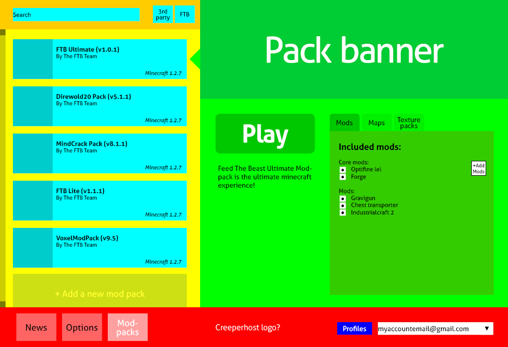
This Options button should probably be renamed Global Options, and will include things like RAM allocation, install directory, Private Packs, and Languages.

The cyan tabs at the top right are specific to each modpack, and fulfil the functions already found in the Launcher.
The Info tab shows the pack logo (as shown), and the pack description. A list of default mods may be included, but may not be necessary.
The Maps tab shows maps available for download for that modpack, i.e. the FTB map for Ultimate, Direwolf20 maps, the currently-existing FTB and FTB Insanity maps for Retro, etc. If Ultimate has all the mods that Direwolf20 has, the Direwolf20 maps should show under Ultimate as well... although Compact / Advanced Solars could be a problem.
The Mods tab shows basically the same screen as the current Edit Modpack screen (i.e. disable mods, locate mods on your computer and add them).
The Texture Packs tab shows texturepacks available for download that are known to work with the current modpack.
I probably should've inserted a Configs tab here, although downloading and swapping out config packs would probably fit within the Options tab.
The Options tab on the far right should probably be renamed Pack Options, and will contain pack-specific things, such as Download Server, Pack Version, Force Update, and Configs.

The red box at the left lists the various modpacks available. Pretty familiar.

The magenta Login box at the bottom right should be pretty self-explanatory, even though I forgot to add in the Login button. Best
put that right under the Remember checkbox.
Whenever you login with the Remember checkbox checked, your username will be shown in the dropdown menu, and clicking on your name in that menu will automatically paste your username and password into the appropriate boxes. If possible, the most recent person to sign in would appear at the top of the list.

Hmm... There should probably be a way to remove a name from the list. Perhaps clicking on one of the names will automatically check the box, and if a player logs in with the box unchecked, their name will automatically be removed from the list?

Am I forgetting anything? Hmm... The Filter Settings thing could be placed below the green box (above the modpacks), or in the Global Options menu.
 

Jammarson02

New Member
Jul 29, 2019
1
0
0
I was wondering if you could add a somewhat vanilla mod pack, just have nei and rays mini maps. I have lots of kids that use my computer to play ( niece's and nephews ) and they have a hard time with all the extra mods.

I have been trying to teach them the game and they do enjoy it but I have to run a seperate launcher ( Mojang's ) for it. I'd rather stick with yours as it is much easier to switch between the packs.

And maybe add a button to increace the font size on the launcher ( I Havent found one if its there ) Us old people ( 40 + years ) may need glasses ! My mom ( 72 ! ) Even plays !
 

Aurilux

New Member
Jul 29, 2019
3
0
0
My submission:

FTB_UI.jpg


My idea is that the modpack is the main focus of the launcher, so it should always be displayed. When the user selects a modpack, the banner at the top will change to one that represents that specific modpack. Also, when the user goes to either the Texture Packs or Maps tap, options that won't work with the selected modpack will be grayed-out but still selectable so that the user can see which modpacks that option is compatible with. Info for the modpack will be displayed at the top of the News Tab.

C:\Users\John Rogers\My Stuff\FTB_UI.jpg
 

SizzleBacon

New Member
Jul 29, 2019
24
0
0
My submission:

View attachment 2476

My idea is that the modpack is the main focus of the launcher, so it should always be displayed. When the user selects a modpack, the banner at the top will change to one that represents that specific modpack. Also, when the user goes to either the Texture Packs or Maps tap, options that won't work with the selected modpack will be grayed-out but still selectable so that the user can see which modpacks that option is compatible with. Info for the modpack will be displayed at the top of the News Tab.

C:\Users\John Rogers\My Stuff\FTB_UI.jpg
Me gusta
 

Voreden

New Member
Jul 29, 2019
1
0
0
I don't understand how the launcher mechanics work, but I tend to think it seams unnecessary have to download all the mods etc each time you change the mod pack version. can this be updated with the new launcher. say im playing single player on one version then switch to another to play on a server does it really need to download on each change? can this be cached on the system, or an option to cache the files. esp for those that have slower internet or when there's problems or overload on the download system.
 

DaemosDaen

New Member
Jul 29, 2019
232
0
0
The current look of the launcher is ok. I personally prefer a more minimalistic approach, so it needs a smaller graphic for the modpacks, and a thinner modpack list with the MC version placed under the modpack name.


I'm more worried about what happens under the hood. It's wasefull to have to download a whole mod pack just to get some new configs, or 1 new/changed mod mods should be in a pool where the needed mods are downloaded individually. Private mod pack makers must upload mods to FTB and be approved based on permissions.
 

Sahin

New Member
Jul 29, 2019
1
0
0
There should be a button to switch between the new and old design for thoose people which dont like the new one (Just my suggestion)
 

Tsun

New Member
Jul 29, 2019
47
0
0
Here's my take, borrowing some ideas from this thread so far.

Note that I'm only suggesting the layout, not the design. Colors and graphics are obviously placeholders.
2tc55mK.png


Red bar is always visible. You select the above content with the buttons (replace text with icons) on bottom left.

Yellow area has the mod packs, and the green area has info about the currently selected pack. Typing on the search bar will show only the mods that include the text in the name.

The green area also has an area where you can customize, add, remove and load the mods/maps/texture packs. Maybe the whole green area has a scrollbar? It could also have buttons for downloading servers and whatever needed. Idk how those work because I've never played multiplayer.
 

paperlord

New Member
Jul 29, 2019
32
0
1
I've been busy, but I was able to get some more work done on this launcher design.
Again a few things changed. But I'll let the pictures speak.
This is how the overal design looks for this proposal, more info and picture inside the spoiler tags.
2cymkk3.png

List View (above)
It's still a tile view, but this time with four buttons peeking from the top: Launch - Info - Extra - Edit.
Launch is quite self-explanatory, double clicking will also launch the game.

Info panel
Hasn't changed much since last time.
But in the mod list, the arrow is indeed the official mod page and the W is indeed the FTB wiki page.
16l0eb9.png

Extra's panel
Now this is a new concept in this design. I removed the separate categories for MAPS and TEXTUREPACKS.
This is a personal preference, since I don't really use either maps or texturepacks. By placing them together with each modpack it's easier for people to see which maps and texturepacks work well together with their chosen pack. Optionally there is also a place where some official SEEDS can be shared.
(I'm not really sure about this change, since the discoverability of new maps maybe isn't optimal. For example, you would have to install FTB retro first to find the official FTB maps.)
(+ I think there also should be a better way to show pictures of the given map, TP or seed.)
2qi05ro.png

Edit Panel
This one is new too, there's a few options available here.
  1. Name. (Put whatever info you like underneath each tile)
  2. Account to launch this pack with. (Default or other, see the accounts category)
  3. Config setting. (Easy, Hard, Extremely Hard, Custom, etc.)
  4. The basic pack selected. (Should be able to be vanilla too and will decide which image each tile uses)
  5. Version of the pack. (With upgrade/downgrade button)
  6. Back-up the whole game folder. (To selected location)
  7. Mods list. (Where each mod can be enabled or disabled + updated by selecting a new version)
    (And the ability to add or delete mods)
  8. Reset Button. (To default settings)
  9. Delete Button. (Will delete the complete tile and gamefolder)
2r5f3g2.png
This a new category to hopefully redirect people to the wiki first before overrunning the forums. ;)
It'll show the server status from the creeperhost repo's and the mojang servers. If a server is down it should show some helpful message.
soyb9l.png
In this category users can manage their accounts and select a default account to use for their modpacks.
The account can be selected per modpack under the edit button.
174fn8.png
I haven't worked on the Settings Category yet. Maybe it's something I'll do later.

EDIT: Am I the only one where the text within the spoilers is completely mashed up?
EDIT2: above edit seems to have fixed it?
 

PhilHibbs

Forum Addict
Trusted User
Jan 15, 2013
3,174
1,128
183
Birmingham, United Kingdom
^
On that note, it would be nice if we could have different versions of a modpack at once.
Agreed. For a while my server was on 5.0.1 but both I and a friend had already updated our SSP worlds to 5.1.1. This was very confusing for my friend, she kept messing things up editing the path and version every time she switched between SSP and SMP. She ended up losing all the waypoints on both her SSP and SMP games and was very angry with me for not just updating the server.
 

Yuka

New Member
Jul 29, 2019
318
0
0

I don't know, green area seems to be wasting a lot of space.
Mainly that giant "Play" button in the middle of everything, which could easily be shrunken and moved to a corner and have the "Mods/ Maps/ Texture Packs" area have more space.

(Plus you're missing a couple of buttons. :p)
Also, would you mind using at least some darker colors next time?
You seem to have chosen an exact combination of the brightest, most eye-burning colors. xD
 

SizzleBacon

New Member
Jul 29, 2019
24
0
0
I've been busy, but I was able to get some more work done on this launcher design.
Again a few things changed. But I'll let the pictures speak.
This is how the overal design looks for this proposal, more info and picture inside the spoiler tags.
2cymkk3.png

List View (above)
It's still a tile view, but this time with four buttons peeking from the top: Launch - Info - Extra - Edit.
Launch is quite self-explanatory, double clicking will also launch the game.

Info panel
Hasn't changed much since last time.
But in the mod list, the arrow is indeed the official mod page and the W is indeed the FTB wiki page.
16l0eb9.png

Extra's panel
Now this is a new concept in this design. I removed the separate categories for MAPS and TEXTUREPACKS.
This is a personal preference, since I don't really use either maps or texturepacks. By placing them together with each modpack it's easier for people to see which maps and texturepacks work well together with their chosen pack. Optionally there is also a place where some official SEEDS can be shared.
(I'm not really sure about this change, since the discoverability of new maps maybe isn't optimal. For example, you would have to install FTB retro first to find the official FTB maps.)
(+ I think there also should be a better way to show pictures of the given map, TP or seed.)
2qi05ro.png

Edit Panel
This one is new too, there's a few options available here.
  1. Name. (Put whatever info you like underneath each tile)
  2. Account to launch this pack with. (Default or other, see the accounts category)
  3. Config setting. (Easy, Hard, Extremely Hard, Custom, etc.)
  4. The basic pack selected. (Should be able to be vanilla too and will decide which image each tile uses)
  5. Version of the pack. (With upgrade/downgrade button)
  6. Back-up the whole game folder. (To selected location)
  7. Mods list. (Where each mod can be enabled or disabled + updated by selecting a new version)
    (And the ability to add or delete mods)
  8. Reset Button. (To default settings)
  9. Delete Button. (Will delete the complete tile and gamefolder)
2r5f3g2.png
This a new category to hopefully redirect people to the wiki first before overrunning the forums. ;)
It'll show the server status from the creeperhost repo's and the mojang servers. If a server is down it should show some helpful message.
soyb9l.png
In this category users can manage their accounts and select a default account to use for their modpacks.
The account can be selected per modpack under the edit button.
174fn8.png
I haven't worked on the Settings Category yet. Maybe it's something I'll do later.

EDIT: Am I the only one where the text within the spoilers is completely mashed up?
EDIT2: above edit seems to have fixed it?

This. Is. Amazing. I would highly suggest doing this one. I would load this up all day ery day.

EDIT: Did you actually program this? Or just design it in photoshop?
 
  • Like
Reactions: CurliNg40

HitLuca

New Member
Jul 29, 2019
14
0
0
I've been busy, but I was able to get some more work done on this launcher design.
Again a few things changed. But I'll let the pictures speak.
This is how the overal design looks for this proposal, more info and picture inside the spoiler tags.
2cymkk3.png

List View (above)
It's still a tile view, but this time with four buttons peeking from the top: Launch - Info - Extra - Edit.
Launch is quite self-explanatory, double clicking will also launch the game.

Info panel
Hasn't changed much since last time.
But in the mod list, the arrow is indeed the official mod page and the W is indeed the FTB wiki page.
16l0eb9.png

Extra's panel
Now this is a new concept in this design. I removed the separate categories for MAPS and TEXTUREPACKS.
This is a personal preference, since I don't really use either maps or texturepacks. By placing them together with each modpack it's easier for people to see which maps and texturepacks work well together with their chosen pack. Optionally there is also a place where some official SEEDS can be shared.
(I'm not really sure about this change, since the discoverability of new maps maybe isn't optimal. For example, you would have to install FTB retro first to find the official FTB maps.)
(+ I think there also should be a better way to show pictures of the given map, TP or seed.)
2qi05ro.png

Edit Panel
This one is new too, there's a few options available here.
  1. Name. (Put whatever info you like underneath each tile)
  2. Account to launch this pack with. (Default or other, see the accounts category)
  3. Config setting. (Easy, Hard, Extremely Hard, Custom, etc.)
  4. The basic pack selected. (Should be able to be vanilla too and will decide which image each tile uses)
  5. Version of the pack. (With upgrade/downgrade button)
  6. Back-up the whole game folder. (To selected location)
  7. Mods list. (Where each mod can be enabled or disabled + updated by selecting a new version)
    (And the ability to add or delete mods)
  8. Reset Button. (To default settings)
  9. Delete Button. (Will delete the complete tile and gamefolder)
2r5f3g2.png
This a new category to hopefully redirect people to the wiki first before overrunning the forums. ;)
It'll show the server status from the creeperhost repo's and the mojang servers. If a server is down it should show some helpful message.
soyb9l.png
In this category users can manage their accounts and select a default account to use for their modpacks.
The account can be selected per modpack under the edit button.
174fn8.png
I haven't worked on the Settings Category yet. Maybe it's something I'll do later.

EDIT: Am I the only one where the text within the spoilers is completely mashed up?
EDIT2: above edit seems to have fixed it?
Yes, this is really awesome, surely my favourite
 

paperlord

New Member
Jul 29, 2019
32
0
1
Thanks for the kind words! :)
And no I didn't program this, it's a mockup created with illustrator, so it has absolutely no functionality.
 

Chinthor

New Member
Jul 29, 2019
25
0
1
Just an idea, in the spirit of "ease of use" and "user friendly." How about a simple interface for injecting custom skins? Or go crazy and include 16x, 32x, or even 64x skin editors. That one would take more doing, but would be a cool integrated feature. Perhaps even have a model standing by as the skin is edited, showing the changes.
 

Rustik

New Member
Jul 29, 2019
6
0
0
i just want to be able to run FTB without having to run a terminal file. (Im on Mac, sadly) I also want to be able to play without constant crashes every 5 minutes. It gets extremely annoying.
there is a simple solution to this problem. open up spotlight and search for the jar bundler and follow the steps to create a "application" that contains the FTB jar file and a logo of your choice!!! PM me with any questions
 

dmrbacon

New Member
Jul 29, 2019
2
0
0
Since there's so many messages and I don't know if this was mentioned in any that I've read, I'll just throw it out there. Make the memory (RAM) allocation a little more customizable. With Vanilla Minecraft you can setup batch files to set the minimum and maximum memory allocations, and some launchers have input boxes for entering that in as well. It makes things easier and possibly better for those who either like to be picky or have to be picky about the memory allocation. The current slider is alright and in most cases adequate, but it's set to predetermined increments that for some it just doesn't work. I know this may seem silly, but not everyone thinks the same, so I thought I'd throw this out there.
 

Charles McCOy

New Member
Jul 29, 2019
1
0
0

Who's for this design of new launcher say I! No really, your work PaperLord with the design is pretty awesome and I hope that it will be used... It's simple, it's clean... just how launchers should look like... Just thumbs up!

Well, when we are talking about new ideas of what should be launcher capable of, it would be pretty awesome to give users an opportunity to create their own modpacks and then share them with the community... Then there will be even more users, cause then there will be even more modded servers which will use their own modpack. Here then comes another things like importing other mods from other sources, or just expand FTB "database" of mods to select from, also there could be some info about which mods can be combined or which ones are needed for running the other one... Then there will be plenty of space to create something new. Same thing about maps and texture packs.

There is one thing I learned from other games - people are extremely creative... If you give them space to show their work and then support to get it workin', you wouldn't believe how many new ideas (and solutions for problems associated with them) will come.

Well, I think I wrote just enough, so sincerely
McCoy
 
Status
Not open for further replies.