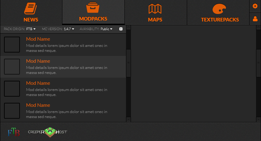
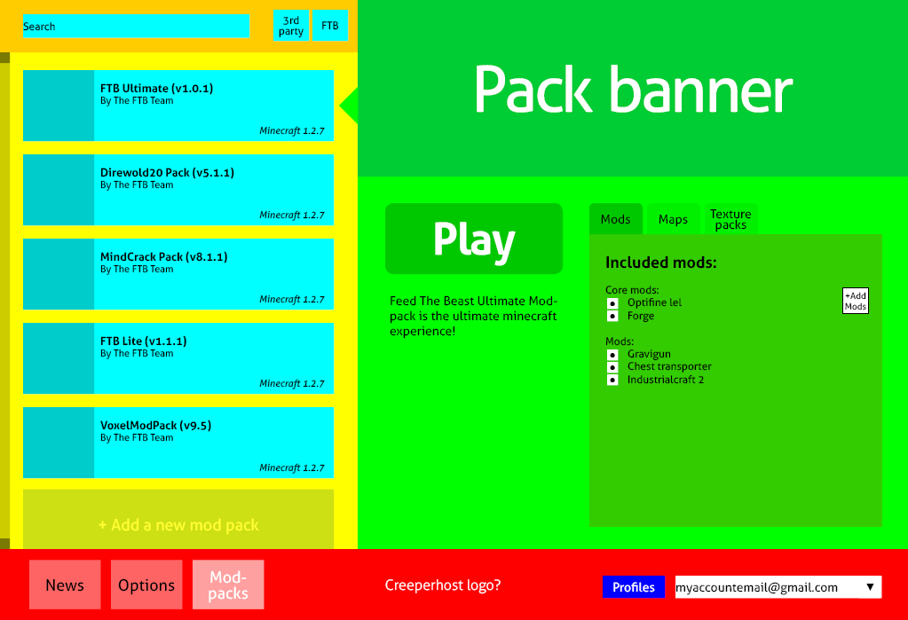
Yeah I kind of agree with the green space actually. It seemed fine with the mod list but it might be too small for maps/etc.I don't know, green area seems to be wasting a lot of space.
Mainly that giant "Play" button in the middle of everything, which could easily be shrunken and moved to a corner and have the "Mods/ Maps/ Texture Packs" area have more space.
(Plus you're missing a couple of buttons.)
Also, would you mind using at least some darker colors next time?
You seem to have chosen an exact combination of the brightest, most eye-burning colors. xD
Well if you read the second sentence, I'm not showing a design. Just the functionality and placement of things. And it's easier to read what I'm going for with the interface if I separate them with colors. I didn't have time to make a finished graphically pretty thing, and there's a very minimal chance it will be used at all. And the ftb team has to remake it anyway.
What buttons am I missing in particular? I know I forgot donate button but other than that I don't see any.

