[16x] Isabella II: FTB Edition

  • The FTB Forum is now read-only, and is here as an archive. To participate in our community discussions, please join our Discord! https://ftb.team/discord

Nilocshot

New Member
Jul 29, 2019
16
0
0
Going to start working on the desat sprite sheet now.

Just to toss an idea out there, some ores will be more shiny than others. Do we care about that? It would'nt effect much, maybe a few lines to represent light reflection, and color choice. Looking at Frederikam's reference sheet in the DropBox, they look to all be a matte finish. Wat do?

Edit:
Added some basics to the reference sheet. Those using photoshop among us (I assume gimp would also have this capabilities but different menus) Just need to set Hue/Sat to colorize and select the proper hue (Degrees, color wheel, I thought I escaped my freshman art class a long time ago). Just need to convert RGB to HSB for photoshop.
 

MrAndrew420

New Member
Jul 29, 2019
119
0
0
I love the idea of the reference sheets. I know I have slipped up quite a few times (Factorization lead using the brick tex as a base instead of ingot. I fixed it in the Thermal Expansion but never went back to factorization because it doesn't generate in world :p)

My only grief with it is the plate texture. Way too much contrast imo, funny shaped, idk it just doesn't "fit" for me (sorry nemo, I know you just did a bunch in GT). The last time I did a gregtech update I changed the way the plates look into a 14x14 machine block texture. They are actually still there I believe which makes for some inconsistency. I honestly just lost my train of thought and have no idea where I'm going with this, but... hmmmmm

Yes, we need to pick a style and stick with it, and this is a great start :]
 

oOKnightmareOo

New Member
Jul 29, 2019
17
0
0
Wow I'm super late, but-

Going to start working on the desat sprite sheet now.

Just to toss an idea out there, some ores will be more shiny than others. Do we care about that? It would'nt effect much, maybe a few lines to represent light reflection, and color choice. Looking at Frederikam's reference sheet in the DropBox, they look to all be a matte finish. Wat do?

Yea, like silver ingots or the whatnot, idk that I feel like is more of a situational thing that the person texturing it will just have to decide. At the very least they could look through the materials list I'm doing and find a material with similar properties or w/e, I think the desat sheet looks really good so far.

My only grief with it is the plate texture. Way too much contrast imo, funny shaped, idk it just doesn't "fit" for me (sorry nemo, I know you just did a bunch in GT). The last time I did a gregtech update I changed the way the plates look into a 14x14 machine block texture. They are actually still there I believe which makes for some inconsistency. I honestly just lost my train of thought and have no idea where I'm going with this, but... hmmmmm

Yea... I mean I like the texture I think it needs some noise and less saturation, I'ma post some screens before I make any edits and you can all see if you like them so far. I'm starting to see how much time this full materials sheet is going to take with gregtech I might make different parts of the same sheet dedicated to just it or something.
 
  • Like
Reactions: Nemo and Nilocshot

MrAndrew420

New Member
Jul 29, 2019
119
0
0
Yea... I mean I like the texture I think it needs some noise and less saturation, I'ma post some screens before I make any edits and you can all see if you like them so far. I'm starting to see how much time this full materials sheet is going to take with gregtech I might make different parts of the same sheet dedicated to just it or something.
OK, here's my problem with it:
8GzMm57.png

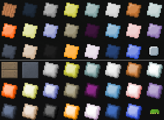
This is a selection of what you see when you type plate into NEI.
Top is Vanilla, bottom is Isabella. They are not the same, but way too similar. (also, Isabella having MORE saturation and contrast than vanilla??)

So this is why I think we should go with the design seen with the silicon plate in the top left corner of the bottom panel, the tinplate design from RP2, or come up with something new.
 

Nemo

New Member
Jul 29, 2019
12
0
0
OK, here's my problem with it:

This is a selection of what you see when you type plate into NEI.
Top is Vanilla, bottom is Isabella. They are not the same, but way too similar. (also, Isabella having MORE saturation and contrast than vanilla??)

So this is why I think we should go with the design seen with the silicon plate in the top left corner of the bottom panel, the tinplate design from RP2, or come up with something new.


Yeah, I totally agree. I tried to stay as low contrast as possible but with most of those plates there was too much of a color range. I always invite any improvements people think could be made to my stuff.
 

oOKnightmareOo

New Member
Jul 29, 2019
17
0
0
Ok, here's my problem with...

Yea I agree, what I mean is I like the shape of the texture or the whatnot. I threw up some sample textures, the top row is the vanilla textures re-schemed, the middle row is the other type of plates, the bottom row is the texture I made and was going to use, how do you all feel about these - compare, opinions, etc.

As a side note the center plate of my row of textures would be the used for shiny metals and these colors probably won't even be used once I attempt my recolor but I'm just throwing some examples out before I do anything.

Stuff.png
 

AlfieSR

New Member
Jul 29, 2019
26
0
0
I like the slightly tilted look, and it also makes it easier to identify at a glance in your inventory - both where the item is, and what it is. I honestly thought the wooden plate texture was a rendering bug the first time I saw it. I do, however, dislike the darkening effect around all the edges. Makes it look like the plate is dented. Leaving a single or double-pixel width shading around the bottom-most edge and leaving the top alone would probably look best, and if you have the tilt angle somewhere between inventory-matching 0 degrees and the default-pack 45-ish degrees, it could even give you some room to put in the little bolts(?) on the texture.

I rather like the bottom row of plates on Knightmare's texture. The flat look is more appealing to me than both the default plate look and the panel look that's being introduced to some textures at the moment.
 

oOKnightmareOo

New Member
Jul 29, 2019
17
0
0
I'm slowly updating all of the material colors, haven't dropboxed the material sheet yes because it's been changing as I've changed the textures of course - how nice would it be if their weren't multiples of the same item
 
  • Like
Reactions: MrAndrew420

AlfieSR

New Member
Jul 29, 2019
26
0
0
Probably not a major detail for anyone, but I'm slightly colour-blind and it's a tad difficult to tell the difference between honey drops and royal jelly at times. Even though it's somewhat the opposite of what Isabella usually is, could I suggest increasing the saturation of royal jelly a bit?
 

ScottKillen

New Member
Jul 29, 2019
69
0
0
NOTE TO CURRENT AND PRESENT CONTRIBUTORS:

All future revisions of the pack will be maintained in the Isabella II: FTB Bitbucket repository. The Bitbucket repository makes it pretty easy to submit new textures, or begin your own branch of the pack. Here is how to get started:

Creating your own version of the pack:
  1. Create an account and log in at Bitbucket.
  2. " Fork" the main repository this makes your own online editable copy of the pack.
  3. Use git to retrieve the repository, using the repo url found on this page. (You can choose between https and ssh urls.) -- You may need to install git software for this.
  4. Make your edits.
Contributing to the pack:
  1. Create your own version of the pack (see above)
  2. Commit your changes using git.
  3. Push your changes to your online bitbucket copy of the pack. (using git software)
  4. From your online bitbucket repository, submit your changes back to the main pack repository by submitting a pull request.
  5. The managers of the main repository will evaluate your submission and then 1) approve it, 2) deny it -or- 3) ask you to revise your changes for reconsideration.
GIT is a powerful tool that is made for social collaboration. You can do all kinds of things like incorporate future changes from the main repo into your own custom fork, incorporate changes from other custom repos into your own and more. I highly encourage interested parties to read bitbucket's extensive documentation to learn more! (-or- you can PM me for help.)
 

Gnomeo

New Member
Jul 29, 2019
134
0
1
Going through tutorials this week in an attempt to wrap my head around the git process.

For contributors, there is a texture unstitcher here on the FTB forums: http://forum.feed-the-beast.com/threads/mod-texture-unstitcher-wip.17460/

I haven't been able to get it to work, but it's supposed to be able to take 1.4.7 texture files and split them into the necessary individual textures for 1.5. Perhaps smarter people can make it work and save a bunch of conversion time.
 
  • Like
Reactions: ScottKillen

Gnomeo

New Member
Jul 29, 2019
134
0
1
If I can help, let me know! ;)

Thanks Scott.

I put in my first pull request (Soul Shards). It's the tiniest of updates (three measly image files I copied from the 1.4.7 version), but I prefer to dip my toe in the water rather than dive into the deep end headfirst. It took me two commits, but I think I got it straightened out.
 

ScottKillen

New Member
Jul 29, 2019
69
0
0
I just saw it! Very nice. I think I will remove the distribution zip from the repository as it doesn't make much sense (if every contributor rebuilds the zip file and checks it in, we will quickly have conflicts.) I think I will move the distribution zip to the downloads area of the repo...and then update it each time there is an official release.

Fredrikam is on vacation and I promised him I would leave edits/additions for him to approve when he returns.
 

hanleybrand

New Member
Jul 29, 2019
13
0
1
I just saw it! Very nice. I think I will remove the distribution zip from the repository as it doesn't make much sense

I forked the repo and have been looking through it - I was going to suggest that it just be a working texture/resource pack folder (unzipped) for each target version of mine craft (1.4.x, 1.5.x, 1.6.x) -- hopefully after 16 the resource pack format will hold steady until at least 2.0. ;)