Then it is no longer personal, and is being distributed, which would require a private modpack code.then give that code to others
New Launcher design | We need you!
- Thread starter Captainnana
- Start date
-
The FTB Forum is now read-only, and is here as an archive. To participate in our community discussions, please join our Discord! https://ftb.team/discord
You are using an out of date browser. It may not display this or other websites correctly.
You should upgrade or use an alternative browser.
You should upgrade or use an alternative browser.
- Status
- Not open for further replies.
In steam, you have a list of recent achievements for a game.
not sure if its possible, but could the launcher pull from the player file the list of achievements completed for that mod pack?
Unlocked 1/50
Most recent : Tree Puncher
Not really that useful, but an aesthetic option.
not sure if its possible, but could the launcher pull from the player file the list of achievements completed for that mod pack?
Unlocked 1/50
Most recent : Tree Puncher
Not really that useful, but an aesthetic option.
Has anyone thought of making a server launcher/wrapper?
there are a few out there with basic ftb support, but none of them really work out of the box. a cross platform wrapper, that makes life for an admin easier, esp with forge essentials support etc.
there are a few out there with basic ftb support, but none of them really work out of the box. a cross platform wrapper, that makes life for an admin easier, esp with forge essentials support etc.
Type in the private pack key and click removePlease add a way to remove custom packs. I'm tired of having and old ultimate pack on my launcher.

A cool mod pack to have would be a creeper mod pack with all the different kind of creeper mods
One of the great things about Minecraft is that if you don't like the look, you can change it. I think that's an idea that should be implemented into the launcher. Keep the same UI at first, but offer the option of using and creating personal skins. That way, everyone can have the launcher designed to their liking. A few good ideas to start you off;
- Industrial- The brushed steel design is rather attractive and easy to make. You can also add metal clips to the sides for some added effect.
- Natural- Dirt covered with grass at the top, trees for the sides
- Miner's dream- DIAMONDS! Lots of diamonds.
- Night at Steve's house. For the background, have an HD inside view of Steve's house, with a torch on the table, an arsonal of swords and pickaxes by the door, Steve hanging off the bed.
- Nether- Build with netherak
- Brony
- Girly
- candy
Okay, now I know this is more than likely stopped being looked at but, i think that we need to get rid of the excess mod packs. I mean there are lots of them. A lot of them aren't really played like the beta pack. Now, some people still play these. So my solution add a delete button to the packs. so you can get them off the launcher and if you ever want them back, there could be a tab for that, with all of them. On a side note, can we please get Icons for all of the packs for some diversity its really bothering me.
Earlier in the thread, I mentioned my want to see a native version of the launcher for the different platforms (I.E, native window and control themes for Windows, Mac OS X, Linux distros, etc.). I've managed to cobble up a simple illustration of what I meant by that. So, since everyone's throwing in their own concepts of what the launcher should look like, I'd like to show mine:

This is how it would look on Windows, using the system's native Windows Classic theme; ignore the purple titlebar, as one of Windows Classic's traits is color customization of the GUI widgets. It's simple enough to operate: The tabs from the top are split into five different buttons. Options would pop up a separate window with the Launcher settings. News/Updates would display past news articles and updates as options in the pack selection window to the left, with the article appearing in the information window to the right; the rest of the screens match up the same way.
The "Edit" button by the account drop-down menu has two options, Edit and Delete. Edit would pop up the account edit window, while Delete would delete the account displayed in the drop-down menu.
Furthermore, Filter Settings and Edit Modpack have been expanded and consolidated as their own dropdown buttons, with two options for Filter Setting: Filter Settings and Default Filter. Filter Settings brings up the Filter Settings window, like before, and Default Filter quickly resets to the default filter display.
Edit Modpack contains the consolidated options of Edit Modpack, Download Server, and Private Packs. Edit Modpack brings up the Edit Modpack window, like before, and Private Packs brings up the password entry window. The dropdown menu for the Modpack Versions is the same as before, only smaller. The Launch button is easy to notice.
Finally, Clicking Site will take you to the FTB main page, and About will display a small window about the Launcher, with links to the FTB main page and CreeperHost's page.
I will be working to make concepts of how the launcher would look on Mac OS X, Windows 8, Windows 7 with the Aero theme enabled, and Linux distros.
Icons used in the launcher are from the Tango Desktop Project, an open-source icon guideline project for Linux distros. A link to the Tango webpage would optionally be included in the About window.
If it hasn't been mentioned already, aesthetic features similar to the new technic launcher are worth considering. They seem to have gone all out and made each pack stand out on its own and makes them all look quite attractive. Attractive in that I want to play them all but I definitely don't have time for that.
An alternative to this would be having unique banners for each pack (like this. To go along with that, a button that will open up a detailed information screen that gives more information about the pack such as it's creators, all the mods that it contains, and maybe some suggested texture packs.
Also, it would be fantastic if it would actually work. I updated my java and now I can't download a single pack. "Error downloading modpack" as soon as it hits 100%. It's really annoying. In fact, I would much rather see a text based launcher with no issue than a pretty launcher that doesn't do anything. That might just be me though.
Finally, it would be really nice to see more packs use the HD Minecraft Skins mod. It's SMP compatible and super awesome but gets very little love.
U should add a refresh button on the modpack, maps and texturepacks pages; because i keep getting connexion problems and whenever i try to launch FTB during one of these glitches, nothing shows up and i have to re-launch the entire modpack to get the texture i want... real obnoxious problems.
I want THIS one, perhaps you guys could set up a proper competition like the logo to design a new oneI've been busy, but I was able to get some more work done on this launcher design.
Again a few things changed. But I'll let the pictures speak.
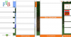
This is how the overal design looks for this proposal, more info and picture inside the spoiler tags.

List View (above)
It's still a tile view, but this time with four buttons peeking from the top: Launch - Info - Extra - Edit.
Launch is quite self-explanatory, double clicking will also launch the game.
Info panel
Hasn't changed much since last time.
But in the mod list, the arrow is indeed the official mod page and the W is indeed the FTB wiki page.

Extra's panel
Now this is a new concept in this design. I removed the separate categories for MAPS and TEXTUREPACKS.
This is a personal preference, since I don't really use either maps or texturepacks. By placing them together with each modpack it's easier for people to see which maps and texturepacks work well together with their chosen pack. Optionally there is also a place where some official SEEDS can be shared.
(I'm not really sure about this change, since the discoverability of new maps maybe isn't optimal. For example, you would have to install FTB retro first to find the official FTB maps.)
(+ I think there also should be a better way to show pictures of the given map, TP or seed.)

Edit Panel
This one is new too, there's a few options available here.
- Name. (Put whatever info you like underneath each tile)
- Account to launch this pack with. (Default or other, see the accounts category)
- Config setting. (Easy, Hard, Extremely Hard, Custom, etc.)
- The basic pack selected. (Should be able to be vanilla too and will decide which image each tile uses)
- Version of the pack. (With upgrade/downgrade button)
- Back-up the whole game folder. (To selected location)
- Mods list. (Where each mod can be enabled or disabled + updated by selecting a new version)
(And the ability to add or delete mods)- Reset Button. (To default settings)
- Delete Button. (Will delete the complete tile and gamefolder)
 This a new category to hopefully redirect people to the wiki first before overrunning the forums.
It'll show the server status from the creeperhost repo's and the mojang servers. If a server is down it should show some helpful message.
 I haven't worked on the Settings Category yet. Maybe it's something I'll do later.In this category users can manage their accounts and select a default account to use for their modpacks.
The account can be selected per modpack under the edit button.

EDIT: Am I the only one where the text within the spoilers is completely mashed up?
EDIT2: above edit seems to have fixed it?
snip
This one is the best one here.
If you changed to this one i would never complane about it.
The top buttons are better than the hover buttons, but now they're super tiny hard-to-click buttons and they have no room for text labels. I also don't like the idea of having so much stuff stuck in flimsy tooltip-looking windows that will probably vanish if the window loses focus.
The only fix I can think of (other than discarding the tablet PC gigantic icons which I would prefer
 ) is just removing the different buttons altogether: when you click on an icon it causes a sidebar to slide into view which contains tabs for each of those buttons. When the sidebar appears the icons get reduced to half size so they still fit comfortably in the reduced area.
Side note: what happens when there are more than 6 mod packs? Despite the huge area dedicated to the mod list alone, the user will still have to scroll to see them all?
The top buttons are better than the hover buttons, but now they're super tiny hard-to-click buttons and they have no room for text labels. I also don't like the idea of having so much stuff stuck in flimsy tooltip-looking windows that will probably vanish if the window loses focus.
The only fix I can think of (other than discarding the tablet PC gigantic icons which I would prefer
Side note: what happens when there are more than 6 mod packs? Despite the huge area dedicated to the mod list alone, the user will still have to scroll to see them all?
It seems like a lot of people are praising this proposal just because it looks pretty. If this design in its present state actually gets chosen I will be disappointed in the FTB team.
Is it really that hard to click a button ... , Also a side arrow on the bottom to scroll through pages would be fine, TBH the whole point of this makeover is to make it LOOK good, its really not hard to press a button & i personally didnt have a problem with the scroll over original one. Just my opinion of course
The top buttons are better than the hover buttons, but now they're super tiny hard-to-click buttons and they have no room for text labels. I also don't like the idea of having so much stuff stuck in flimsy tooltip-looking windows that will probably vanish if the window loses focus.
The only fix I can think of (other than discarding the tablet PC gigantic icons which I would prefer
Side note: what happens when there are more than 6 mod packs? Despite the huge area dedicated to the mod list alone, the user will still have to scroll to see them all?
It seems like a lot of people are praising this proposal just because it looks pretty. If this design in its present state actually gets chosen I will be disappointed in the FTB team.
There's some valid points in here, tiny buttons could be indeed a problem for some people.
I'm glad you're thinking this a bit more through, but some problems have been solved before.
- These tooltip-like windows are in fact separate windows, their position is locked to their parent window. So even if the parent window loses focus, the tooltip will remain in place. (This is just a basic UI-element in Mac OS X, nothing too fancy)
- Apart from the modpacks list being scrollable, the window is resizable (I did mention this somewhere), so if you have more modpacks installed, you can just make a bigger area. Plus, the size and spacing of the tiles is absolutely not verified as the best, just a mockup of how things could be. Optionally, if there's demand for a feature like this, people could resize the tiles to their own needs.
The solution you're proposing might work, but I'm not a big fan of having three columns. I know this layout is well implemented in some cases, but I don't think it's optimal here. This is just a personal opinion, so if you wish you can always try to persuade me.
")
If you've got any other questions, I'll gladly answer them if I'm able to.
To everyone else, keep coming up with more ideas, I've seen some different but nonetheless good ideas around.
Edit: I see some people who say this design should be chosen, thanks for liking it, but I don't it should be 'chosen'. I'd be glad if some ideas and elements would be implemented, not if it would be copied completely. But I'm assuming the point of this thread is to get the best ideas and mix them together, not to take the best idea and copy it.
Honestly, I thoroughly enjoy the streamlined look. I agree with Yuka about being able to maximize or minimize the launcher screen. Also, if you could include the little loading screen(the one that pops up when opening the launcher and informs you of what is being downloaded, etc) as a separate tab in the launcher itself, it would serve to clear up screen clutter. You could also possibly include, as motokaieracer suggested, a scenic view of the modpack. I also agree with acc1dent with the store idea
- Status
- Not open for further replies.