New Buildcraft Textures...

Do you like the new Buildcraft textures?

  • No! Bring the old ones back!

    Votes: 7 22.6%
  • Yes! They look good.

    Votes: 22 71.0%
  • Maybe...

    Votes: 2 6.5%

  • Total voters
    31

Wolfie_Waffle

New Member
Jul 29, 2019
45
0
0
The new Buildcraft (I think it is 7) has new textures. Some of them, like the quarry, look like they're from the new IC2, while some of them look like they were made with the bucket fill tool in MSPaint. Personally, I would like them to be changed back or have a config option to change them back (no offense, whoever made them).

What do other people think?
 

asiekierka

Over-Achiever
Mod Developer
Dec 24, 2013
555
1,086
213
BuildCraft has needed a unified visual language for a long time. Every mod has had a trademark style - IC2 had its own (but they changed it in Experimental to 32x weirdness), TE has its own, Ender IO has its own, etc. But BC was all over the place, with textures often made by different people without much thought as to how well they fit with others. Some of them looked good, some of them were terrible, but they always were sub-par compared to other mods' texturing.

That's why CyanideX and I set out to create new BC textures. After rejecting the original idea from early 2014 based on the Unity resource pack, we tried to create something which would still feel BC while having a unified look. The IC2-esque look is actually based on the look of the Quarry, Pump and Mining Well - the three most iconic textures of BC, bar the pipes, and we decided to go in this direction.

No config option will be added for multiple reasons:

1) Most of the hate comes from inertia. People are used to the old textures and don't want drastic changes. That's fine, but we can't support habit if we want to change things in the long run.
2) The amount of people who want the old textures is disproportionate to the amount of work involved to put them back - and even then some incompatibilities will persist, as we changed the texture layout and other things. And no, I don't just take these forums into account.
3) BC is getting many new blocks and items which simply won't have old textures period. We can't fix that either.

EDIT: The best part is that everyone only talks about the machines. Pipes, gates, robot stations, laser tables, lasers, etc. all changed. Even the pipe plugs. We got new status LEDs and animations on the machines. New models to laser tables! All the items were retextured. We got tweaks and improvements to GUIs. The only textures that DIDN'T change yet is the robots themselves (and gate trigger/action icons, but that's a TODO for me), but they will undergo changes soon.
 
Last edited:

CyanideX

New Member
Jul 29, 2019
140
0
1
Considering the fact that all the textures I made used my base template, how is it possible that some of them happen to look like they were done in MS paint? Would you care to share which ones you are referring to?

They are also 16x, IC2 is 32x. Are you saying they look the same simply because of the color scheme? I would hope so, seeing how none of the other elements even slightly resemble IC2 machines.

Now, I'm not taking offense to your opinion. I know not everyone likes the new textures and that's fine... but you don't offer much constructive criticism here; just a vote and an insult.
 

asiekierka

Over-Achiever
Mod Developer
Dec 24, 2013
555
1,086
213
Alright. I decided to give it an honest look.

L77jqWT.png


The main similarities I notice are the color scheme (they're both white! and they both have dark gray/black elements! however, the "BC" white is slightly warmer) and the fact we also have light "screw" dots on the corners of a machine's face. Beyond that, however, it's all different.

Anyhow, that's what I think. Go make your own conclusions.
 

[daniel]

New Member
Jul 29, 2019
1
0
0
Personally, I would like them to be changed back or have a config option to change them back

Correct me if I'm wrong, but isn't there a config option already to change them back:
  1. Extract textures from old version of BC.
  2. Create new resource pack with old textures (lot's of copy&paste).
  3. Choose this new resource pack to be used in your client.
 

immibis

New Member
Jul 29, 2019
884
0
0
Alright. I decided to give it an honest look.

L77jqWT.png


The main similarities I notice are the color scheme (they're both white! and they both have dark gray/black elements! however, the "BC" white is slightly warmer) and the fact we also have light "screw" dots on the corners of a machine's face. Beyond that, however, it's all different.

Anyhow, that's what I think. Go make your own conclusions.

If I didn't already know the answer already, I'd think the left 7 blocks on the top row, and the left 5 blocks on the bottom row, and the rightmost block on each row, were all from the same mod.

I think that's because:
  • They're all based on shades of white. Although, they were before, as you said.
  • They all have grey borders around the edges, and grey screw holes.
  • Their faces are all populated with arbitrary shapes that tell me nothing about their function (except for the furnace, and the crafting table tops, and is that green thing a computer screen?). I suppose having arbitrary shapes is unavoidable in any mod.
  • They all tend to have (but don't always have) grey outlines around the arbitrary shapes.
  • They're almost all monochrome.

Buildcraft's previous machine style had plain white backgrounds, with some noise, and with fewer details. (Just enough to make it not be a white cube). Still with arbitrary shapes, but more colours - basically a few large colourful details, instead of many small unsaturated details. That might be the difference.
 
Last edited:

lenscas

Over-Achiever
Jul 31, 2013
2,015
1,799
248
If I didn't already know the answer already, I'd think the left 7 blocks on the top row, and the left 5 blocks on the bottom row, and the rightmost block on each row, were all from the same mod.

I agree but I don't care at all about it as I use ic2 and buildcraft together anyway.
 

asiekierka

Over-Achiever
Mod Developer
Dec 24, 2013
555
1,086
213
I think that's because:
  • They're all based on shades of white. Although, they were before, as you said.
  • They all have grey borders around the edges, and grey screw holes.
  • Their faces are all populated with arbitrary shapes that tell me nothing about their function (except for the furnace, and the crafting table tops, and is that green thing a computer screen?). I suppose having arbitrary shapes is unavoidable in any mod.
  • They all tend to have (but don't always have) grey outlines around the arbitrary shapes.
  • They're almost all monochrome.

Buildcraft's previous machine style had plain white backgrounds, with some noise, and with fewer details. (Just enough to make it not be a white cube). Still with arbitrary shapes, but more colours - basically a few large colourful details, instead of many small unsaturated details. That might be the difference.

Actually, neptunepink agrees that the grey borders and screw holes are the primary similarity. The other things are either what used to be there, what is unavoidable, what is my personal taste or what is simply good design decisions.

More colours is probably it. I'll look into it.
 

al3xthegre4t

New Member
Jul 29, 2019
62
0
0
I've been making BC7 style textures for the mod BuildCraft Additions recently, and i can safely say it's a little more than just a fill bucket in MSPaint. There is a lot of hidden depth in these blocks, especially around the checkerboard patterns you might be able to see (CyanideX's base template shows is a lot more involved than you might think). And although they are lower resolution than IC2's textures, i feel there is a lot more detail in the block faces. There's something quite nice about adding so much detail into so few pixels.
 

epidemia78

New Member
Jul 29, 2019
1,810
-4
0
Yeah the new ones do look like IC2...and washed out as if low contrast...the old ones were pretty awful though. When I think buildcraft, the color scheme that comes to mind is mainly the orange you see in real life construction projects. On the vehicles, on the hard hats etc...
 

Wolfie_Waffle

New Member
Jul 29, 2019
45
0
0
BuildCraft has needed a unified visual language for a long time. Every mod has had a trademark style - IC2 had its own (but they changed it in Experimental to 32x weirdness), TE has its own, Ender IO has its own, etc. But BC was all over the place, with textures often made by different people without much thought as to how well they fit with others. Some of them looked good, some of them were terrible, but they always were sub-par compared to other mods' texturing.

That's why CyanideX and I set out to create new BC textures. After rejecting the original idea from early 2014 based on the Unity resource pack, we tried to create something which would still feel BC while having a unified look. The IC2-esque look is actually based on the look of the Quarry, Pump and Mining Well - the three most iconic textures of BC, bar the pipes, and we decided to go in this direction.

No config option will be added for multiple reasons:

1) Most of the hate comes from inertia. People are used to the old textures and don't want drastic changes. That's fine, but we can't support habit if we want to change things in the long run.
2) The amount of people who want the old textures is disproportionate to the amount of work involved to put them back - and even then some incompatibilities will persist, as we changed the texture layout and other things. And no, I don't just take these forums into account.
3) BC is getting many new blocks and items which simply won't have old textures period. We can't fix that either.

EDIT: The best part is that everyone only talks about the machines. Pipes, gates, robot stations, laser tables, lasers, etc. all changed. Even the pipe plugs. We got new status LEDs and animations on the machines. New models to laser tables! All the items were retextured. We got tweaks and improvements to GUIs. The only textures that DIDN'T change yet is the robots themselves (and gate trigger/action icons, but that's a TODO for me), but they will undergo changes soon.

Yeah, I thought about the problems with using different textures like that, and I didn't expect a change. I do agree that it didn't have much of a unified style, so it's good that you tried to fix that. But after that comparison, I think that it looks really similar to IC2.

I agree with the inertia thing, and I think I also fall somewhat into that trap. I don't like huge retextures, usually, unless they improve the overall mod. For example, I personally think that Blood Magic could use some retextures, but I liked most of the old BC ones better than most of the new ones.

Considering the fact that all the textures I made used my base template, how is it possible that some of them happen to look like they were done in MS paint? Would you care to share which ones you are referring to?

They are also 16x, IC2 is 32x. Are you saying they look the same simply because of the color scheme? I would hope so, seeing how none of the other elements even slightly resemble IC2 machines.

Now, I'm not taking offense to your opinion. I know not everyone likes the new textures and that's fine... but you don't offer much constructive criticism here; just a vote and an insult.

Yeah, I agree that I was kind of mean, sorry. I didn't mean to insult anyone, but they DO look a lot like the IC2 machines. I actually like the quarry and pump textures, they look very computer-y and modern. But overall, there are more textures that I feel were not as good as the old ones than ones that I feel were improved.

As for which ones look like MSPaint, I was mainly talking about the lasers and autocrafting tables. I think they just don't have enough depth to them, like they have an outline that is filled in with a noise filter. The pump is slightly similar, but I think that that texture is successful, because there is enough contrast and variety that the machine looks real. There are no big open spaces with little variety besides noise, like with the laser. Or the redstone chipset textures, which have a lot of shading and detail, compared to the old ones which had little depth.

Overall, I realize I should have provided some actual constructive criticism. So my advice would to be do add more detail to some of the textures, making them more 3d-looking. Some of the textures don't seem to have a "texture" - if you put them in greyscale, it would be hard to tell what material they are made of. Something to distinguish from IC2 would also be good, but I think it's more important to make the blocks look more believable.

P.S: It's mostly the block textures that I'm opposed to - the items are fine, they look detailed and not flat. I think the block textures should fit in more with the items.
 

CyanideX

New Member
Jul 29, 2019
140
0
1
As for which ones look like MSPaint, I was mainly talking about the lasers and autocrafting tables. I think they just don't have enough depth to them, like they have an outline that is filled in with a noise filter. The pump is slightly similar, but I think that that texture is successful, because there is enough contrast and variety that the machine looks real. There are no big open spaces with little variety besides noise, like with the laser. Or the redstone chipset textures, which have a lot of shading and detail, compared to the old ones which had little depth. Overall, I realize I should have provided some actual constructive criticism. So my advice would to be do add more detail to some of the textures, making them more 3d-looking. Some of the textures don't seem to have a "texture" - if you put them in greyscale, it would be hard to tell what material they are made of.

My base template is identical for each block; this includes contrast variation, pattern, and placement of visual elements. To say one has more depth than the other would be incorrect but most likely a result of the coloring and block shapes (model). If you were to take a screenshot, make it grey scale, and look at each of the textures you would find that aside from the brightness of some blocks, they would each contain the same visual style.

The models, unfortunately, lack design elements on the outer faces which is most likely the primary reason for the differences in their aesthetics. I tried to compensate by adding depth through the shapes. Perhaps I failed. Perhaps it would be better to stick with basic half-slab shapes and rely on textures for detail.

I understand what you're saying when you stated that they "don't seem to have a texture". This was the design style we went with; the blocks wouldn't resemble the material textures they were built with which would, A, allow the mod to fit within any resource pack without being tied to the material textures and, B, create a very consistent design style across the entire mod. It isn't uncommon to have textures that don't resemble the recipe materials. Take vanilla for example; the cauldron certainly doesn't match iron, nor does the chest match the wood texture. I tried to find a balance.

If you'd like to see the Essence photoshop template, you can download it on the repo. You can get an idea of how my design process works from the ground up. The similarities between BC and IC2 were unintentional.
 

Wolfie_Waffle

New Member
Jul 29, 2019
45
0
0
My base template is identical for each block; this includes contrast variation, pattern, and placement of visual elements. To say one has more depth than the other would be incorrect but most likely a result of the coloring and block shapes (model). If you were to take a screenshot, make it grey scale, and look at each of the textures you would find that aside from the brightness of some blocks, they would each contain the same visual style.

The models, unfortunately, lack design elements on the outer faces which is most likely the primary reason for the differences in their aesthetics. I tried to compensate by adding depth through the shapes. Perhaps I failed. Perhaps it would be better to stick with basic half-slab shapes and rely on textures for detail.

I understand what you're saying when you stated that they "don't seem to have a texture". This was the design style we went with; the blocks wouldn't resemble the material textures they were built with which would, A, allow the mod to fit within any resource pack without being tied to the material textures and, B, create a very consistent design style across the entire mod. It isn't uncommon to have textures that don't resemble the recipe materials. Take vanilla for example; the cauldron certainly doesn't match iron, nor does the chest match the wood texture. I tried to find a balance.

If you'd like to see the Essence photoshop template, you can download it on the repo. You can get an idea of how my design process works from the ground up. The similarities between BC and IC2 were unintentional.

The reason I thought some textures more had depth is because they look more 3D somehow. The screen on the pump seems to curve outward a bit, and the redstone chipset seems to have a sort of bump in the middle. There are small dark area that give the impression of shadows in some areas, giving the illusion of depth.

As for the 3d model on the assembly table and other tables, I can see them now. I think they could be kept, and could improve the the overall look. But the reason I liked the old laser textures so much was that it looked like it was made of obsidian, and the laser part looked like some sort of crystal, as it had a sort of "glare" on it that made it more interesting.

As for the materials/texture thing, I didn't necessarily mean "looks like it's make of it's crafting ingredients." The cauldron doesn't look like iron ingots, and the chest doesn't look like wood planks, but the cauldron looks like it's made of metal and the chest looks like it's made of wood. I understand that you would want to make fit in with texture packs, but I think that it would still be possible to do that without making them look like they have no material. I think that any material texture is better than having a "generic" material that's not made of anything. But I guess that's just my opinion.

After reconsideration (and after the shock of all the textures changing :p
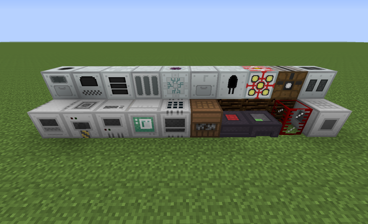
) I think that the overall style is better than the original Buildcraft, but that some of the individual elements could be improved, like the "generic material fuzz" and the non-laser-ness of the laser.
 

Golrith

Over-Achiever
Trusted User
Nov 11, 2012
3,834
2,137
248
One thing I notice looking at asie's screeshot is take the bottom left 4-5 machines. The edging grey has no variation, so when placed next to each other, they blend. There's no clear indication they are separate blocks.
Compared with the top row, the left 4-5 machines (are those IC2? Haven't used in years!) have different shadings of grey, and I think, looking closely, there's a slight gradient map. Applying a gradient map to that edging grey border would help.
The other thing I feel is more contrast. I always feel the CyanidX texture style lacks enough contrast, which gives the impression of being bland/less colourful. Not much, just a bit of an increase.

Just tested in photoshop, I applied a 25% overlay gradient (white top left, black bottom right) to the 167,167,167 grey edge, and added +5 contrast to base texture. Looked better (mining well front used as a test)
 

CyanideX

New Member
Jul 29, 2019
140
0
1
One thing I notice looking at asie's screeshot is take the bottom left 4-5 machines. The edging grey has no variation, so when placed next to each other, they blend. There's no clear indication they are separate blocks.

I honestly didn't even think about that... that is a huge oversight on my part! :S

As for the gradients, that is something I typically do with my Unity textures but I wanted to try something different with these.
 

asiekierka

Over-Achiever
Mod Developer
Dec 24, 2013
555
1,086
213
I honestly didn't even think about that... that is a huge oversight on my part! :S

As for the gradients, that is something I typically do with my Unity textures but I wanted to try something different with these.

I like the lack of gradients, but I am a man of soft, pastel colouring.

About "the edging grey has no variation" - if we just add different colours to different machines like IC2 does, I believe it would look far, far worse.
 

Zandorum

New Member
Jul 29, 2019
315
-3
0
I like the textures but... can we get a config option to toggle between the textures? It feels wrong to change them. I also like the Engines of the Old one significantly more.
 

thephoenixlodge

New Member
Jul 29, 2019
1,388
0
0
I like the lack of gradients, but I am a man of soft, pastel colouring.

About "the edging grey has no variation" - if we just add different colours to different machines like IC2 does, I believe it would look far, far worse.
I think what they were meaning is have slight differences in shading of the edging gray, so you can easier distinguish where one block ends and another begins, rather than having an amourphously thicker border between the blocks.
 
  • Like
Reactions: RedBoss

Wolfie_Waffle

New Member
Jul 29, 2019
45
0
0
I like the textures but... can we get a config option to toggle between the textures? It feels wrong to change them. I also like the Engines of the Old one significantly more.

I agree that I like the old engines better. For me, here is a general breakdown:

Lasers, tables, auto crafting table, engines: worse than before
Nearly all items, most machines, maybe landmarks if they had a *bit* more saturation: better than before

At least that's my opinion. I think the gradient might look cool, and I also agree with the borders.
 
  • Like
Reactions: RedBoss