Forum update 7/11/13
- Thread starter Captainnana
- Start date
-
The FTB Forum is now read-only, and is here as an archive. To participate in our community discussions, please join our Discord! https://ftb.team/discord
You are using an out of date browser. It may not display this or other websites correctly.
You should upgrade or use an alternative browser.
You should upgrade or use an alternative browser.
Not so much scary as painful. I guess you're not prone to headaches, huh.Everything's different and scaaaaaaaaary!
7/11/13. I thought this outdated for a minute, because it's 11/7/13 in my date writing style

No no, sugarcube. this thread did it the right way.
Actually I was just following internet protocol of; "Things have changed so I immediately hate it."Not so much scary as painful. I guess you're not prone to headaches, huh.
That said, I followed this guy's advice.

I ended up inverting my screens colors as a temp fix lol
I found a wonderful add-on for Mozilla that does exactly this. Incidentally, the forum theme looks great inverted.
Not a perfect solution but I'm using Blank Your Monitor + Easy Reading for Firefox.
From this

To this at the click of a button,

You can also specify what background colour is used and also the colours used for links.
From this

To this at the click of a button,

You can also specify what background colour is used and also the colours used for links.
No, no it did not: http://xkcd.com/1179/No no, sugarcube. this thread did it the right way.
And if you don't trust xkcd, http://www.iso.org/iso/home/standards/iso8601.htm
Not a perfect solution but I'm using Blank Your Monitor + Easy Reading for Firefox.
From this
To this at the click of a button,
You can also specify what background colour is used and also the colours used for links.
holy bookmarks batman

Bright colors notwithstanding, I'm finding a few things to be too small for ease of use or reading. Primarily, the font used in the various buttons feels too small by one or two points, and the page buttons underneath thread titles are much too small.
Personally, I think that the forum would benefit from an option to alternately darken table entries. I find the dashed line that currently separate posts easily overlooked and it doesn't contribute to a pleasing eye-flow. I don't think it should be the default option though, because a lot of people find the alternating color bars to be distracting.
Personally, I think that the forum would benefit from an option to alternately darken table entries. I find the dashed line that currently separate posts easily overlooked and it doesn't contribute to a pleasing eye-flow. I don't think it should be the default option though, because a lot of people find the alternating color bars to be distracting.
I've just had a check on the old theme and its actually not that different: http://i.imgur.com/6sw7yDm.png I believe the difference is the forum now fills peoples whole screens due to the responsive design and therefore more of the screen is white. The outer area is offwhite on this theme whereas it was dark grey on the old one but the content area which I assume is the area people are saying is too bright was actually the same
http://i.imgur.com/6sw7yDm.png
Actually, the only reason why it's painful is because there aren't any "relief" areas on the screen to look at, besides the top of the screen and the bottom. On a 1920x1080, everything is white, where previously only 90% of the screen was white and the bars on the side were easily distinguishable and somewhat eye-pleasing in terms of contrast to the content area in the middle.
Honestly, though, I could get used to this.
And the fact that salmon is great to eat but not great to use as a background for anything.Actually, the only reason why it's painful is because there aren't any "relief" areas on the screen to look at
 [DOUBLEPOST=1383926052][/DOUBLEPOST]
Yup.even a bright theme would be better off with a light gray tone.
I'm back guys, I'll start reading through all the posts from last night and making changes again now
Because everyone writes dates like that. Even the 'Muricans.No, no it did not: http://xkcd.com/1179/
And if you don't trust xkcd, http://www.iso.org/iso/home/standards/iso8601.htm
Whatever, I still call it the right way for us non-conforming normal people.
Welp, the fun was sufficiently sucked out of that joke. Time for me to fade back to Thaumcraft where I belong.
Honestly, after having spent most of my youth and young adulthood on the internet, I think that white on dark grey should be the default colour scheme for everything. Head over to the Elder Scrolls forum for a design that works well, although it may be abit oversimplified (having an accent colour, like orange in our case, makes things nicer).
Well, I for example have nothing against good bright themes. However after this change I spent 20 minutes searching for an option to change it back or to any other theme. Now I can only use this forums when I manually decrease brightness on monitor. Theme can be bright as long as it doesn't make my eyes bleed. I'm sorry for harsh critique, but for me it is completely unusable.
This is much better. Though, there are definitely still going to be people who have an issue with the brightness of the content area.
The content area is the same as with the old theme but I'll look into a slightly darker oneThis is much better. Though, there are definitely still going to be people who have an issue with the brightness of the content area.
EDIT: Ok I made it a little darker again hows that?
Theme changes made, I didn't do the other changes yet.Just noticed: I can't see Member Since or location in the users name area to the left anymore.
I liked that feature too.
So comprehensive list time.
Features that have been changed/removed that I'd like to see return:
Join date
Location
FTB Forum button (top large one) navigates to the forum list, not the front/main/news page
Theme changes I'd like to see:
Darker theme or darker theme option
I liked the color choice on the old theme (dark grey, orange highlight) It was much easier on the eyes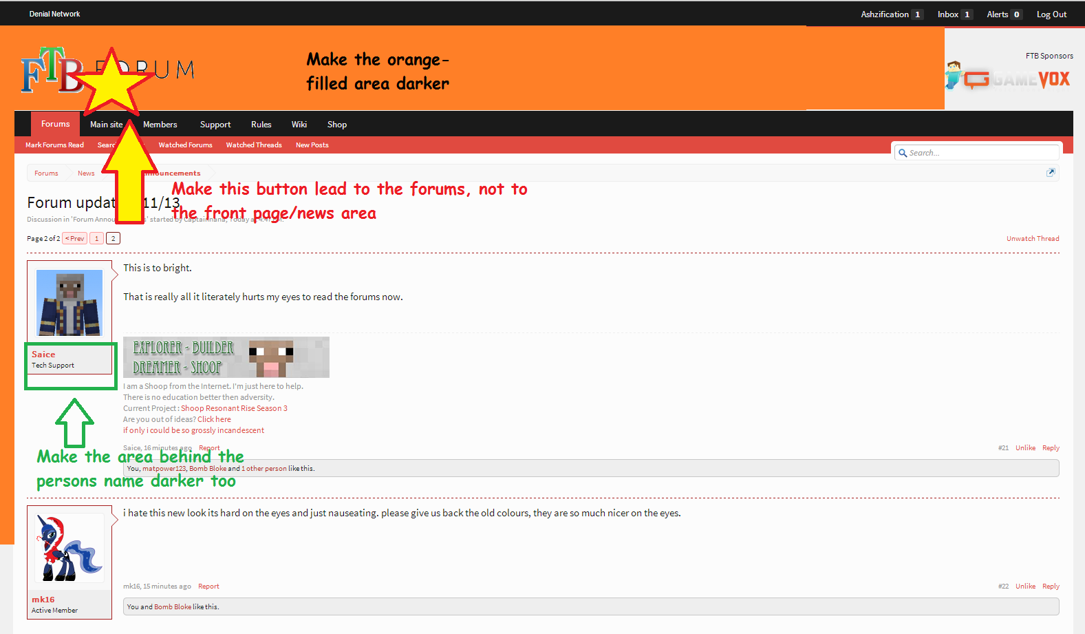
From my android 4, viewing on Chrome,
It looks good, but I would still prefer the ability to use a darker theme.
I really like the changes Eyamaz made in "MS" Paint, much better than my MS paint work
I think I'll just use unix timestamp next time :3No, no it did not: http://xkcd.com/1179/
And if you don't trust xkcd, http://www.iso.org/iso/home/standards/iso8601.htm
And finally to anyone that is asking for the dark theme, the dark theme will not be here until I get this one sorted, I don't want to have to make all my changes twise when I'm making so many right now, saying that this theme is to bright does not help me, please if you want to say something give ways to fix the problem otherwise it just slows everything down. To those asking for the old theme back while I could go and restyle the forums to use the old theme on the new xenforo version this is not something I plan to do because I would then have to maintain multiple totally different themes which will slow down updates we have to make to the forums and new features.
This is atrocious. Did you even setup a beta site so ppl could look at it first and give opinions.. like this theme is horrible.
Your link to this http://i.imgur.com/6sw7yDm.png tells us you can re-enable the old theme. Please please give it back.
If you can't tell the difference in the white / salmon balance, and the greyer blacks, you may need a new monitor. You need more contrast.
Suggestion? Make the white more white, it's more pink. And put more red in the highlighted areas. This salmon/orange/pink is horrible.
Last edited:
We had a feedback thread before it was updated and people said they wanted a dark theme which will happen after we are happy with this one, I don't want to maintain changes on two until we're happy with this one. The old theme is broken and would require me to start from scratch to make it work due to the new responsive design.This is atrocious. Did you even setup a beta site so ppl could look at it first and give opionions.. like this theme is horrible.
Your link to this http://i.imgur.com/6sw7yDm.png tells us you can re-enable the old theme. Please please give it back.
If you can't tell the difference in the white / salmon balance, and the greyer blacks, you may need a new monitor. You need more contrast.
Suggestion? Make the white more white, it's more pink. And put more red in the highlighted areas. This salmon/orange/pink is horrible.
What exactly do you mean here, are you talking about the quote areas if you can't explain then take a screenshot so I can tell which part you are talking about.Suggestion? Make the white more white, it's more pink. And put more red in the highlighted areas. This salmon/orange/pink is horrible.
I also find it funny that people are asking for exact opposites, some people say there is too much red, others say there is not enough :3
Basically we had a discussion during the development of the new website (not this one, the www site), I had kept the orange color scheme we had there, slowpoke said that he didn't like the orange and would like to change the color scheme for everything. The launcher, website, forums, this is the color that was selectedWhy do we want a pink/red theme anyway? Orange was great