Forum update 7/11/13
- Thread starter Captainnana
- Start date
-
The FTB Forum is now read-only, and is here as an archive. To participate in our community discussions, please join our Discord! https://ftb.team/discord
You are using an out of date browser. It may not display this or other websites correctly.
You should upgrade or use an alternative browser.
You should upgrade or use an alternative browser.

how can we get the old theme back? Or set our own colors?
This is obnoxious ....
My 12yr old niece might like the new look. I dont.
Too much white, and too high of a contrast. If you must change the border colors - consider changing them to black, or dark/grey but not this pink/red schtuff.
This is obnoxious ....
My 12yr old niece might like the new look. I dont.
Too much white, and too high of a contrast. If you must change the border colors - consider changing them to black, or dark/grey but not this pink/red schtuff.
") I know not very helpful but when I get a chance I will check out the full version
I know not very helpful but when I get a chance I will check out the full versionI did this quickly in paint.net. obviously didn't bother doing detail work, but it looks 10x better.
Just noticed: I can't see Member Since or location in the users name area to the left anymore.
I liked that feature too.
So comprehensive list time.
Features that have been changed/removed that I'd like to see return:
Join date
Location
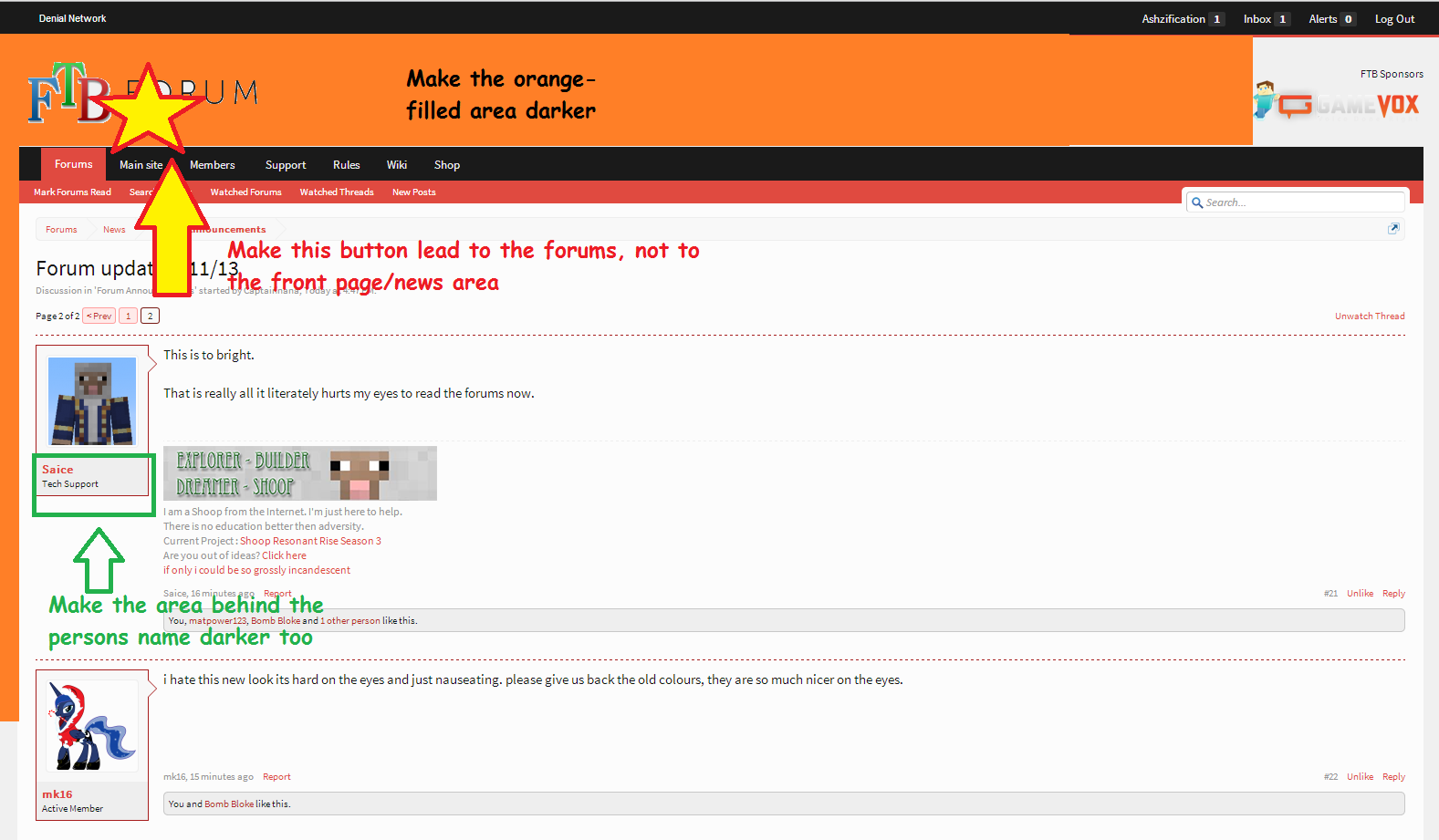
FTB Forum button (top large one) navigates to the forum list, not the front/main/news page
Theme changes I'd like to see:
Darker theme or darker theme option
 I liked the color choice on the old theme (dark grey, orange highlight) It was much easier on the eyes
From my android 4, viewing on Chrome,
It looks good, but I would still prefer the ability to use a darker theme.
I really like the changes Eyamaz made in "MS" Paint, much better than my MS paint work
I liked that feature too.
So comprehensive list time.
Features that have been changed/removed that I'd like to see return:
Join date
Location
FTB Forum button (top large one) navigates to the forum list, not the front/main/news page
Theme changes I'd like to see:
Darker theme or darker theme option
From my android 4, viewing on Chrome,
It looks good, but I would still prefer the ability to use a darker theme.
I really like the changes Eyamaz made in "MS" Paint, much better than my MS paint work
Things that I think is a little effed up:
http://forum.feed-the-beast.com/members/?type=staff
Neither Tech Support norWiki staff are listed there. We bust our butts and deserve a spot in that list.
Edit: Wiki lead is on the list, but not the other members. Not cool yo.
http://forum.feed-the-beast.com/members/?type=staff
Neither Tech Support nor
Edit: Wiki lead is on the list, but not the other members. Not cool yo.
Last edited:
Yuck, I definitely want to be able to choose the old theme if I'm ever gonna visit here again...I think it's the hot pink that's the problem. Also, the total lack of color like, everywhere else. It's like a total lack of yellow or blue on the site as far as I can tell.
There's "some" yellow/orange at the top of the drop down menu for sponsors in the top leftYuck, I definitely want to be able to choose the old theme if I'm ever gonna visit here again...I think it's the hot pink that's the problem. Also, the total lack of color like, everywhere else. It's like a total lack of yellow or blue on the site as far as I can tell.
I agree, I want my position back NanaThings that I think is a little effed up:
http://forum.feed-the-beast.com/members/?type=staff
Neither Tech Support nor Wiki staff are listed there. We bust our butts and deserve a spot in that list.
i would agree that the white sea is a little much and should be toned down a little and darken the grey in the gamevox logo a little so you can see it. other than that its not that bad.
Things that I think is a little effed up:
http://forum.feed-the-beast.com/members/?type=staff
Neither Tech Support nor Wiki staff are listed there. We bust our butts and deserve a spot in that list.
at least your at the top of most messages? #Kappa
I find it hilarious that every single person on there besides Ash was a heavy No Topic Thread user. lolat least your at the top of most messages? #Kappa
Whooooa, yes, I definitely need member join date back. It's actually a very important feature. 
Yeah, I've only been doing tech support here since the day I left Technic forums and came here.I find it hilarious that every single person on there besides Ash was a heavy No Topic Thread user. lol
Edit: <19:59:12> "SatanicSanta": "Not cool yo" for some reason I cant picture you saying this in your entire life.
^True Story.
I sat here reading posts on this thread for about 5 minutes before my eyes started hurting. There's just too many light colours. Back in the old theme where there were dark borders and darker colours in the white, then it was easier to see. So, very much easier to see because the dark colours diluted the light colour.
I sat here reading posts on this thread for about 5 minutes before my eyes started hurting. There's just too many light colours. Back in the old theme where there were dark borders and darker colours in the white, then it was easier to see. So, very much easier to see because the dark colours diluted the light colour.
Yeah the whole theme feels like it was bleached out. Even the accent colors are faded out and its hard to see the boarders between some elements now. Heck the bottons at the bottom here are almost ghosts. I mean the bottom bottom where is says Forums>News>Forum Announcements.
Over all its just eye strain waiting to happen and I have this bad feeling they are just going to say screw it and hope people just give up and adjust.
Why? The button directly below that leads to the forums, and there are no other buttons leading to the front page.As someone with frequent migraines and very sensitive eyes, I'd prefer to be able to work in an area than need to leave until I can look at the screen again.
Changes I need to see happen before I can look at the forums without a head-splitting headache:
Why have the entire news section be the "front page"? It has its own section. It's the same stuff as the News Tab on the launcher.Why? The button directly below that leads to the forums, and there are no other buttons leading to the front page.
When I click on something that says FTB Forum, I want to be directed to the forum, not just one section.
Why? The button directly below that leads to the forums, and there are no other buttons leading to the front page.
because it says Forums and most people looking at a huge button labeled like that would most likely believe that is where it leads to.
But that is just one view on it. I personally don't use that button