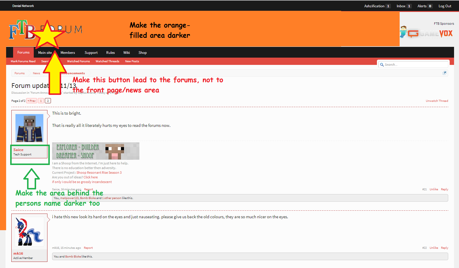
This is to bright.
That is really all it literately hurts my eyes to read the forums now.
That is really all it literately hurts my eyes to read the forums now.
Guys, seriously.... "Give us back the old colors" is not gonna help anything. As already been said, the previous theme is no longer avail. Provide examples of how you'd like it to look or wait for the dark theme. (which is what I'm doing unless someone comes up with a stylish theme)
The GameVox logo is really hard to see now too. Maybe it needs a border?
Agreed, it was always going to need tweaking and everyone was always going to hate it at first, thats normal when changing theme, I'm trying to implement as much of the requests as I can but I'm going to have to sleep now. I would add some darker elements but I can't really find anywhere that looks right. The text editor does need work, its basically default right now with our colors on. I fixed the default message font but I need to update that in the text editor as well. I also fixed the broken URL's bookmarks work againThis definitely needs some tweaking--I think the red needs to be darker, particularly on the buttons. Also, we need SOME more contrast--even a very very light shade of red in certain areas would be better than just pure white. I'm also thinking we need a contrasting accent color--the old theme had white and orange, but it also had an accent color of dark gray/black. We could definitely use one here.
Also, the buttons in the text editor need work--they should either be rounded or square. At the moment, they look like they're trying to do both, but...well...it's...it's not working out.
Also, why do we have a serif font as default now? It looks...strange. I prefer non-serif fonts online, especially for sites that are going for a cleaner look.
EDIT: Oh, and one more thing--is there any particular reason the address for the forum changed from "forum.feed-the-beast.com/forum" to "forum.feed-the-beast.com/forums"? Because it's broken half of my bookmarks.
")
You can't right now.where do you even go to change the theme if i may ask?
It used to be in the bottom part of the forum, near "Share this page" thing.where do you even go to change the theme if i may ask?
I'll be getting a new logo from them and 100% agreed, if you're just gonna say "It's to bright" it does not help me in the slightest because I don't know what I can do to fix thatGuys, seriously.... "Give us back the old colors" is not gonna help anything. As already been said, the previous theme is no longer avail. Provide examples of how you'd like it to look or wait for the dark theme. (which is what I'm doing unless someone comes up with a stylish theme)
The GameVox logo is really hard to see now too. Maybe it needs a border?
Rolling out a theme that people had adverse reactions to prior to implementing it was not a good idea.Agreed, it was always going to need tweaking and everyone was always going to hate it at first, thats normal when changing theme, I'm trying to implement as much of the requests as I can but I'm going to have to sleep now. I would add some darker elements but I can't really find anywhere that looks right. The text editor does need work, its basically default right now with our colors on. I fixed the default message font but I need to update that in the text editor as well. I also fixed the broken URL's bookmarks work again
You can't right now.
Heh the drop down arrow disappeared somehow, I'll look into it and the ftb logo is supposed to link to /forum I'll fix that as wellAlso, I can't just click the big FTB Forums to skip past the news section. It now just refreshes the front page news. I liked that feature...
And I can't see the drop down menu for the sponsors in the top right. You have to mouse over it to get the dropdown. A new user won't know there's more up there without mousing over.
The only reason I didn't hold out was because I thought getting tech support done was more important *facepalm*Rolling out a theme that people had adverse reactions to prior to implementing it was not a good idea.
We already requested a darker theme prior to you choosing this one. You could have had both available instead of sticking us with just one harsh-colored theme.
As someone with frequent migraines and very sensitive eyes, I'd prefer to be able to work in an area than need to leave until I can look at the screen again.The only reason I didn't hold out was because I thought getting tech support done was more important *facepalm*
As someone with frequent migraines and very sensitive eyes, I'd prefer to be able to work in an area than need to leave until I can look at the screen again.
Changes I need to see happen before I can look at the forums without a head-splitting headache:
The gamevox thing isn't that visible. But other than that, this is AWESOME!Hands down mine is better! http://i.imgur.com/p2BuOMI.png
I've just had a check on the old theme and its actually not that different: http://i.imgur.com/6sw7yDm.png I believe the difference is the forum now fills peoples whole screens due to the responsive design and therefore more of the screen is white. The outer area is offwhite on this theme whereas it was dark grey on the old one but the content area which I assume is the area people are saying is too bright was actually the same
http://i.imgur.com/6sw7yDm.png

")