For the same reason the front page exists at all, I guess.[DOUBLEPOST=1383877029][/DOUBLEPOST]Is there some way to change from mobile version to full desktop version?Why have the entire news section be the "front page"? It has its own section. It's the same stuff as the News Tab on the launcher.
When I click on something that says FTB Forum, I want to be directed to the forum, not just one section.
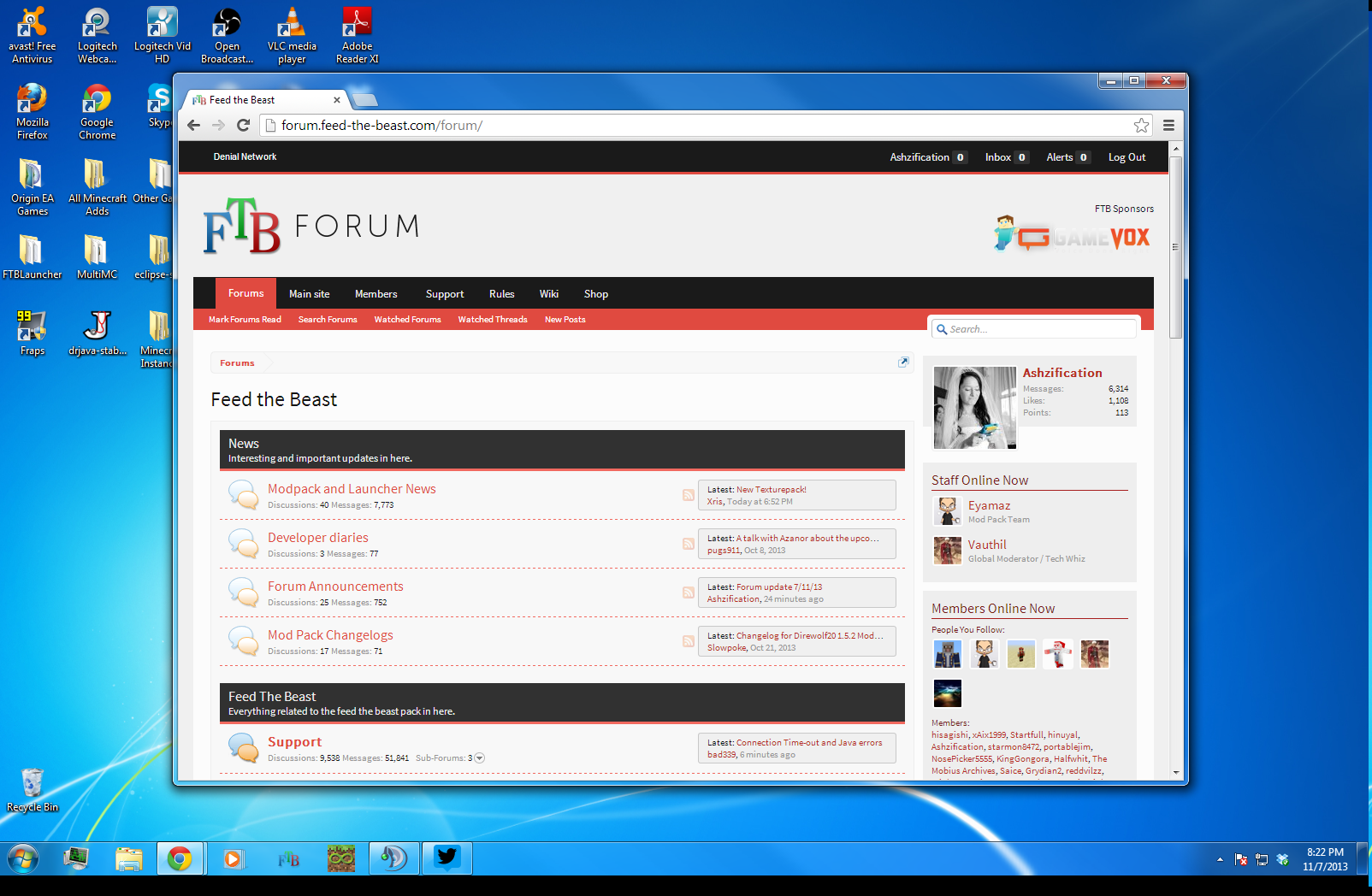
Forum update 7/11/13
- Thread starter Captainnana
- Start date
-
The FTB Forum is now read-only, and is here as an archive. To participate in our community discussions, please join our Discord! https://ftb.team/discord
You are using an out of date browser. It may not display this or other websites correctly.
You should upgrade or use an alternative browser.
You should upgrade or use an alternative browser.
I'm just being picky. I got used to clicking on the big button to refresh to the forum list.For the same reason the front page exists at all, I guess.[DOUBLEPOST=1383877029][/DOUBLEPOST]Is there some way to change from mobile version to full desktop version?
And I don't think so. Or, I haven't found one yet.

I mainly use Tapatalk on a mobile device anyway. It has a charcoal ba kground with white text. VERY easy on my eyes. When I logged in the PC it was very blinding.I sat here reading posts on this thread for about 5 minutes before my eyes started hurting. There's just too many light colours. Back in the old theme where there were dark borders and darker colours in the white, then it was easier to see. So, very much easier to see because the dark colours diluted the light colour.
I'd suggest Tapatalk if you have the option until this gets cleared up.
This is what I'm doing to not go blind:I mainly use Tapatalk on a mobile device anyway. It has a charcoal ba kground with white text. VERY easy on my eyes. When I logged in the PC it was very blinding.
I'd suggest Tapatalk if you have the option until this gets cleared up.
Wait... I can access the full editor from my mobile device?  Hallelujah!
Hallelujah!Wait... I can access the full editor from my mobile device?
Now if only I had a mobile device that could access the internet...

...any volunteers to give me theirs?

On-topic, Captainana, another forum I'm on went through this same issue with software/skin updates last year. If you want, I could PM you a link so you could see how they handled it--the transition went really well once we figured a few basics out, and I think we could borrow some color ideas from them as well.
")
This is what I'm doing to not go blind:
Vary much the same over here

dontgoblind by Saice, on Flickr
EDIT: case people think I have boring backgrounds below is my desktop layout without windows up.

Desktop by Saice, on Flickr
Last edited:
This color scheme is like jabbing burning magnesium into my eye sockets and then staring into the core of a supernova. Also, the "double alert" thingy is kinda distracting since the alerts queue up on two different tabs. 
Edit:
BUT THE EDIT BUTTON WORKS NOW!
Also, I know how much of a pain in the rear maintaining a forum is and appreciate all the effort and time put into this upgrade. Everyone responsible is awesome and should feel awesome.
Edit:
BUT THE EDIT BUTTON WORKS NOW!
Also, I know how much of a pain in the rear maintaining a forum is and appreciate all the effort and time put into this upgrade. Everyone responsible is awesome and should feel awesome.
Akivar just let me know that the IRC chat link is gone in the top menu. Since people actually use that to get support, it's kinda necessary.
Mine eyes! They burn!
A billion internets for the charcoal gray / orange theme to make a re-appearance.
I feel horrible now for being "that redundant end-user" so a sincere thanks for the tireless and under-appreciated work running the forum.
A billion internets for the charcoal gray / orange theme to make a re-appearance.
I feel horrible now for being "that redundant end-user" so a sincere thanks for the tireless and under-appreciated work running the forum.
As someone with a IPS monitor that I use to edit photos and do artwork, this font and color scheme is making me run to the FTB sub reddit if I want any information.
If I don't get an option to get back the old theme I may just end up turning away from the forums. I'm that conservative. Having a darker theme similar to this would be an improvement, but all in all it would still be much worse than the last theme we had. The only improvement that I see is that the spoiler divisions have a border.
https://chrome.google.com/webstore/detail/change-colors/jbmkekhehjedonbhoikhhkmlapalklgn
turns the white into whatever you like, in my case

turns the white into whatever you like, in my case

ofcourse people's eyes hurt. imagine being in a dark room and suddendly stepping into the sunlight. your eyes need time to adjust.
for now just let nana iron out the bugs in this theme, so it'll be easier to add a new theme later on. you don't want nana to work on 2 themes at the same time trying to fix the bugs now do you?
but I have been wondering, the themes are all quite the same, just some different colors, placements and such. is this the only option to edit xenforo themes or is it also possible to get a whole different type of theme?
you don't want nana to work on 2 themes at the same time trying to fix the bugs now do you?
Of course not, assuming of course the theme being worked on is one with a dark background
.This current iteration with the large unbroken white spaces and washed out red looks quite a bit like the original google+. Far too little contrast overall, and I would really like a slightly sharper separation between posts. Personally I'd also give someone else's right arm for having a dark background with light text rather than the reverse, but I gather from the long-ignored 'dark theme is broken'-thread that we probably aren't getting one until everything else is done.
In short, I think this needs contrast, segmentation and less white. No white at all in fact, even a bright theme would be better off with a light gray tone.
Last edited:
Honestly, after having spent most of my youth and young adulthood on the internet, I think that white on dark grey should be the default colour scheme for everything. Head over to the Elder Scrolls forum for a design that works well, although it may be abit oversimplified (having an accent colour, like orange in our case, makes things nicer).
This whole light red on bright white with a small touch of nearly white on the sides is plain bad. Also, what's wrong with having borders on the sides anyway? Now I get way too many characters per row if I maximize the window, making it hard to read (optimally, all books/magazines/websites strive to have in the region of 60 characters per row to make the text the most readable (excluding magazines that have a column format)).
This whole light red on bright white with a small touch of nearly white on the sides is plain bad. Also, what's wrong with having borders on the sides anyway? Now I get way too many characters per row if I maximize the window, making it hard to read (optimally, all books/magazines/websites strive to have in the region of 60 characters per row to make the text the most readable (excluding magazines that have a column format)).