32x [32x] JohnSmith Technician's Remix
- Thread starter Zica
- Start date
-
The FTB Forum is now read-only, and is here as an archive. To participate in our community discussions, please join our Discord! https://ftb.team/discord
You are using an out of date browser. It may not display this or other websites correctly.
You should upgrade or use an alternative browser.
You should upgrade or use an alternative browser.
I must say that makes two of us Zic, I've never thought the GUIs were as bad as some make them out to be, the only thing I can think is if the machine's gui is opened whilst looking at the sky, or any other bright background that will probably make the text harder to read.
On that note, if anyone knows of simple mod that allows the GUI text colour to be changed, we will put a link in the OP to it, but it appears nothing of the sort currently exists.
On that note, if anyone knows of simple mod that allows the GUI text colour to be changed, we will put a link in the OP to it, but it appears nothing of the sort currently exists.
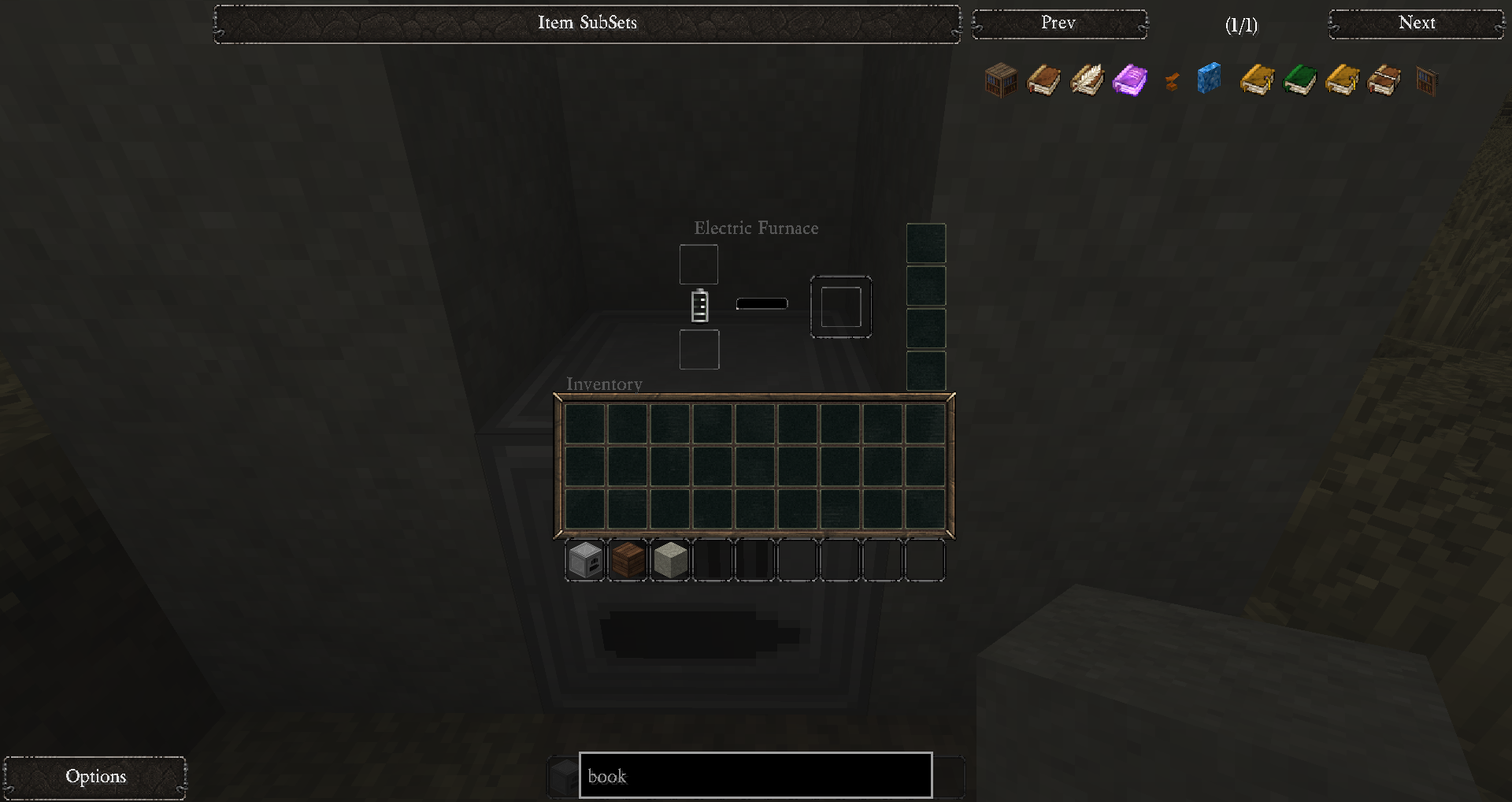
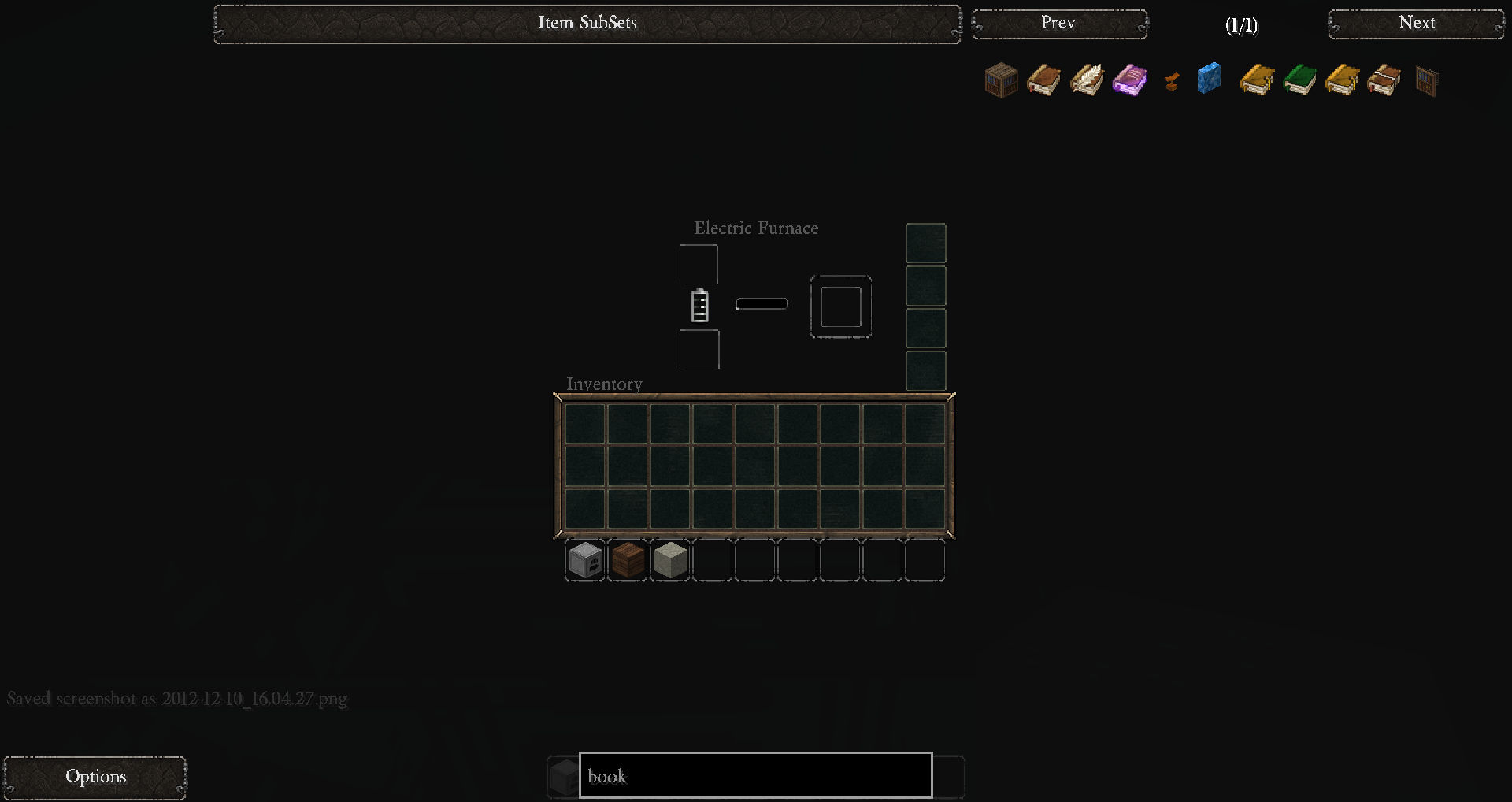
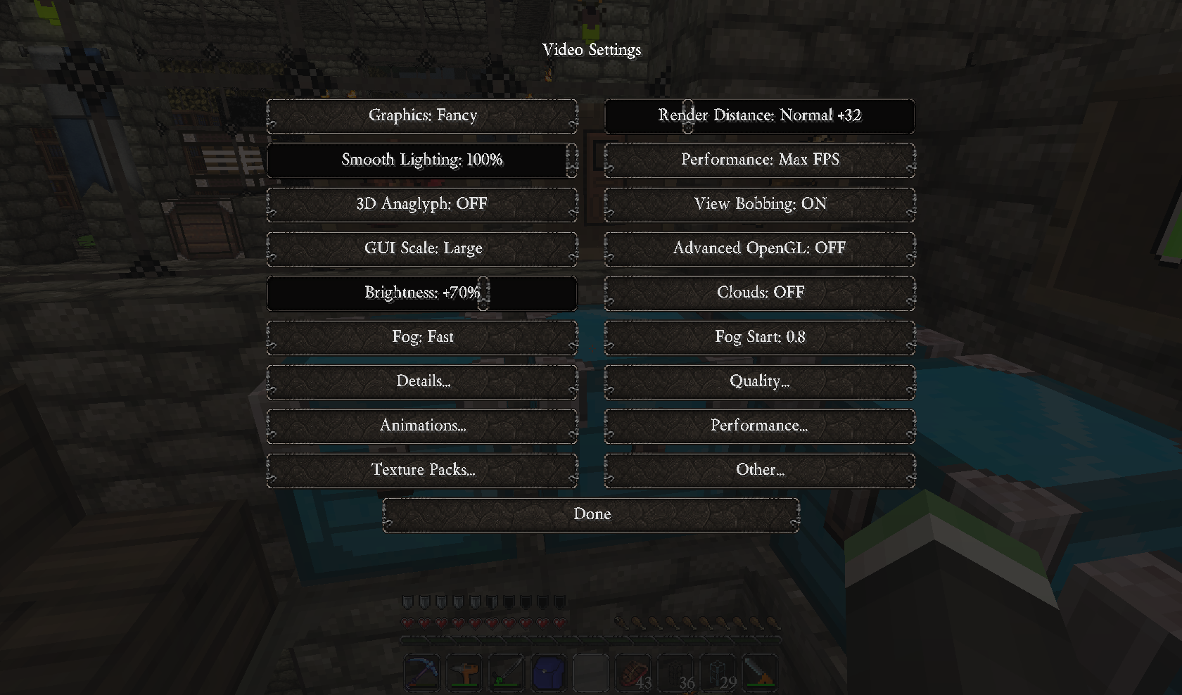
Here are some screenshots with John Smith, 1600x1200, Full Screen, GUI is sent to Normal, and No Optifine.


This Gui isn't changed it seems and is much easier to see/read then the others. The text color is definitely different on this Gui as well, so not sure how they did it. I even checked with photoshop to make sure it was not just an optical illusion.


The next ones are same settings with Optifine turned on and all the default settings for it. I noticed that with the font in JS it makes it even harder to read then on the default font. Not sure if everyone is running Optifine or not while using the texture pack.


This Gui isn't changed it seems and is much easier to see/read then the others. The text color is definitely different on this Gui as well, so not sure how they did it. I even checked with photoshop to make sure it was not just an optical illusion.


The next ones are same settings with Optifine turned on and all the default settings for it. I noticed that with the font in JS it makes it even harder to read then on the default font. Not sure if everyone is running Optifine or not while using the texture pack.


I just downloaded the Painterly Pack and replaced the GUI in JS with the one from there , they are close to the same style and are much easier to read.
Painterly doesn't have a lot of mod support, alas.
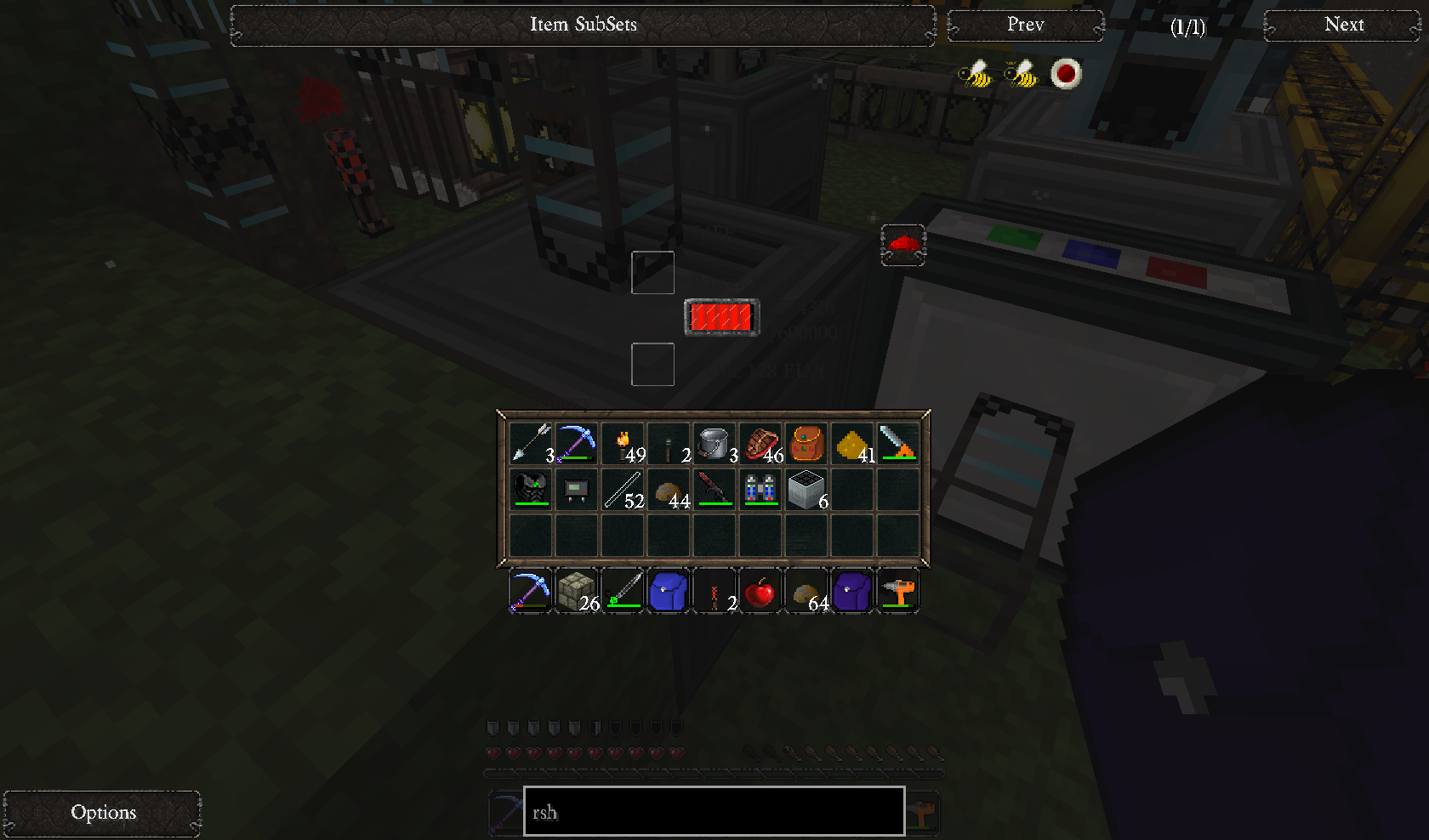
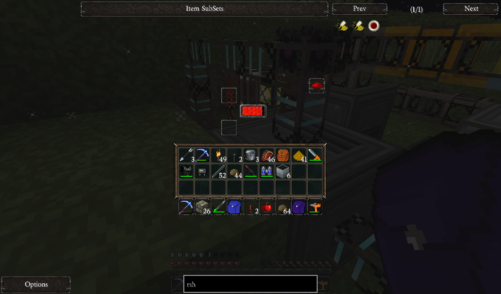
I've cherry picked a handful of items to make a point: can you identify the glass panes in this picture? How about the IC2 carbon fiber plates and mesh?
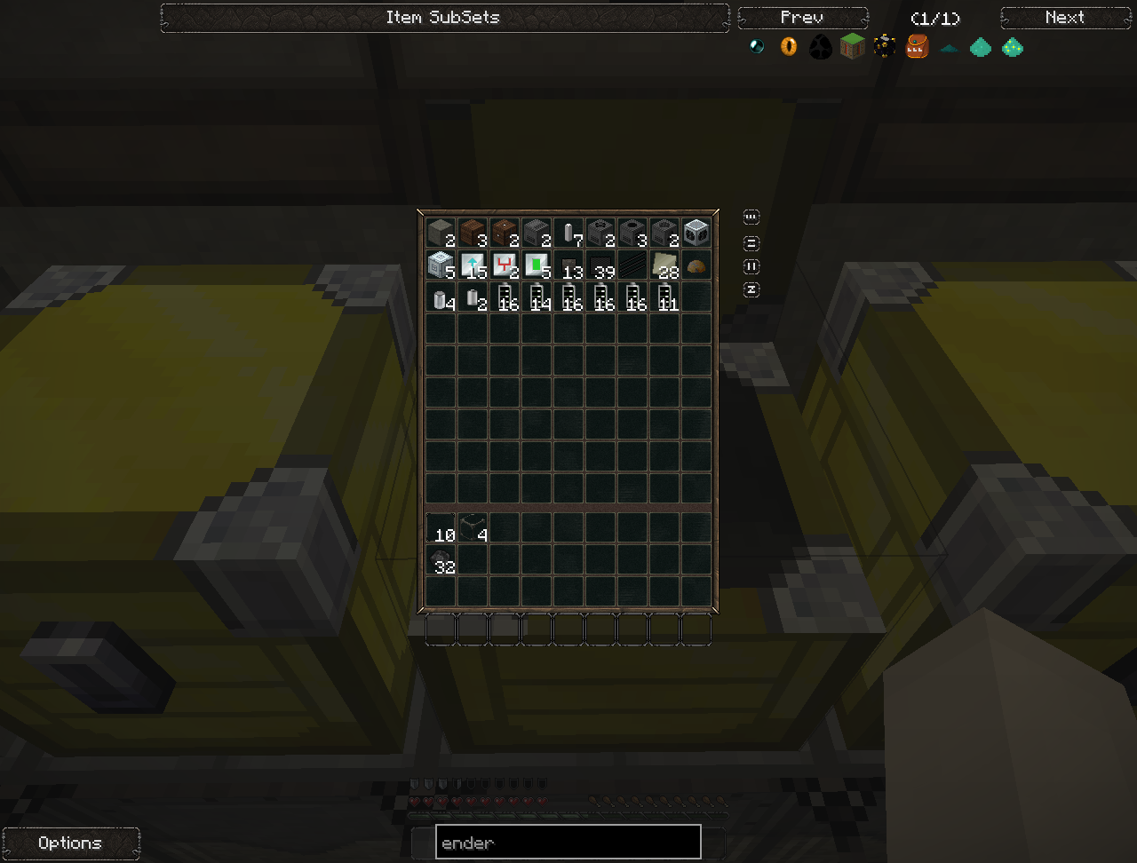
My GUI experience about matches Dekar's above, but it's harder to see the darker the things behind your background, and I have to squint at the screen to make out the text in some cases. No optifine or high res fonts (which do look somewhat more readable in those pics), just the texture support Forge comes with.
(The advanced solar GUI pictured above, BTW, probably hasn't been re-skinned.)
I've cherry picked a handful of items to make a point: can you identify the glass panes in this picture? How about the IC2 carbon fiber plates and mesh?
My GUI experience about matches Dekar's above, but it's harder to see the darker the things behind your background, and I have to squint at the screen to make out the text in some cases. No optifine or high res fonts (which do look somewhat more readable in those pics), just the texture support Forge comes with.
(The advanced solar GUI pictured above, BTW, probably hasn't been re-skinned.)
Painterly doesn't have a lot of mod support, alas.
I've cherry picked a handful of items to make a point: can you identify the glass panes in this picture? How about the IC2 carbon fiber plates and mesh?
My GUI experience about matches Dekar's above, but it's harder to see the darker the things behind your background, and I have to squint at the screen to make out the text in some cases. No optifine or high res fonts (which do look somewhat more readable in those pics), just the texture support Forge comes with.
(The advanced solar GUI pictured above, BTW, probably hasn't been re-skinned.)
Yea, dark or more clear items like glass are very hard to see in your inventory. I don't know how many times I have made extras of stuff that I didn't need because I found it in my inventory. Thinking that it was a completely different item.
The 1.4.2 branch should work fine on 1.4.5, and although a few mods (such as railcraft) have changed their paths, I have catered for that (hopefully) where I can. When FTB updates we can clean out any outdated textures.
The default is fine if it works. I'll try to put up some screenshots from when it doesn't, and as much info as I can about my Optifine settings (I'm using Optifine_1.4.2_HD_U_A7 with GUI set to Large).Screenshots
Last night it literally switched on me between clicks. I checked my MFSU and it was almost unreadable. The text was just too dark to read without squinting (or too light or too transparent? I'm really not sure). Then I looked again and it was fine.
OK, so here's the deal.
First, use Optifine! Seriously, Optifine is required for 32x and above texture packs to actually work with any degree of decency.
Secondly, the font colour in the GUIs is up to the mod, not the pack, hence why we can't change that.
Thirdly, try turning your brightness up or down, see if that helps.
Fourth-ly, we know the glass panes are really hard to find in your inventory, and it annoys me too. However, to change that, we'd have to add noise to the glass texture like the vanilla one, and I know I certainly prefer my glass clear, don't you? It's the price of class, I'm afraid.
Minecraft doesn't support partial transparency for GUIs.Not that I feel the need to impose or anything, but a possible solution would be to make the GUIs a little less transparent. Even a small decrease could help make transparent items easy enough to see normally.
The reason text is so hard to read is due to the mod, and since the standard Minecraft GUI is white, the mod makers have to cater to that, making the text a darker gray.
Honestly, the transparent GUI is one of the things I love the MOST about this TP. When I was playing around with it to get a feel and see if it was the one I was going to use in my LP, my life was saved by seeing a creeper creepin' up on me while I had my inventory up. I also really like the vaguely victorian-era steampunkish feel to the TP. Ultimately, the windows and windowpanes were just too much of an eyesore for me. It looked more like a wooden fence than glass to me, for some reason. Oddly enough, I had no problem with that texture in glowstone and glowstone lamps, as one assumes a bit of infrastructure to mount it. I dunno why I have a double-standard like that, I guess it's just me.
This is a strong contender for me to use, and if the 64x Soartex Fanver is just too resource-intensive to run alongside my recording software, I may well use it in my Let's Play.
This is a strong contender for me to use, and if the 64x Soartex Fanver is just too resource-intensive to run alongside my recording software, I may well use it in my Let's Play.
Does anyone have glowstone as a yellow rocky texture instead of the lantern-esque glowstone shown in the screenshots? I think there are a few other blocks that I see as vanilla that aren't supposed to be, but that is the most obvious one. I am using the latest version.
Does anyone have glowstone as a yellow rocky texture instead of the lantern-esque glowstone shown in the screenshots? I think there are a few other blocks that I see as vanilla that aren't supposed to be, but that is the most obvious one. I am using the latest version.
Currently, in the 1.4.2 version, glowstone is a rock texture, rather than a lantern. The screenshots don't show the most up-to-date work, so don't use them as a basis for analysis.
It's the price of class, I'm afraid.
Speaking as someone who has done design, including UI design, this is a very misguided sentiment. A UI, first and foremost, has to work; looking good is a bonus.
There's a title of a very well regarded book on UI design that sums it up: "Don't make me think." A UI that gets in the way of the user and what they're trying to do is flawed in its design, no mater how attractive it is. If they are dark translucent because the original John Smith UIs are that way, then the originals are flawed. And the consideration of the UI design also needs to include users with different levels of perception ability, such as color blindness, or different monitor resolution, or not using Optifine. (Also, I use a hardware gadget to configure my monitor color/brightness, so it's as accurate as it's going to get without a newer, fancier monitor.)
As a passing note, I'd also like to point to packs like Painterly and their extensive customizes. It's a big undertaking and understandable if you don't want to go that far, but offering different choices of GUI style is hardly unheard of.
My two cents:
I really like the transparent GUIs. Makes the game fee more real to me, instead of seeing this big grey box constantly.
On a side note, I really like the glowstone texture. The yellow rocky thing is how it's supposed to feel, and it's why Mojang invented the redstone lamp. My opinion is if you want a lamp, use the redstone lamp. It really decreases from the feel of the nether when I'm walking through it and a bunch of man-made looking lamps are hanging from the ceiling.
Thanks for all the hard work you're putting into this, you guys. You've got a faithful supporter and downloader here. By far the best pack for FTB, I just love the feel it gives to the game.
Ah ok, just wanted to make sure that it's supposed to be that way, though I'll just submit that I prefer the lantern look. Do you have any plans to implement a customizer similar to the one that the normal JohnSmith pack has?Currently, in the 1.4.2 version, glowstone is a rock texture, rather than a lantern. The screenshots don't show the most up-to-date work, so don't use them as a basis for analysis.
