New Launcher design | We need you!

Are you scared of change? (Trollol)

  • Yes

    Votes: 72 11.7%
  • No

    Votes: 546 88.3%

  • Total voters
    618
Status
Not open for further replies.

SizzleBacon

New Member
Jul 29, 2019
24
0
0
I don't if it will be ven possible to make it look like this, but i couldn't resist creating it, so here you go:
VjFBEEs,lghhICx,xdTbL6N

http://imgur.com/VjFBEEs,lghhICx,xdTbL6N#1
VjFBEEs,lghhICx,xdTbL6N

http://imgur.com/VjFBEEs,lghhICx,xdTbL6N#2
VjFBEEs,lghhICx,xdTbL6N

http://imgur.com/VjFBEEs,lghhICx,xdTbL6N#0

Tell me what you think, I may add some later (like the store or settings).

Must have.

I don't see why they don't do a contest. So many great designs!
 

WebMaka

New Member
Jul 29, 2019
20
0
0
FTB desperately needs some sort of notification mechanism for server administrators so we can know when something is updated or has been changed. The silent update for Twilight Forest a few days ago broke my server's connectivity until we figured out that ONE mod was changed on the client side without any actual notification to clients or servers. You can't do this to people if you want them to continue using your stuff.

There should never, ever be a silent update for a client-server project. ANY necessary change needs to be made obvious to both clients and server admins.
 
  • Like
Reactions: SizzleBacon

cyberzwerg

New Member
Jul 29, 2019
49
0
0
Hey guys Here's my attempt:
eyfWOcY.jpg


nLY2szl.jpg


1xwioL3.jpg


More to come! I hope you like it (im still a beginner in things like design (12 yrs old)) ;) greets
 

SizzleBacon

New Member
Jul 29, 2019
24
0
0
Hey guys Here's my attempt:
eyfWOcY.jpg


nLY2szl.jpg


1xwioL3.jpg


More to come! I hope you like it (im still a beginner in things like design (12 yrs old)) ;) greets
Hope you don't mind some constructive criticism.

Your limited use of colors gives the over all design a sort of flatness. It doesn't really pop or catch the eye in any particular way. Try adding some color schemes, even if they are subtle.

You seem to like that rounded square with the two points. Around the players texture next to the logout button, it seems like a nice detail. But you then use it for every texture pack option. This makes your design look recycled, un-original, and frankly like a copy paste project. Try not to use the same design for multiple elements.

That sans serif font is hard to read, this is made more pronounced by the choice of colors. Try using a serif font for large bodies of text such as news. The sans serif seems fine for larger buttons and titles.

The large logo bar at the top is kind of a waste of space. Either get rid of it, or fill it with something useful.

I know the design isn't finished, but certain things need to be included in the finial submission. Such as an option menu and the like.

FTB has to have a certain feel. If you take what the current launcher looks like, that's the feel the player should get when they see it. Sort of a gaming/cool/sleek/'I like looking at this' feeling. Dark grey and orange can make most things look cool by themselves. If you have doubt about design choices, try stealing from the current one. Although you don't want it to be too similar (they are trying to change it after all) many people like it and would appreciate some throwbacks to it.

I hope this was helpful! This obviously isn't the stone set rules of design, but I personally feel that these are some things every designer should consider. Good luck with your design!
 

neo3979

New Member
Jul 29, 2019
3
0
0
I really love this. I only wish I would find this sooner anyway. I hope you will add shpax to the texture packs to the texture pack tab. I also really hope the yogcast will do maps DL. anyway great job FTB
 

cyberzwerg

New Member
Jul 29, 2019
49
0
0
Allright, Ive done some work on it :
Y0uf0en.jpg

Not much changed here except some work on the background which has some more white in it and the color of the Login button

cVIx3Q1.jpg

allright i hope you dont think this is to cramped but i tried to move most of the stuff on this page. On the left you see the unfinished navigation bar. In the top left youll see your players head (on all pages) then you can filter between modpacks or search for them. if you have more than 10 modpacks you can use the arrows on the left and right to change the pages ( indicator on the top) if there's an update it says update below the modpack (modpack 2). the selected modpack is underlined in yellow. on the bottom youll see settings for every modpack ( Texture , version , options , Ram , get server, a banner and the launch button ) .
Hope you like it!
PS. Im not a professional and just got startet with design (12 yrs old)
 

FastTquick

New Member
Jul 29, 2019
151
0
0
I think I once read that you wanted to add the ability to adjust the config files of any mod in any modpack right from the FTB menu rather than open the mod's config files through notebook. Do you still have plans for such a feature.
 

funisfun8

New Member
Jul 29, 2019
2
0
0
ALL the modpacks should have custom logos.
A custom background? (Like multiple theme options)
An option to make the console pop up when you start a modpack(If it is not open already.)
 

Someone Else 37

Forum Addict
Feb 10, 2013
1,876
1,440
168
Allright, Ive done some work on it :
Y0uf0en.jpg

Not much changed here except some work on the background which has some more white in it and the color of the Login button

cVIx3Q1.jpg

allright i hope you dont think this is to cramped but i tried to move most of the stuff on this page. On the left you see the unfinished navigation bar. In the top left youll see your players head (on all pages) then you can filter between modpacks or search for them. if you have more than 10 modpacks you can use the arrows on the left and right to change the pages ( indicator on the top) if there's an update it says update below the modpack (modpack 2). the selected modpack is underlined in yellow. on the bottom youll see settings for every modpack ( Texture , version , options , Ram , get server, a banner and the launch button ) .
Hope you like it!
PS. Im not a professional and just got startet with design (12 yrs old)
Not bad...
The main problem I have with this design is the fact that black text on a black background is impossible to read. Try white, orange, or some other light color for text on a dark background.
I'm also not a big fan of the huge contrast between the top and bottom portions, but that might just be me.
I like the update flag idea. However, the "Update" text (which is easily readable, by the way) seems to be in line with the orange line... maybe change the orange line to your rounded box with two points from before?
If you're cramming as much as possible into the one screen, why not throw in the "Login" bit as well? There's a space right above the "Get Server" and "Launch" buttons there that would fit nicely. You could even replace the "Launch" button with a "Login" button until the player has logged in (and then have the username and password boxes turn into the "Logout" button as well, complete with head and all), although I'd prefer either having the launcher automatically log the most recent player in, or have the whole standalone Login screen be a one-time deal- I just want to click a modpack and hit the "Launch" button.
I'm not sure I like having the RAM and texturepack options on the main screen, either. Those should probably go in an "Options" tab on the left, right under "Packs".
Finally, you didn't put the gradient in the background of the main screen. If it's in the launch screen, it should be in all the screens.
 

Ovoce

New Member
Jul 29, 2019
3
0
0
Allright, Ive done some work on it :
Y0uf0en.jpg

Not much changed here except some work on the background which has some more white in it and the color of the Login button

cVIx3Q1.jpg

allright i hope you dont think this is to cramped but i tried to move most of the stuff on this page. On the left you see the unfinished navigation bar. In the top left youll see your players head (on all pages) then you can filter between modpacks or search for them. if you have more than 10 modpacks you can use the arrows on the left and right to change the pages ( indicator on the top) if there's an update it says update below the modpack (modpack 2). the selected modpack is underlined in yellow. on the bottom youll see settings for every modpack ( Texture , version , options , Ram , get server, a banner and the launch button ) .
Hope you like it!
PS. Im not a professional and just got startet with design (12 yrs old)

Pretty nice, but let me express bit of criticism.

Most importantly, you should always make your text easy to read. Having black text on Dark BG is not the best. Also, don't you think the default PowerPoint orange is horrible? That's just my opinion, anyway. The next thing is, that you make everything BIG. If you take a look at current launcher, you'll se that you don't really need that huge text, or even icons. And I don't think FTB will be used on touchscreen devices, but who knows. But now imagine that there isn't Modpack 1,2,3,1,1,1..., but FTB Ultimate modpack by FTB Team. How do you fit those 6 miles long ttles in your launcher? Also, I think you don't need to have the RAM amount setting and so on that big. You could use dropdowns instead, to save a lot of space. Now this might be just me, but to me your UI looks... not polished, i would say. I know me, if only a stupid button is a pixel away from being exactly symetrical with others, i just can't stand it. Lastly, I think it you might reduce the amount of lines in your desing, and maybe use less inner shadows and disable the smooth edges on steve's face, but that's just my opinion. You can check out my design too, if you fell like it. I hope you don't mind my criticism :)

Ovoce
 

cyberzwerg

New Member
Jul 29, 2019
49
0
0
yeah i noticed that it looks different from my laptop then on my pc ( the black on black thingy)
im allready working on some tweaks and stuff (reducing lines and borders ) making it more slim and not so big.
I tried to make the launcher look like the feed the beast website and im also working to make my things HTML 5 ;)
so you guys can try out some of the features like they're thought! i hope youll give me more feedback in the future !
Thanks so far cyber~
 

cyberzwerg

New Member
Jul 29, 2019
49
0
0
Pretty nice, but let me express bit of criticism.

Most importantly, you should always make your text easy to read. Having black text on Dark BG is not the best. Also, don't you think the default PowerPoint orange is horrible? That's just my opinion, anyway. The next thing is, that you make everything BIG. If you take a look at current launcher, you'll se that you don't really need that huge text, or even icons. And I don't think FTB will be used on touchscreen devices, but who knows. But now imagine that there isn't Modpack 1,2,3,1,1,1..., but FTB Ultimate modpack by FTB Team. How do you fit those 6 miles long ttles in your launcher? Also, I think you don't need to have the RAM amount setting and so on that big. You could use dropdowns instead, to save a lot of space. Now this might be just me, but to me your UI looks... not polished, i would say. I know me, if only a stupid button is a pixel away from being exactly symetrical with others, i just can't stand it. Lastly, I think it you might reduce the amount of lines in your desing, and maybe use less inner shadows and disable the smooth edges on steve's face, but that's just my opinion. You can check out my design too, if you fell like it. I hope you don't mind my criticism :)

Ovoce
i totally dont mind your criticism I even thank you for it! About the Modpack title: I would say that the text should be scrolling. And i can understand the thing with the simetrical stuff:
This is still a very early prototype so i didnt finish up everything! ;) Ill post some updates in a few minutes
 

DraigoDragon

New Member
Jul 29, 2019
66
0
1
http://i.imgur.com/GoQI1WR.jpg
http://i.imgur.com/KmhMtiK.jpg
http://i.imgur.com/973UCOW.jpg
http://i.imgur.com/Blo691b.jpg
http://i.imgur.com/0EuoLBk.jpg
Many Tweaks! Hopy you dont mind that i posted links and not the pictures. Just didnt want to spam everything!
Greets cyber~

The first 2 image's I like... "I guess"

The 3-5 image Is bad for one reason the blinding white box's specially the 5th one.

Are you trying to burn my eye's out.. because It's working
 

cyberzwerg

New Member
Jul 29, 2019
49
0
0
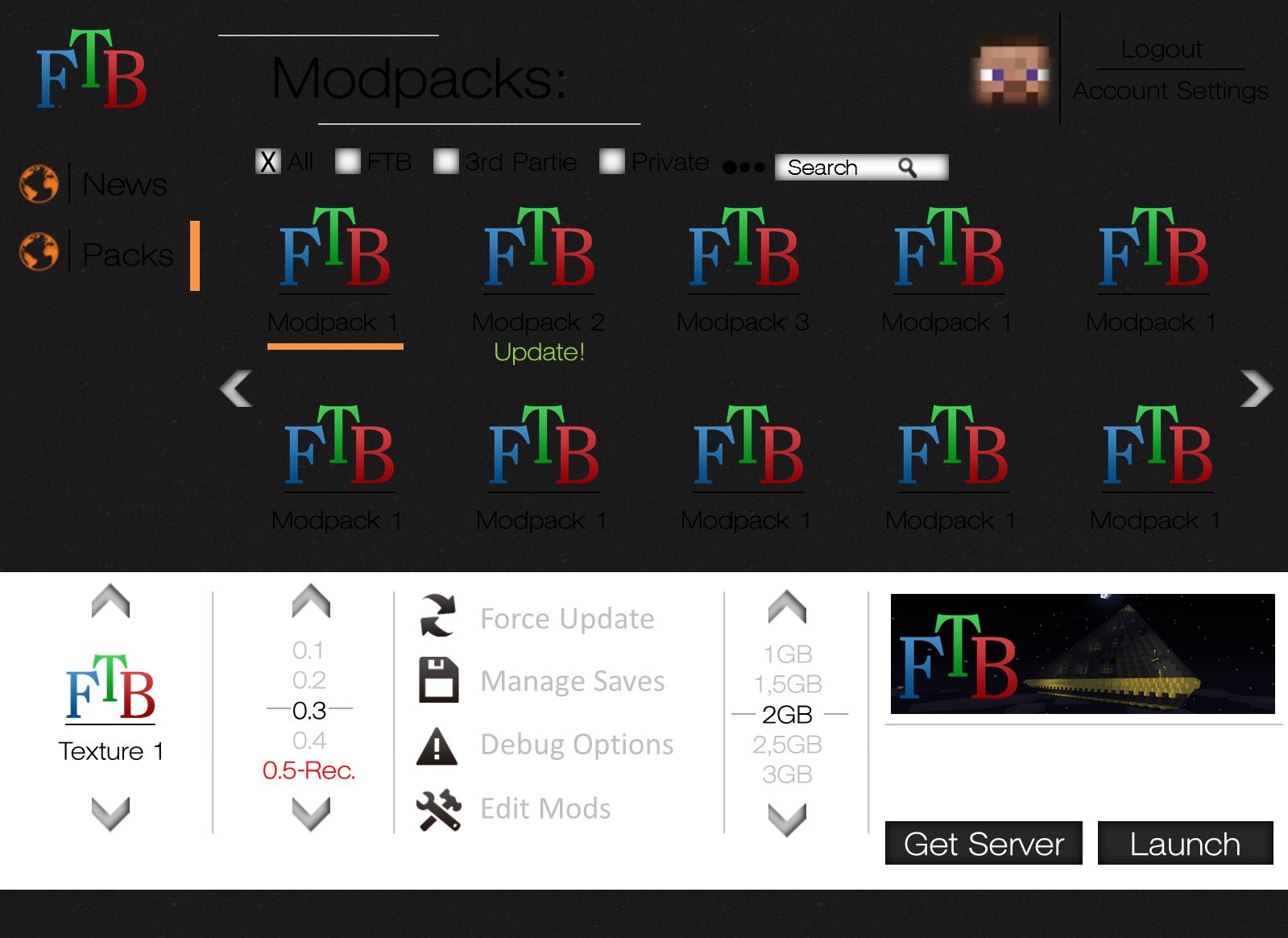
Here's my attempt. Ive made it more os x style, but it could probably look different with every os (and be more in style with it). For me java apps with "one size fits all" design approach always look jarringly out of place.

Anyway, functionality wise:
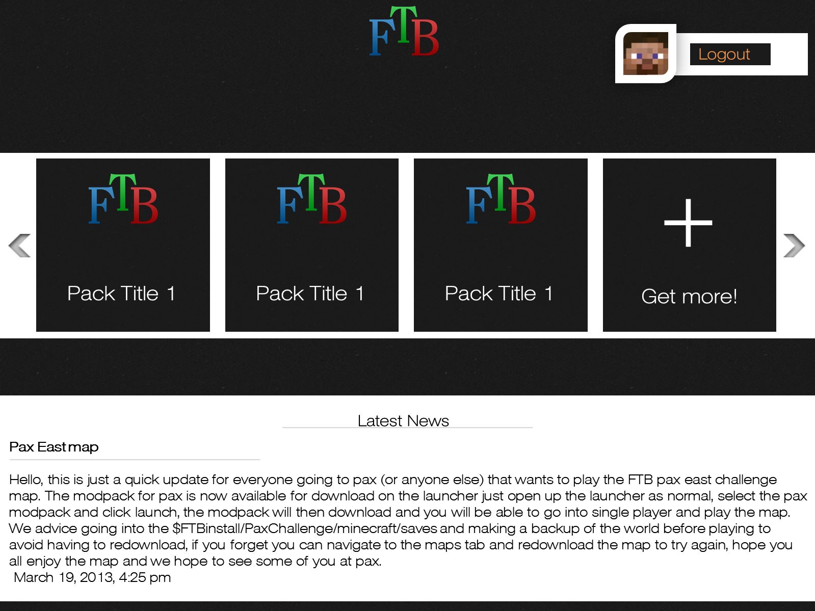
For me, launcher is for launching my game and, sometimes, tweaking what mods are installed.
So, that's what i've put upfront. Don't really care for other mod packs, maps etc.

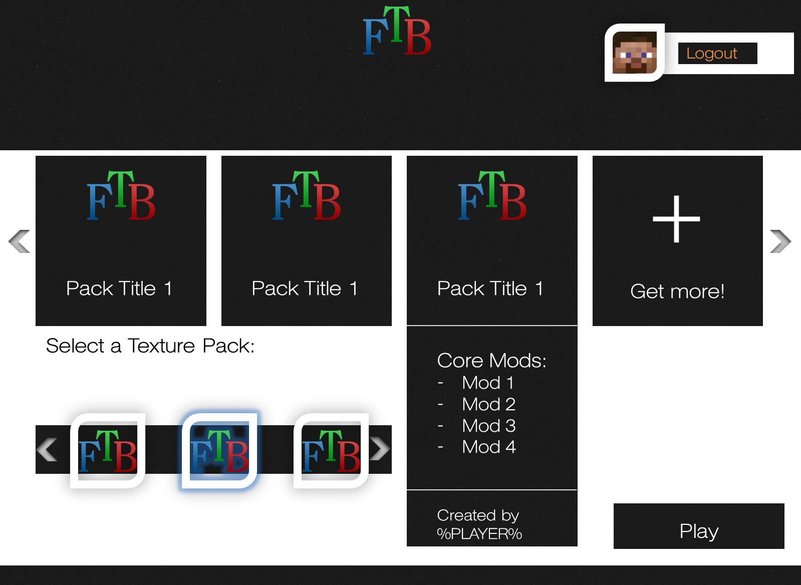
Regarding mod editing, I also never understood why there are mod/jar/core tabs. Probably developers know the distinction, but I (and users) don't need to know that.

Filter bar could be hidden via menu item.
Someone suggested world/save management and backups, so i added hypothetical tab for that. could be useful. What also could be useful if mod edit window would show mod version number and update status. Probably impossible without proper infrastructure but still, just an idea for the future.

Hope you like it,
take care!

View attachment 2383[DOUBLEPOST=1362259039][/DOUBLEPOST]I'm @antonkudin on twitter if you want to contact me.
Hey just a quick question: What programm are you using?
 
Status
Not open for further replies.