Logo Contest
- Thread starter Captainnana
- Start date
-
The FTB Forum is now read-only, and is here as an archive. To participate in our community discussions, please join our Discord! https://ftb.team/discord
You are using an out of date browser. It may not display this or other websites correctly.
You should upgrade or use an alternative browser.
You should upgrade or use an alternative browser.
- Status
- Not open for further replies.


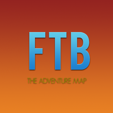
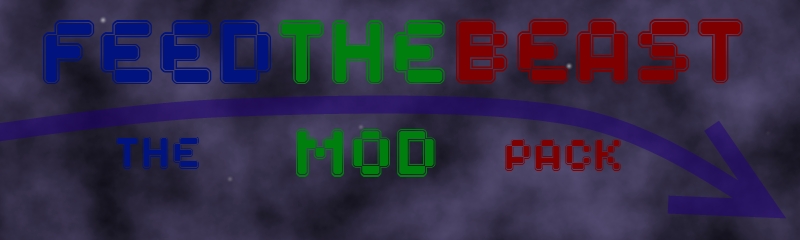
Here is my attempt at the logo. Hope you guys like it . I would appreciate some feedback.
http://imgur.com/a/p9rDS
http://imgur.com/a/p9rDS
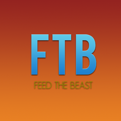
There's my entry. I used paint just to keep it simple and it looks okay not my best piece of work but it goes with different backgrounds and could be used as a logo
") so far the amount of responses to this post is fantastic and i'm sure slow will be thrilled with the amazing quality
so far the amount of responses to this post is fantastic and i'm sure slow will be thrilled with the amazing quality


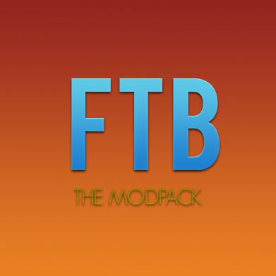
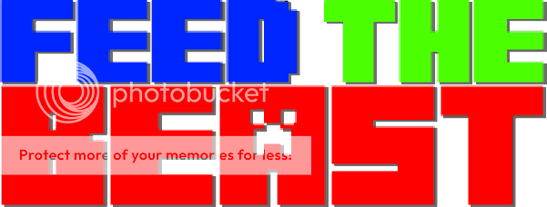
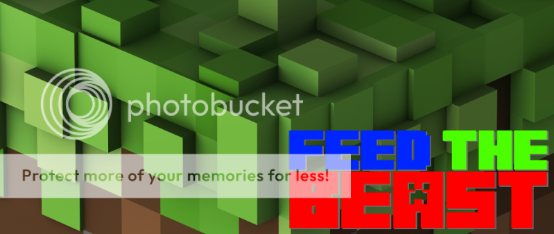
Here is my take on this. I can re-edit some of them to how you may want.(i had hard time trying to post these images hope this worked)
View attachment 38View attachment 39View attachment 41View attachment 42
i won't mind feedback
I liked the second one from the top, but the rest seems a little to much
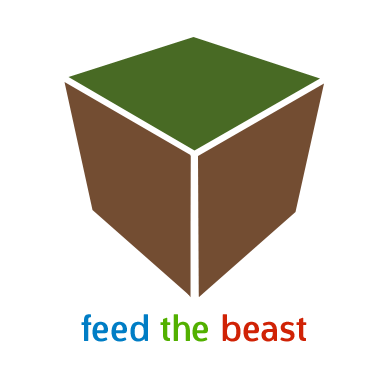
This design is the one that I like the most. I just feels like a nice and clean design and the dirt block does make the statement for me that it is talking about minecraft.
Here's what I came up with so far.
The concept is pretty simple. It's supposed to resemble a minecraft block, with the ftb name underneath. :3
I went for clean, mostly.
Also had two versions. One has the original colors on the block with a greyscale on the name (this can be changed to only one tone, or maybe white, black doesn't look so nice)
The other one is colored as a dirt block and the colors are on the text.
I like this one too. The simplicity is eye-catching & memorable-- a dirt block is kind of the epitome of where much of Minecraft starts. IMO, the only thing that could use a change is the font-- perhaps a bit.. stonger? Nothing overblown; still retaining the simplistic style but with a tad more "oomph" perhaps? Hard to explain what I mean; I'll have to dig into my font libraries to see if I can find an example. But even if it stays the same, good job! And good work to all who have contributed thus far-- we've got some awesome talent in this community!


We're getting close to the deadline, and I feel like I can still improve my designs a bit, but I'm not sure how. Feedback would be greatly appreciated, check my previous posts for the logos (don't wanna post them again, would only cause more clutter than there already is).


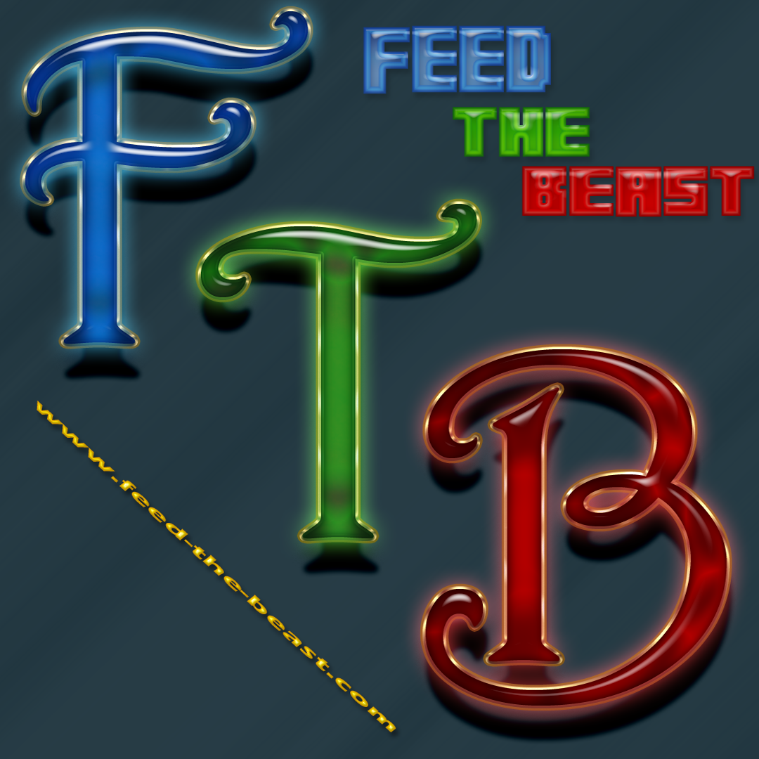
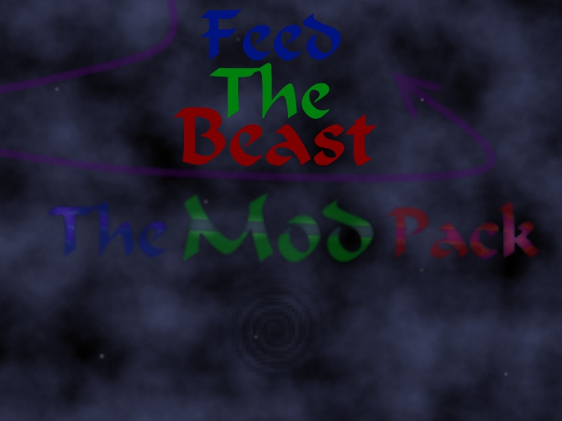
It's me again, I wanted to try another logo, for the FTB.

I made the image a little to big, please give feedback if needed. Have a nice evening.
I made the image a little to big, please give feedback if needed. Have a nice evening.


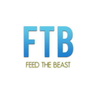
First time on this forum so I hope I'm posting in the right place. This took me a really long time so I hope you all like it.
- Status
- Not open for further replies.