Hi again,
Been using this on and off for awhile, and I have a few comments (And maybe more in the future)
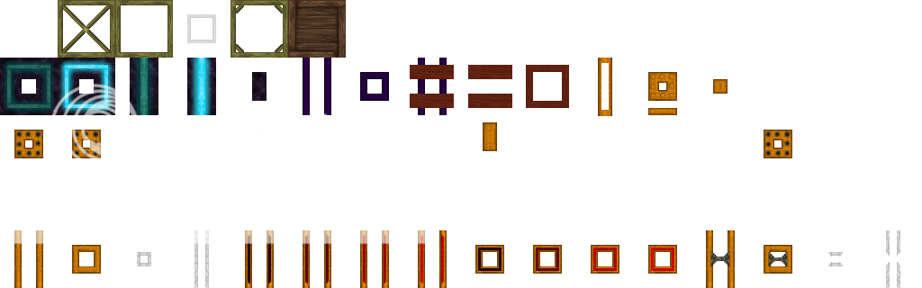
-The selection icon for the hot bar (the indentation) kind of blends in to well for me, maybe make it a bit darker? (I will on my own if you dont

)
-The Nano-Saber (Looks really nice btw) is difficult to tell if its on or off for me :/
-The cracked sand could use a new unique smoother texture I think. Right now it's the dirt texture but brighter, and while I do really like the dirt, seeing huge fields of that texture can be too much. I currently live in a cracked sand area so I see it often
-Finally, the chests have that flickering to them (Nearly every mod has this issue), Lately it's become a pet peeve of mine, so I go in and fix it on my own, which I'll do, again if you dont
This is meant to be constructive criticism, I absolutely love everything else right now (I think).
Also, I'm a bit colorblind, so maybe thats why the nanoblade and hotbar selector are giving me issues.
Keep up the good work
-The dusts icons are much better, a good compromise to the container idea you were going for, and a dust look.


")
")