32x [32x] JohnSmith Technician's Remix
- Thread starter Zica
- Start date
-
The FTB Forum is now read-only, and is here as an archive. To participate in our community discussions, please join our Discord! https://ftb.team/discord
You are using an out of date browser. It may not display this or other websites correctly.
You should upgrade or use an alternative browser.
You should upgrade or use an alternative browser.
I have this, but some of the machine still have the default textures. For example, Industrial Centrifuge, Centrifuge Extractor, Rotary Macerator and Singularity Compressor.
Hey all. First let me say that I really am enjoying this Texture Pack and am using it to do my Let's Play series on YT. The fact that I can run a cool TP like this sans optifine (default FTB Config) is cool. I did notice something last night that I wanted to bring up here to see if it is a texture thing vs. an actual FTB bug.
I created a geothermal generator last night and dumped a bucket of lava in it to power it. The bucket emptied, but there was no following animation on the GUI for the Gen. I was confused so I clicked on my MFE and it was charging it with the power supplied by the lava.
Again, wanted to see if it was a TP issue, or if I need to address this in the FTB Bug section.
A single bucket of lava is not enough to update the GUI.  The Geo-Gen holds a huge amount of lava.
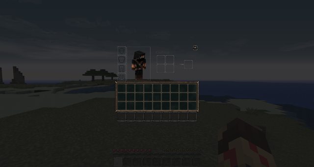
Well, when I hit my E key it goes to my inventory, it looks odd that it's transparent.Hmm? You mean in machines and such? That's largely intentional.
Well, when I hit my E key it goes to my inventory, it looks odd that it's transparent.

If it looks like that, then that is how it is supposed to look.
I know, It's just that the transparency makes my game look odd...
If it looks like that, then that is how it is supposed to look.
Well that's how the original John Smith GUIs look, we've just based any additional GUIs on those. There's only so many changes we can make before the pack stops being John Smith and becomes something totally different.
As you're talking about the transparency of the GUI - I have a question regarding this. I'm quite capable of editing / mixing / creating texturepacks, but I never fiddled with the gui gfx. Is there a way for me to either change the default "dark grey" font color (I don't mind the transparent bg, but I'd prefer to be able to see the text) or would I be better off editing the gui pngs placing some sort of bg onto those areas that hold text ingame?
Thanks for any hint you can give me. =)
Thanks for any hint you can give me. =)
Changing the font colour is something I've already looked into, and unfortunately there's no easy way to change the it. There might be a mod out there that does something like this, but so far I haven't been able to find one.
As you're talking about the transparency of the GUI - I have a question regarding this. I'm quite capable of editing / mixing / creating texturepacks, but I never fiddled with the gui gfx. Is there a way for me to either change the default "dark grey" font color (I don't mind the transparent bg, but I'd prefer to be able to see the text) or would I be better off editing the gui pngs placing some sort of bg onto those areas that hold text ingame?
Thanks for any hint you can give me. =)
I've been experimenting with different styles of GUIs, but I haven't found any style that looks good. It's weird, because I can see the text on the GUIs perfectly fine, but a lot of people have trouble.
Maybe lower the transparency level a bit so people can see text and not have to look through inventories all the way.I've been experimenting with different styles of GUIs, but I haven't found any style that looks good. It's weird, because I can see the text on the GUIs perfectly fine, but a lot of people have trouble.
SilentThief: we've tried many things, I tried adding a background thing behind the text, but it looked worse than transparent. Overall, transparent GUI is the JohnSmith style, and I like it.
Ok, that's alright, I'll just use it how it is at the moment.SilentThief: we've tried many things, I tried adding a background thing behind the text, but it looked worse than transparent. Overall, transparent GUI is the JohnSmith style, and I like it.
Is there an option for GUIs with a light, or at least more opaque background? The existing ones are a lot of dark-on-dark and hard for me to read.
I have to agree here, I love the textures in this pack, but the GUI especially with some of the different machines that have information on them are hard to read.
Yeah, seems there's no "poke here for different font color" way to get a brighter textcolor. I went the "background" way for my personal TP. I respect the creators of the JST pack for all their fantastic work and I see, where you're coming from, when you say "Overall, transparent GUI is the JohnSmith style, and I like it." - but since its only my personal (already heavily tweaked) version and I'm not going to share it anywhere, I shrug that off as a matter of personal taste and made myself some bgs for the text-parts. I like to see when my next UU matter is ready. On the first glimpse, not after crawling halfway into my monitor. *wink* Please, no offense meant. It's just my personal preference. 
Here's the mass fabricator, as an example.
Here's the mass fabricator, as an example.
