Wiki design feedback

Jungalist81

New Member
Jul 29, 2019
14
0
0
I started playing MC again; the last time I played was when FTB Ultimate came out! I am now heavily dependent on reading MC wikis and watching youtube tutorials. I came across this article https://ftb.gamepedia.com/Feed_The_Beast_Wiki:200k_Editathon as there is a need for wiki participants so i thought i'd give it a try.

To start, I wanted to share my feedback on this wiki. I was wondering if anyone is interested in wiki design change? Below are photoshop examples. My designs are inspired from the unofficial wiki site http://ftbwiki.org/Feed_The_Beast_Wiki.
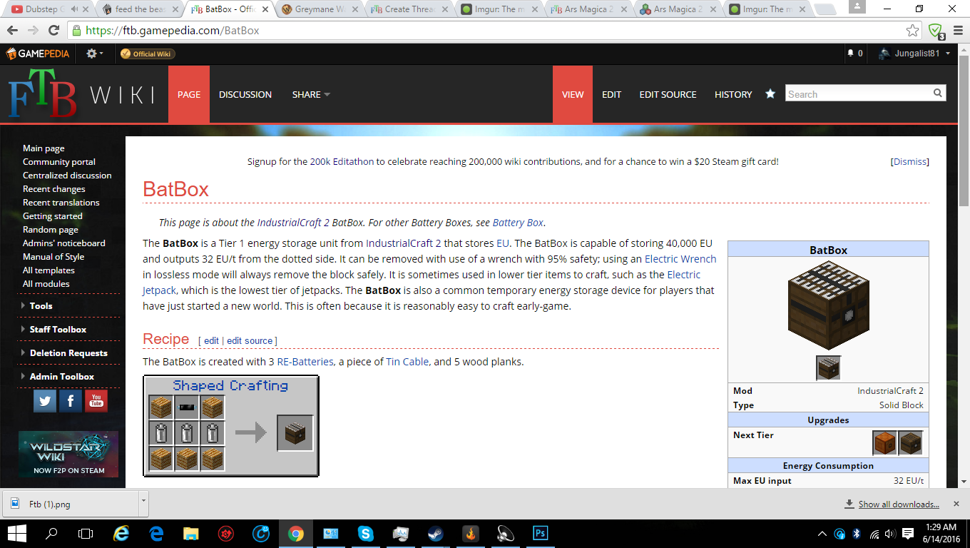
Official FTB Wiki:
ssmxhvV.png


Photoshop Example 1

xD3kPK9.png

In example 1, the page is now a consistent dark template using the same gray and black shade. The top header is much smaller and the left panel has been moved to the right. This way, MC info is immediately located in the top-left. The navplate on the bottom doesn't display language choices, intead we can put that in the front page. Navplate is now 1 less click to more info. Personally, i'd like to have the navplate fully expanded in each article but i know it can get a bit cluttered on big mods. A good compromise is to have the page load the sub-categories as shown above.


Photoshop Example 2
mkKI9ss.png

Example 2 is another dark template with the left panel intact. Instead of a top header that looks like a useless toolbar, I threw it in a blast furnace and added the FTB logo on the top left.


What do you guys think? Shoutout to @xbony2
 

xbony2

WikiWorker
Wiki Staff
FTB Mod Dev
Jul 3, 2013
914
1,353
201
America
ftb.gamepedia.com
The wiki already has a dark theme, if you were curious. I'm not sure if you knew about that or not. You can turn it on here. We aren't going to turn it on per default though, since the style should try to match the style of other FTB sites (this forum, the official website, etc) and also I can easily imagine people bothering us for "copying" the unofficial wiki, because we all know they were the first wiki ever to use a dark theme :p

Language choice isn't something that can be simply be moved to the main page, since different pages support different languages, and some pages support no languages, and the main page contains only links to mod pages, which may or may have translated navboxes. It's also possible (and common) the main mod page might not be translated, but some of the blocks and items might be. Also this makes it difficult for me to find translated pages and maintain them as need be.

I don't like the open navbox thing of the unofficial wiki. It's not really one less click, since the collapsible groups should already be open. It doesn't allow one to view the entire navbox without a bunch of clicking, and sometimes where one item/link may be isn't always obvious. I don't want users to have to search for it.

Having the sidebar on the right feels strange. If you don't like it though, I think making it collapsable would be cool, so people could focus on a page and not need to look at the other junk.

I like the shorter header of WOWpedia (your 2nd example). Adopting that would be good.

(and ping @SatanicSanta @retep998 @Chocohead , the most likely people to have something to say).
 

SatanicSanta

New Member
Jul 29, 2019
4,849
-3
0
@xbony2 I get notified when anyone does anything in this section.

Agree with xbony on the navboxes. Furthermore, it wouldn't work for the navboxes that are lazy loaded like Witchery.

I do agree the panel should e collapsed. Often it goes longer than the article itself. I don't particularly like on the right side, except in rtl languages like Arabic.

I agree that the big header at the top with the edit button and stuff should be a bit shorter.
 

Jungalist81

New Member
Jul 29, 2019
14
0
0
Thanks for the reply guys

"I don't like the open navbox thing of the unofficial wiki. It's not really one less click, since the collapsible groups should already be open. It doesn't allow one to view the entire navbox without a bunch of clicking, and sometimes where one item/link may be isn't always obvious. I don't want users to have to search for it."

I'm glad u said that, When navigating through learning the mods and their blocks and items, to me it's more convenient to just have everything displayed. When learning about mods, I almost always press the expand button several times and just look at the big list of blocks of items Since I'm not familiar where an item is categorized.

"Language can't be moved to main page"

How about separating the language choice links and put them above the nav? If the language choice is for each specific article, why have it guard the nav?

"There's a dark theme"

Oh okay cool I didn't know that, I will just switch to dark theme

" I don't want to follow ftbwiki.org"

Ignore that then, I shouldn't have said that. How about this: my request is inspired by the wow gamepedia and the Habbo gamepedia you showed me earlier. Wow gamepedia is a nice dark theme and Habbo gamepedia doesn't have lots of admin/page tool links in each article.

"I don't like right panel"

Hahaha me too! I over assumed you guys would get mad if I removed it. I like the idea of default collapsing the left panel. Finally, I'm glad you agree with the top header being a bit too big. Consider this, if u have a really high resolution monitor its not a big deal but it's still feels like big empty space up top on lower resolution.
 
Last edited:

xbony2

WikiWorker
Wiki Staff
FTB Mod Dev
Jul 3, 2013
914
1,353
201
America
ftb.gamepedia.com
How about separating the language choice links and put them above the nav? If the language choice is for each specific article, why have it guard the nav?
Most wikis that have the same translation extension we use actually put their language bars at the top of the page, but I think this is a bit too distracting since most users don't care that much about translations.
Ignore that then, I shouldn't have said that. How about this: my request is inspired by the wow gamepedia and the Habbo gamepedia you showed me earlier. Wow gamepedia is a nice dark theme and Habbo gamepedia doesn't have lots of admin/page tool links in each article.
I don't really have a problem with stealing ideas from the unofficial wiki (the "Templates" editing toolbar is proof of that), I just think for the dark theme it would probable we'd get shit for it.

Oh, and don't worry about getting us mad, I'm only allowed to get mad at other staff members :p