New Build - What to do?
- Thread starter DeadPillz
- Start date
-
The FTB Forum is now read-only, and is here as an archive. To participate in our community discussions, please join our Discord! https://ftb.team/discord
You are using an out of date browser. It may not display this or other websites correctly.
You should upgrade or use an alternative browser.
You should upgrade or use an alternative browser.
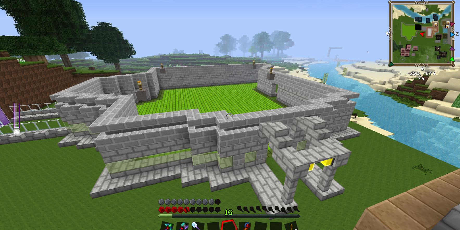
Judging by the look I assume you're going for, I'd go for a green looking roof possibly? it might be a bit of a cliche to match up the flooring with the roof but it does, in all honestly, correspond and look rather majestic.
There's a couple of different roof styles you'd want to dive into, like over-hanging, fitted or messy. These are the 3 types of roof styles I use and, yes, named. (Should note that these are probably real style types and in no way did I create them if so.)
Over-hanging is pretty self explanatory by it's name, it's a roof that goes either 1 or 2 blocks over the outline of the walls.
Fitted is the opposite of Over-hanging, with it's name being a big clue, Fitted is a roof style that I believe to be, well, fitted to the outline of the walls.
And messy, is just as it sounds. Get creative, do something no-one has ever done before. Discard the outline and make something completely new, but most of all, make something you think looks good. Because at the end of the day, as long as you like it, then that's all that counts.
So heres what I did 
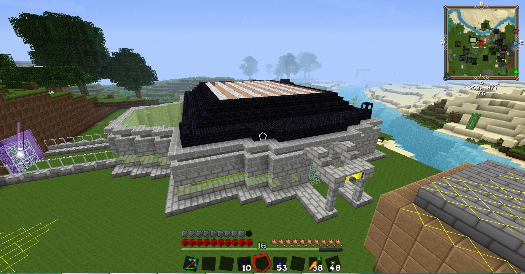
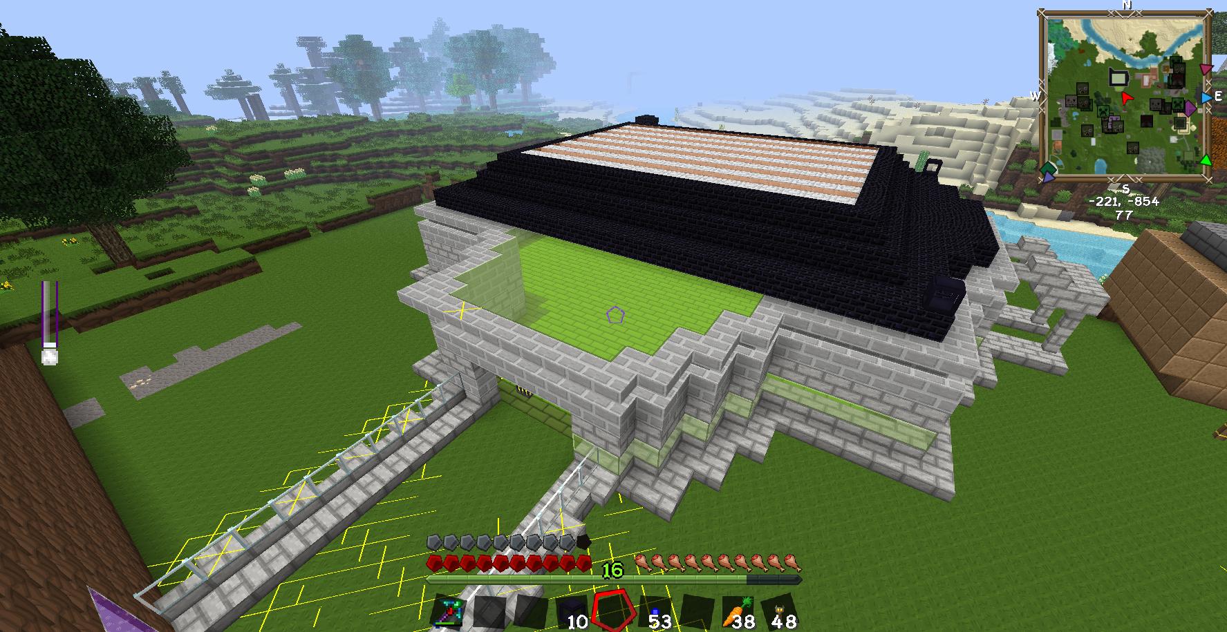
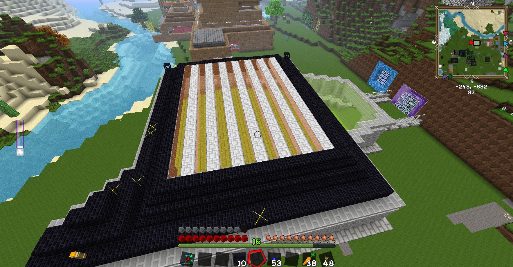
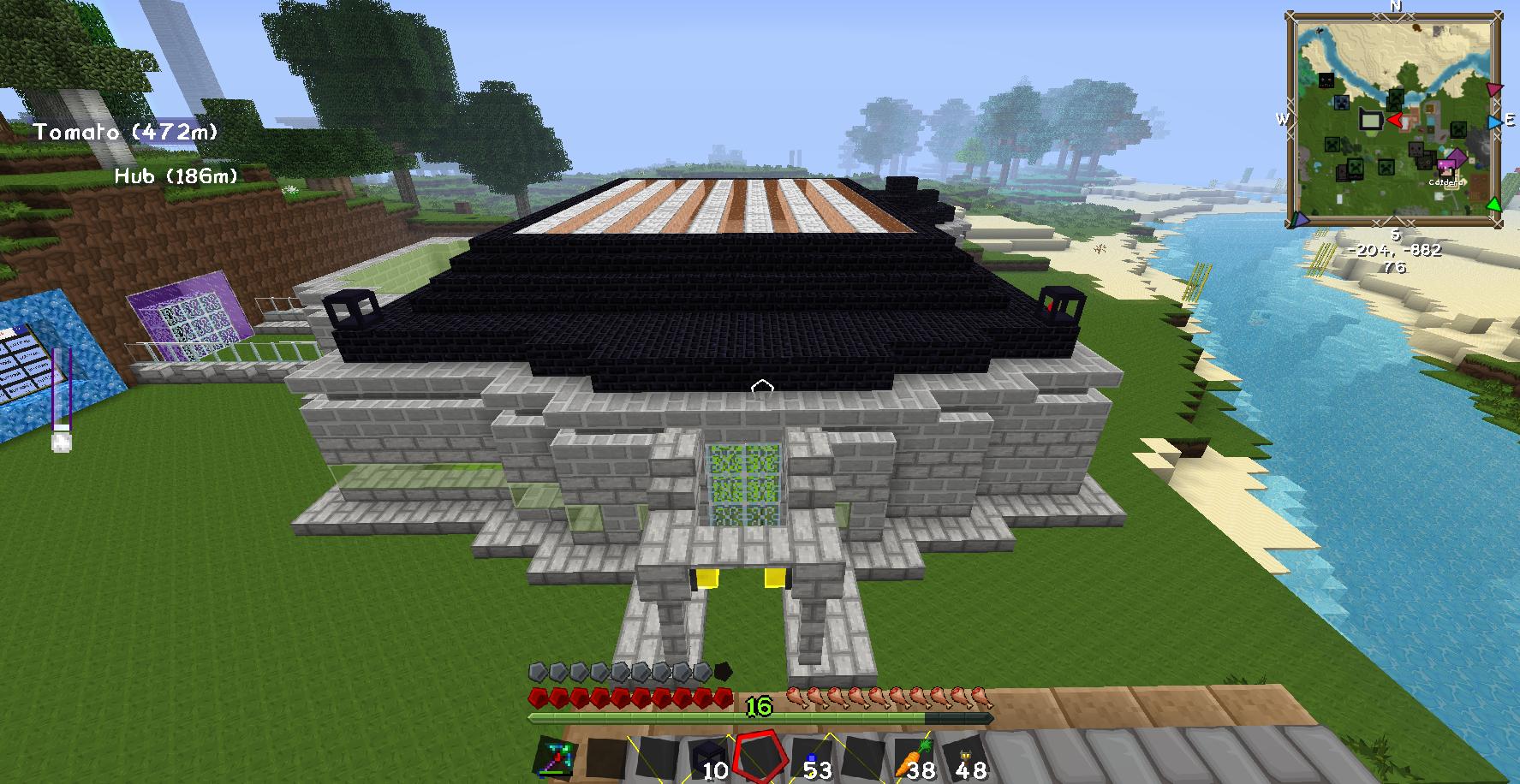
Please no laughing at the stone bricks on the sandy blocks xD
Thanks for the tips


Please no laughing at the stone bricks on the sandy blocks xD
Thanks for the tips
The roof may need to come over the wall a bit more becasue something looks off that I just can't quite pinpoint.
The roof seems like it's smaller then it should be, it's like seeing a person were a baseball cap that's too small for their head.
Edit: Also, unless you only want to impress those with jetpacks a few shots from ground level would be beneficial. Perspective can make things look better and also worse.
And a personal opinion I would not use blackstone brick, I personally find blackstone brick to be one of those "mehh" textures, but that is just me.
Last edited:
I get what your saying, I feel its the first layer of obsidan bricks, when the roof starts as it is only a solid block, perhaps buting stair like around the whole of it would look better.
But the roof is staying how it is, I'll only be making the outskirts look like stairs to see if there any improvement.
But the roof is staying how it is, I'll only be making the outskirts look like stairs to see if there any improvement.
Yeah, that's all I was talking about really. Like slabs on it's current edge.I get what your saying, I feel its the first layer of obsidan bricks, when the roof starts as it is only a solid block, perhaps buting stair like around the whole of it would look better.
But the roof is staying how it is, I'll only be making the outskirts look like stairs to see if there any improvement.
Also they are obsidian bricks? too many blocks that look similar these days, the tinge of violet should have been a give away.
As proven by color theory and this image:
 You should use a purple/red somewhere in there, maybe the roof or floor design.

Oh thou color theory and its 3 forms (RBY, RBG, and CMYK (Cyan, Magenta, Yellow))As proven by color theory and this image:
You should use a purple/red somewhere in there, maybe the roof or floor design.
Such a shame that you don't use microblock instead of stairs etc. That way you have much more options and can make it much more smoother and perfect.
I do use microblocks, I ment in a stair pattern, I don't ever use stairs anymore
Always wonder why more people don't use F1 to hide the UI when taking screenshots. And hiding the F7 crosses for screenshots looks better as well.Good to see you ate something. Your first image made me cringe when I saw your hunger and health bar.

