Logo Contest
- Thread starter Captainnana
- Start date
-
The FTB Forum is now read-only, and is here as an archive. To participate in our community discussions, please join our Discord! https://ftb.team/discord
You are using an out of date browser. It may not display this or other websites correctly.
You should upgrade or use an alternative browser.
You should upgrade or use an alternative browser.
- Status
- Not open for further replies.

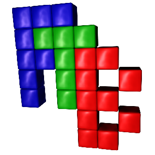
I feel like I've seen a cube exactly like this one before, can't recall where, though.
")
I think, and this is just me giving my opinion, (not meant to bash anyone at all, it's actually more of a heads up I guess), the issue with most of the logos posted is that they don't really refer to Minecraft.
I'll just set an example.
I think you guys should focus more on trying to make it, as the brief says, recognisable to Minecraft fans. It's a game about cubes. Use cubes! (or not!) No round edges, make it rough. Focus on the people you're trying to reach. It's really nice to make awesome stuff full of cool looking effects, but you gotta keep it close and related to the product at hand and what you want people to see.
Well, that was me trying to help.
I'll just set an example.
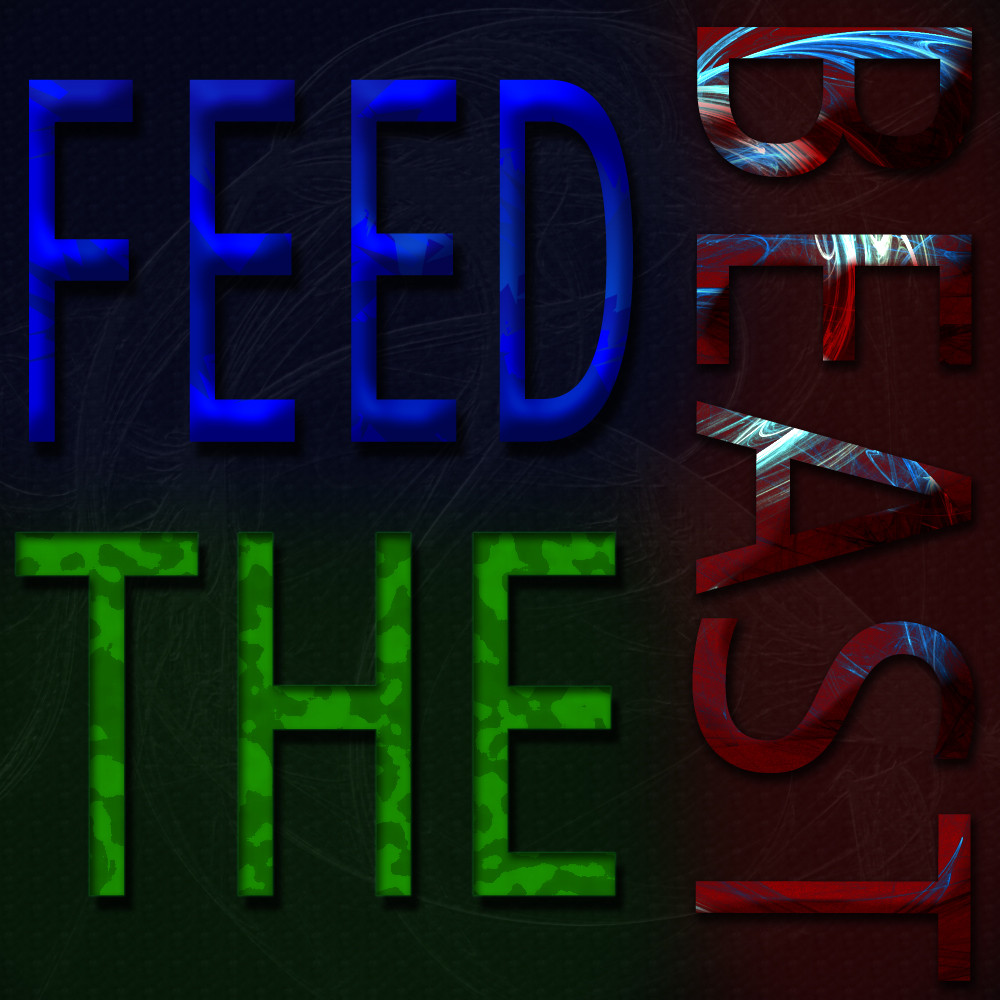
This one. I understand that it is related to the 'beast' and all, but does it really call to the game at all? If you put just one of these logos in front of someone who doesn't know at first about this project, I suppose they'll first think it's a Skyrim Modpack, probably.I tried to make something more beast related...
no gradient or round corners because it doesn't work with this style


I think you guys should focus more on trying to make it, as the brief says, recognisable to Minecraft fans. It's a game about cubes. Use cubes! (or not!) No round edges, make it rough. Focus on the people you're trying to reach. It's really nice to make awesome stuff full of cool looking effects, but you gotta keep it close and related to the product at hand and what you want people to see.
Well, that was me trying to help.


I think, and this is just me giving my opinion, (not meant to bash anyone at all, it's actually more of a heads up I guess), the issue with most of the logos posted is that they don't really refer to Minecraft.
I'll just set an example.
This one. I understand that it is related to the 'beast' and all, but does it really call to the game at all? If you put just one of these logos in front of someone who doesn't know at first about this project, I suppose they'll first think it's a Skyrim Modpack, probably.
I think you guys should focus more on trying to make it, as the brief says, recognisable to Minecraft fans. It's a game about cubes. Use cubes! (or not!) No round edges, make it rough. Focus on the people you're trying to reach. It's really nice to make awesome stuff full of cool looking effects, but you gotta keep it close and related to the product at hand and what you want people to see.
Well, that was me trying to help.
i don't want to be rude but i don't really know how to phrase this...
logos don't need to be related to the product or whatever.
for example lets use the apple logo (the bitten apple). Wich product does that refers to? iPhones, iPads or Macbooks?
logos are a reference to your "brand" so it must be something that will be unique and represent you in a way that when someone sees the image they'll automatically think of your "brand".
so i really think that being related to the offer means nothing and, better than using something minecraft related, a pretty image is a great way to atract people and make people visit your site

You've got a good point about the brand, but I still think it should be something easy to recognize or the tiniest bit related. I agree that neat visuals atract people and that is obviously great but I really don't see how a logo with a ball should represent a game about squares.
I feel like I've seen a cube exactly like this one before, can't recall where, though.
Like this one?
http://www.dawn.ul.ie/
=========================================
The logo will be picked on 12/10/12 at 23:59 BST (UK time)
=========================================
The logo will be picked on 12/10/12 at 23:59 BST (UK time)
=========================================


I just going to make an fool of myselfe, here is my go at the logo
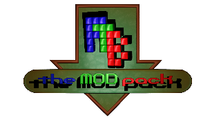
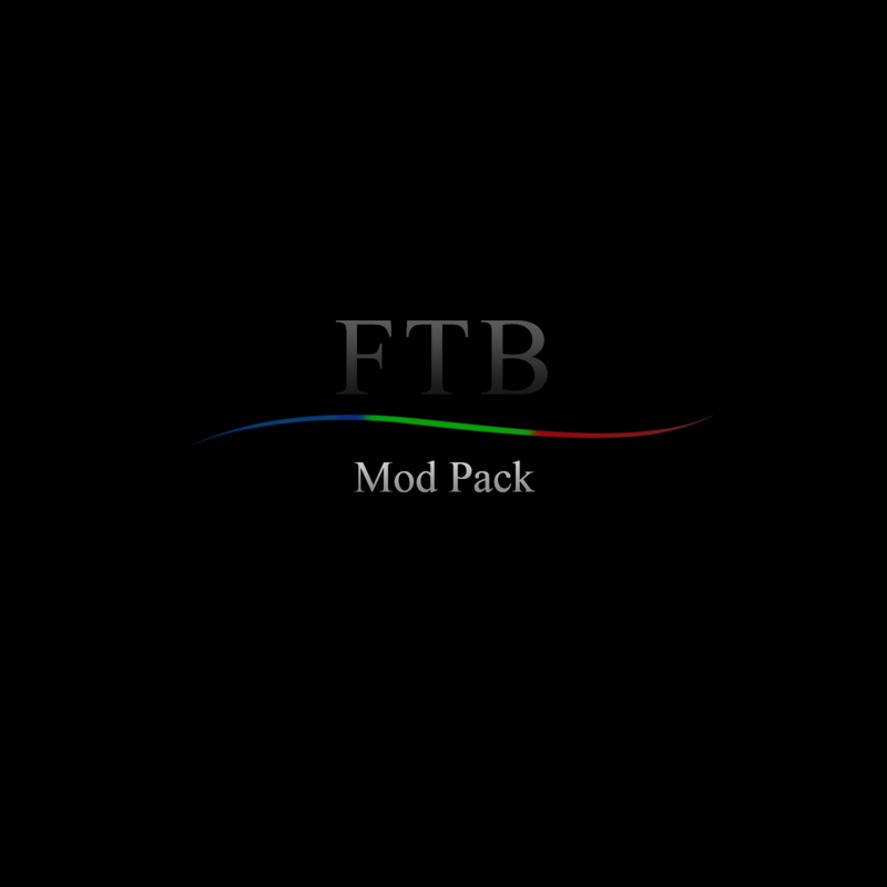
mod pack logo:
FTB_mod_pack
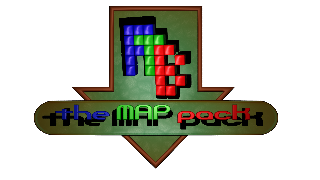
FTB_map_pack
and the standalone FTB
Atleast I can say I tried :-D
mod pack logo:
FTB_mod_pack
FTB_map_pack
and the standalone FTB
Atleast I can say I tried :-D
- Status
- Not open for further replies.