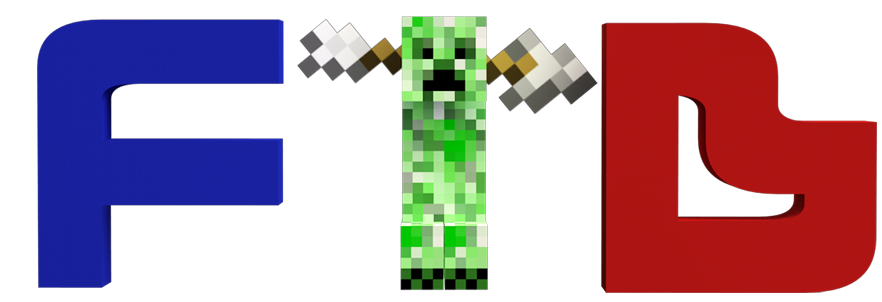
We will be having a new logo here at feed the beast and we would love for one of you to make it for us! All you have to do to enter is create your logo and post it as a reply in this thread, you can enter as many times as you like feel free to give constructive feedback to other contestants.
Design brief:
For those of you that have never really used design briefs before this is just a rough guide of what we want you can do ANYTHING you want but this could help you be creative, its deliberately vague so we don't hinder your creative process.
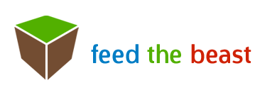
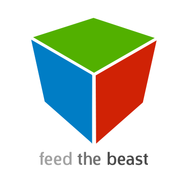
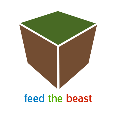
Our current logo:
It might be a good idea to keep the minecraft style and the colours but as I said before this is your design, do what you want with it.
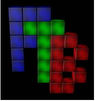
We are looking for a more artistic logo with a bit more handmade feel I am really into web 2.0 logos (they are logos like skype and youtube that are generally seen as web logos generally with gradients and rounded corners) while slow is into more into pictorial logos that are easily recognisable like the apple logo or the CocaCola logo. Letter form logos are also nice as well but if you want to do one of those make sure its recognisable to minecraft fans not just a logo.
Other than that go and have some fun with it, see what you can come up with; I look forward to seeing them!
Captainnana
Web Designer
=========================================
The contest is now over so don't try and enter!
=========================================
Design brief:
For those of you that have never really used design briefs before this is just a rough guide of what we want you can do ANYTHING you want but this could help you be creative, its deliberately vague so we don't hinder your creative process.
Our current logo:
It might be a good idea to keep the minecraft style and the colours but as I said before this is your design, do what you want with it.
We are looking for a more artistic logo with a bit more handmade feel I am really into web 2.0 logos (they are logos like skype and youtube that are generally seen as web logos generally with gradients and rounded corners) while slow is into more into pictorial logos that are easily recognisable like the apple logo or the CocaCola logo. Letter form logos are also nice as well but if you want to do one of those make sure its recognisable to minecraft fans not just a logo.
Other than that go and have some fun with it, see what you can come up with; I look forward to seeing them!
Captainnana
Web Designer
=========================================
The contest is now over so don't try and enter!
=========================================


")